Megalytic bar charts and tables can be easily configured to compare analytics data between two different time periods.
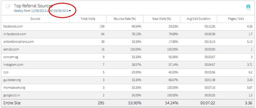
For example, below is a table created by the Referral Traffic widget showing Top Referral Sources for the last 13 weeks. We can change this to display a comparison of this year vs. last year. First, open the date picker by clicking on the date range in the upper left.
When the date picker opens, select “Monthly” from the Period Selector and select “Last 12 months” from the Date Range Selector. Then, click on the “Compare To” check box that is circled below.

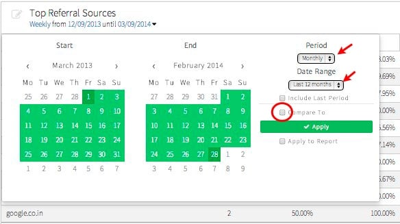
This will open up options to select a date range for the comparison period. Select “Previous Period” to compare with the preceding 12 months. Then, click the “Apply” button to apply these changes to the table.

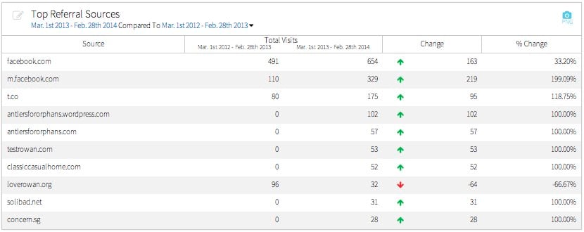
Now, the table will show data from each period side-by-side along with the change as an numeric value and as a percentage – like this:
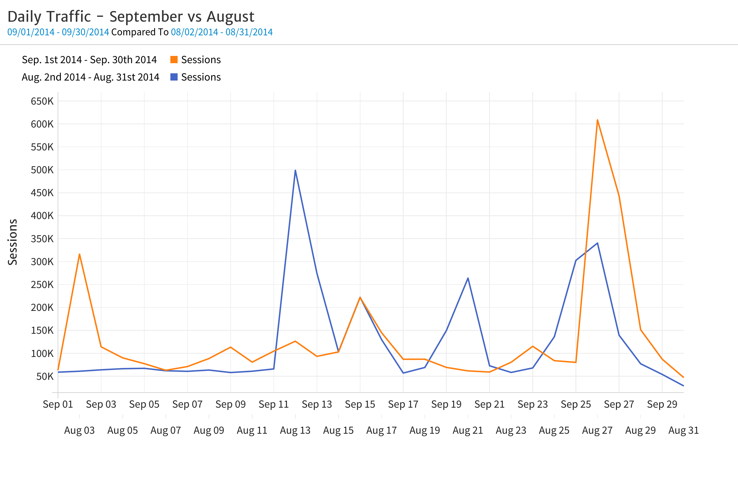
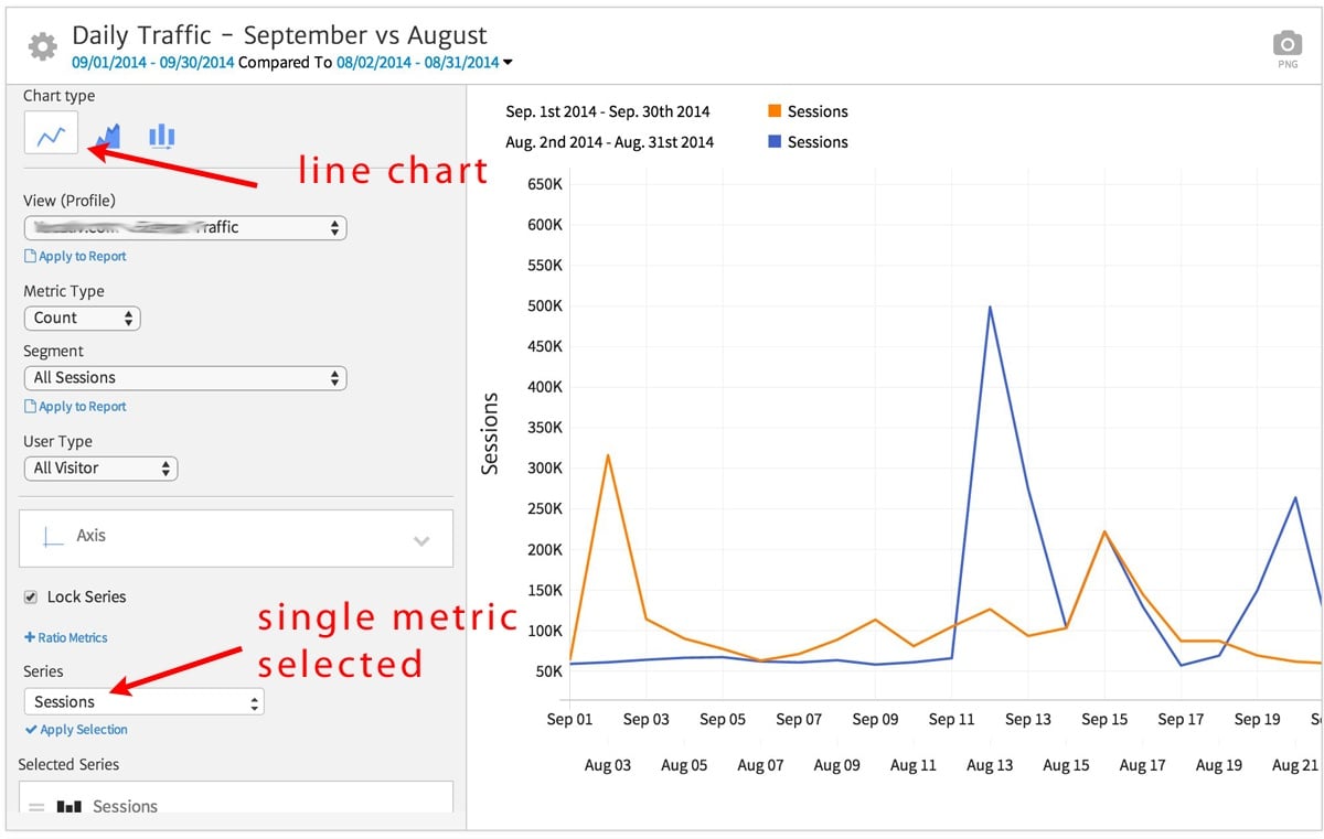
You can also do date range comparisons for time-series data using line or bar charts. For example, to compare the daily traffic across two date ranges, you can use the Metric Timeline widget with a the single metric “Sessions” and the line chart format selected.

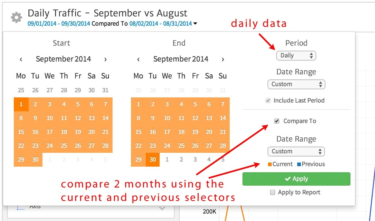
In the date picker, choose “Daily” for the Period, and use the Current and Previous selections to pick the 2 months that you want to compare.
The resulting chart shows the daily Sessions data for each month plotted as separate lines.