
Introduction
for Google Analytics
A Google Analytics Primer for Digital Marketing Agencies
- Introduction
- Navigating Google Analytics
Access
Navigation
- Navigating Reports in Google Analytics
Real-Time Reports Section
Overview (Real-Time) Report
Locations Report
Traffic Sources
Content
Events
Conversions
How To Use the Real-Time Reports with Clients
- Audience Reports
Overview (Audience) Report
Active Users Report
Lifetime Value Report
User Explorer Report
Demographics SubsectionOverview
Age
Gender
Interests Subsection
Overview
Affinity Categories
In-Market Segments
Other Categories
Geo Subsection
Language
.png?width=1005&name=pasted%20image%200%20(11).png)
Location
Behavior Subsection
New vs. Returning
Frequency & Recency
Engagement
Technology Subsection
Browser & OS
Network
Mobile Subsection
Overview
Devices
Location
Devices
Users Flow
Introduction
Google Analytics is one of the most important tools that companies and agencies can use to measure their online marketing performance. It’s a completely free, comprehensive, multi-use tracking tool that provides you and your clients with detailed data on all of the important activity occurring on your clients’ websites. It’s, therefore, become a core component of many digital marketing programs. If you work for a digital marketing agency, it’s likely that your firm has a Google Analytics expert on staff- but they can’t be everywhere at once. Agency employees, particularly those who work with clients every day, can benefit in many ways from knowing their way around this critical tool.
If you are in a client-facing role, such as Account Manager, Marketing Director, or Creative Strategist, you need to be able to communicate well with your clients. To expertly discuss the results of the work that your agency has been doing, you need to understand the data that your company has acquired on the performance of your digital campaigns. Much of the time, these results are being measured and reported in Google Analytics.
A familiarity with Google Analytics- being able to read the data and understand the results- can bring many benefits to client-facing work. Google Analytics provides you with a wealth of data that you can relay to clients easily and interpret quickly to adjust campaigns and make future plans. It helps you and your clients to both track growth and set goals for the future while still allowing you to drill down into data on specific campaigns, channels, or content to optimize current performance. Participating knowledgeably in conversations interpreting data for your clients helps you to build trust, creating a strong agency-client relationship.
Understanding Google Analytics can make conversations with clients smoother, more accurate, and more productive.
Navigating Google Analytics
Access
First, you’ll need to get access to your clients’ Google Analytics (GA) accounts so you can develop a feel for the tool and familiarize yourself with the different data available to you.
- Find the Administrator for the GA account you want to look through - this will often be a person in your agency, but may also be the client.
- Provide them with the email address of a Google account you want to be associated with GA (if your company uses Google for email, that works - otherwise a Gmail account).
- Ask the Administrator to grant you Read & Analyze permission, which will give you basic permissions to see report and configuration data, manipulate data within reports, create personal assets and share them, and see shared assets.
- When Read & Analyze permission has been granted, go to this address to log in to GA: https://analytics.google.com/analytics/web/
Navigation
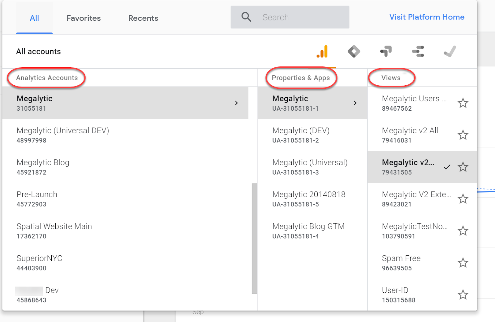
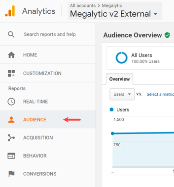
In this example, the Account (Megalytic) has 5 Properties. We’ve selected the Megalytic Property which has 7 Views, among which we picked the “Megatlyci v2 …” View.
The home page when you log into GA has fairly simple navigation.
- When you log into the tool you will see a drop-down menu at the top of the page. This menu allows you to select the account you wish to see analytics for. If you work for an agency, it’s likely you will have multiple accounts for multiple clients. Use this drop-down menu to switch between those accounts.
- Accounts may be divided into Properties, which are usually individual websites or apps. Choose the property you wish to see data for.
- Views are a way to further segment your data-- for example, only looking at visitors from the U.S., or only looking at visitors using mobile devices. When you discuss GA data with a client, make sure you are both looking at the same View to avoid confusion.
- The sidebar on the left side of the page is the main form of navigation that you will use to find specific data in a variety of useful reports. Use this navigation sidebar to switch between these different kinds of reports:
- Real-Time reports let you monitor the activity on your site happening in real-time. Real-Time reports include Overview, Locations, Traffic Sources, Content, Events, and Conversions.
- Audience reports give you essential data about the visitors coming to your webpage or app. Audience reports include Overview, Active Users, Lifetime Value, Cohort Analysis, Audiences, User Explorer, Demographics, Interests, Geo, Behavior, Technology, Mobile, Custom, Benchmarking, and Users Flow.
- Acquisition reports detail how your site interacts with the rest of the internet and show you how visitors are finding your site (i.e., where your traffic is coming from). Acquisition reports include Overview, All Traffic, Google Ads, Search Console, Social, and Campaigns.
- Behavior reports show you how your website is functioning, including how visitors navigate your site and how long it takes to load. Behavior reports include Overview, Behavior Flow, Site Content, Site Speed, Site Search, Events, Publisher, and Experiments.
- Every one of these reports provides you with both high-level overviews and more detailed drilled-downs on important metrics measuring the success of your website strategy and digital marketing campaigns. Understanding how to read these reports and derive actionable insights from them can help to bridge the knowledge gap between you and your client, improving clarity and making it simple to astutely plan for the future.
Navigating Reports in Google Analytics
Now that we’ve explored how to get around in GA, we’ll go into detail on the different kinds of reports. First, we will look at the different types of Real-Time reports, how to interpret the data they provide, and how this data can be useful to you in talking to clients.
Real-Time Reports Section
Real-Time reports do exactly what the title states: provide you with up-to-date information as it occurs on your website or app. These reports allow you to measure the moment-to-moment activity of visitors to your site to gain immediate insight - for example, about how a campaign or initiative is currently affecting website traffic. This makes them extremely useful for tracking, especially tracking things like social media-based promotions or limited-time offers.
There are six different Real-Time reports:
- Overview → which gives you the big picture of what’s happening on your website. There’s an Overview report for all of the different varieties of GA reports, so be sure not to get confused.
- Locations → where in the world your current visitors are from.
- Traffic Sources → what part of the internet brought your current visitors to your site.
- Content → the pages on which your current visitors are most active.
- Events → a feature that allows you to monitor ongoing interactions, custom-defined by you, including button clicks, video plays, and downloads.
- Conversions → allow you to track the completion of Goals set up by the Administrator (usually, as the name implies, a conversion: subscribing to a mailing list, making a purchase, downloading a white paper, etc.)
Let’s look at the different Real-Time reports in more detail.
Overview (Real-Time) Report
The Overview [Real-Time] report gives you an overview of what is happening in real-time on your website.
- Active Users are displayed in the top left corner with an easy-to-read number. This is the total number of people currently accessing your website.
- Underneath this number is a graph displaying, by percentage, the devices used to access the website, including desktop, mobile, or tablet.
- Pageviews are displayed in per-minute and per-second graphs directly to the right of Active Users. This graph displays the number of pages being viewed every minute or second in a timeline - for example, if 2 pages were viewed 6 minutes ago, you could hover over the “6 min” mark of the “per minute” graph to display the number of page views at that time (2). If you have narrowed down the report in any way (only viewers using desktops, or only viewers from India, etc.), a box will appear that you can click to show all pageviews.
- Active Users and Pageviews are present on most of the other Real-Time reports displays.
- Top Referrals, Social Traffic, and Keywords (on the lower left of the page) display how users were brought to your website and how many current users were referred by each source. Referrals will display other websites that drove traffic to your site, while Social Traffic displays the social media platform and Keywords displays the relevant keyword searches (which, due to Google’s privacy restrictions, are almost always listed as ‘not provided’).
- Top Active Pages (on the lower right of the page) displays which pages on your site are currently receiving the most traffic, by number of users and the percentage of active users.
- Top Locations displays the place on earth from which your website is being accessed on a simple-to-read map.
You can easily click on a link, a location, a source, or a type of device to narrow down the adjacent data. For example, clicking “desktop” will show you all relevant data from people who have accessed your website from a desktop. This search can then be carried over from one report to another-- you can easily show real-time Location data from desktop users or the locations of visitors who arrived at your page from Social traffic.
When you narrow down data, this will be shown by a blue box appearing in the top left of the report with the specifications of your search. Occasionally this may take you to another reports page if you undo the specification (by clicking the X in the blue box), so be careful!
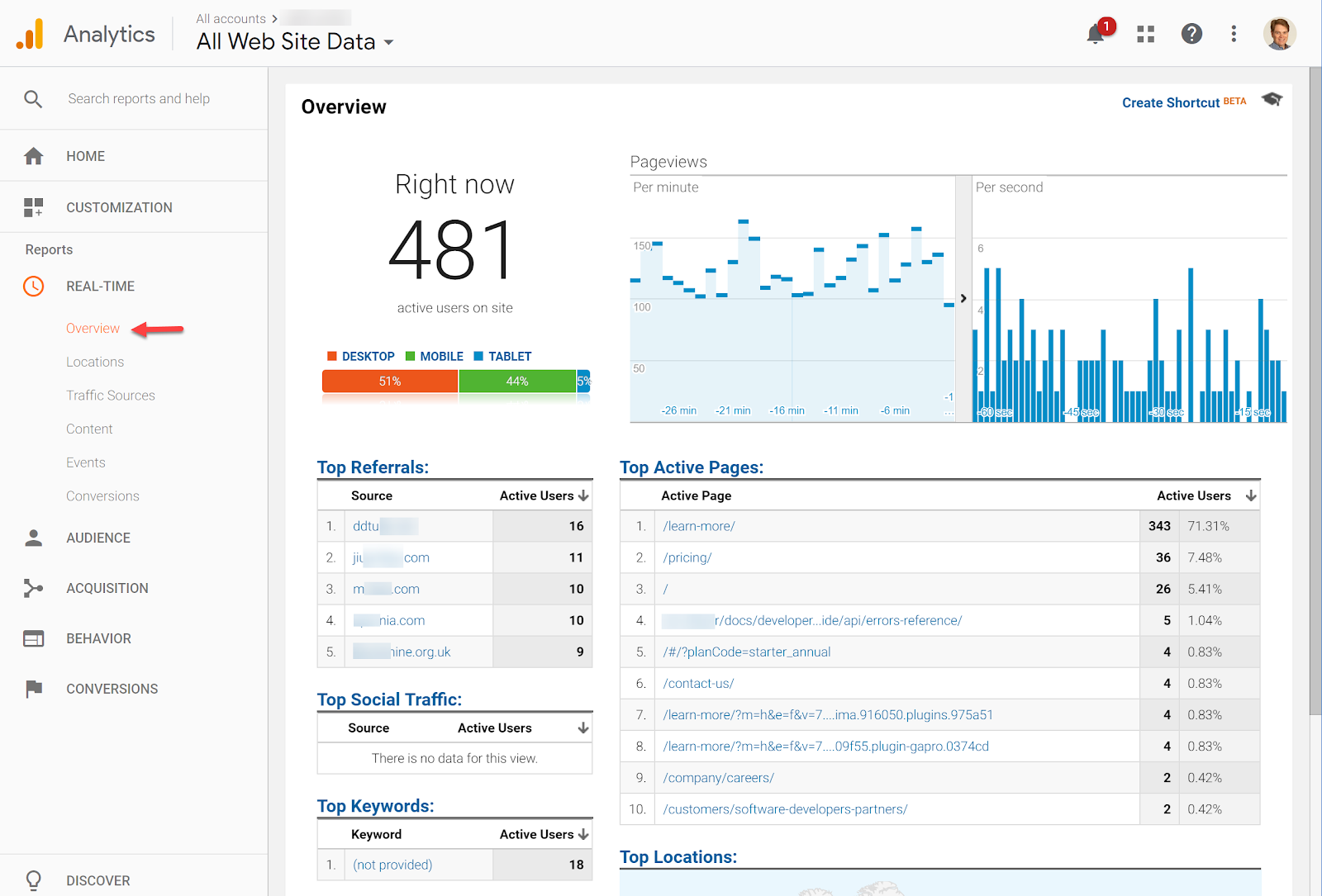 A glance at the Google Analytics Overview Report
Locations Report
The Locations Report gives you more specific information about where in the world the visitors to your website or app are located, in real-time. Uses for this information include helping you tailor your message to the locations where you are making most of your sales, or to develop programs to improve outreach to targeted locations where you wish to improve.
- As with other Real-Time Reports, the top-left provides you with the number of Active Users on the site and the top-right provides you with Pageviews per minute and per second.
- Underneath this number is a graphic displaying the different countries from which the website is being accessed and the percentage of users that are from that country.
- Beneath the total active users is a display that tells you which countries users are accessing your site from, how many users are from that country, and the percentage of total users that are from that country. This display is searchable.
- The map on the bottom right of the page, showing countries, in orange, from which people are accessing your site, allows you to drill down for more specific data. If you click on a country that currently contains users accessing your site (for example, the U.S.), the display will change to show only the U.S. and show the U.S. cities from which people are accessing your website.
- When a new user lands on your website, a country or city will appear briefly in green on the map, helping you to identify hotspots in real-time.
The following graphic shows the Location Report drilled down to the U.S., with a red arrow highlighting the box showing the narrowed-down search parameters (in this case, “United States”).
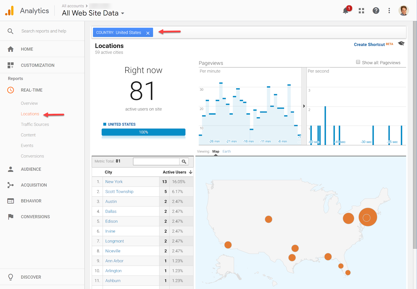
Location Report Drilled Down to the U.S.
Traffic Sources
The Traffic Sources Report shows in real-time the parts of the internet that are sending visitors to your website or app. These sources include direct traffic (people typing in your website directly), searches on Google, social media links from Twitter and Facebook, and many others. Using this data can help you to balance spending among platforms and reduce waste if a particular channel is not performing well.
- As with the other Real-Time reports, the top left displays the number of Active Users on your website, while the top-right displays Pageviews per minute and per second.
- The graph underneath total Active Users shows the percentage of active users from different traffic sources.
- The display at the bottom of the page shows the Medium (organic search, email, social media, direct traffic, etc.) and Source (Google, LinkedIn, direct, etc.) by which visitors arrived at your site.
- This display can be organized by Active Users or by Pageviews (last 30 min).
- Active Users will show you how many users and what percentage of the total users arrived by a certain medium and source.
- Pageviews will show you which medium and source provided how many pageviews, and the percentage of total pageviews, for the last 30 minutes.
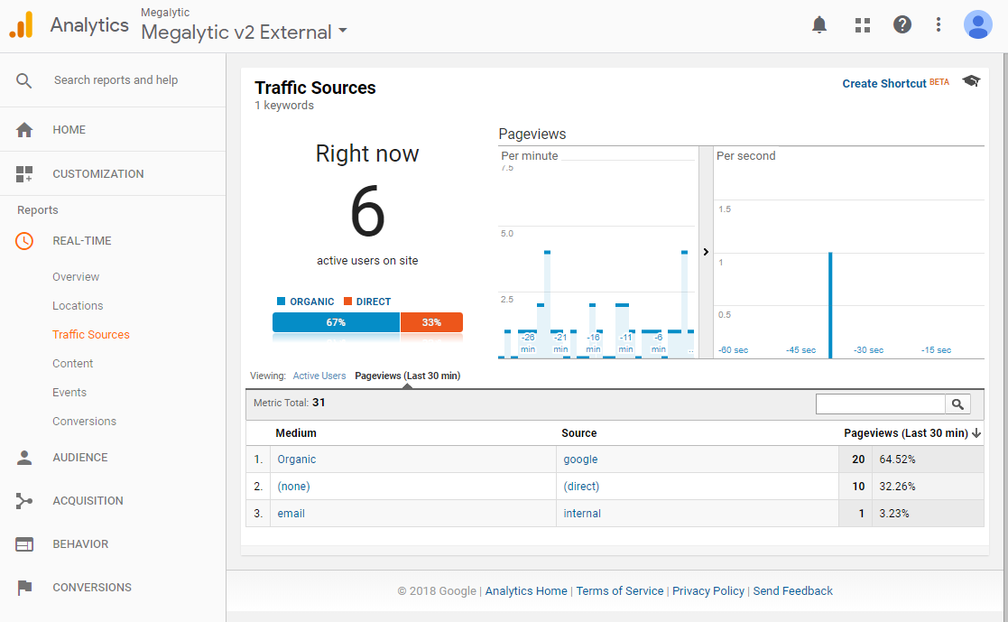
Traffic Sources Report displaying Pageviews
In this example, there have been 31 pageviews in the last 30 minutes. 20 of them came from organic Google searches, 10 were direct traffic, and 1 was from an internal email.
Content
The Content Report displays which pages on your website are currently being viewed by your active users. This helps you gain a complete picture of what content is currently resonating the most with your audience. This can help you give your clients directed information as to the success of your digital marketing output. If you learn that your how-to articles get steady traffic but your thought-leadership posts are a desert, you know that you need to test new thought leadership topics while continuing to publish how-to articles to keep traffic high.
- As with other Real-Time reports, The top left displays the number of Active Users, while the top-right displays Pageviews per minute and per second.
- The graphic below the Active Users display shows what percentage of users are accessing your site on different devices.
- The bottom display shows the Page being currently accessed (by URL [link] path), and the Page Title. This display can be organized by Active Users or by Pageviews (last 30 min).
- If the display is showing Active Users, it will display which pages are actively being viewed, by how many active users, and the percentage of total active users on that page.
- If the display is showing Pageviews, it will detail which pages have been viewed in the last 30 minutes by the number of page views and percentage of total page views.
.png?width=512&name=unnamed%20(1).png)
Content Report displaying Active Users
In the example above, you can see that 4 visitors are currently reading 4 different Megalytic blog posts, one is editing a dashboard (i.e., they are logged in and using the product), and another is reading a support article about KPI widgets.
Events
The Events Report helps you monitor which custom Events you have created within the GA tool are being utilized in real-time. You can define whatever Events you feel are important to measure, including but not limited to: ad click-throughs, downloads, video plays, etc. Then you can measure their real-time occurrence with this report.
- As with other Real-Time reports, the top left will display the number of Active Users on the site. However, the top right will display Events per minute and per second.
- The graphic below the Active Users display shows what percentage of users are accessing your site on different devices.
- The bottom display can be organized in two different formats: Active Users and Events in the last 30 minutes.
- Active Users will display the Event Category and the Event Action as set by you, the number of active users performing these events, and the percentage of total events.
- Events (Last 30 min) will display Event Category, Event Action, the number of each event, and the percentage of total events in the last 30 minutes.
.png?width=1077&name=pasted%20image%200%20(1).png)
Event Report displaying Events (Last 30 min)
At the time this screenshot was taken, you can see that there had been 3 successful logins, 1 “Add Widget” action, and 1 “Open Widget Library” in the last 30 minutes.
Conversions
Conversions are one of the most important measurement tools provided by Google Analytics. These show that a site visitor has taken an active interest in your web content and found value in it-- often meaning that they are ready to go further with you. Typically, a conversion equates to a visitor providing information, such as a name and email address, that enables you to add them to a contact database so that the lead can be nurtured. Often this information is provided in return for a content offer, such as a free trial or a white paper.
The Conversions Report in GA shows in real-time which of your Goals - the GA term for different kinds of conversions - are being completed by active users. Goals are set by you and can include any kind of conversion you deem important, from PDF downloads to free trial signups to successful logins.
Conversions track important activities and are used to measure success. For example, adding engaged contacts from a web form to your marketing database is a fundamental building block of marketing. Your clients will closely track the rate at which contacts (which often become leads) are being added, so having real-time information as to which conversions are being completed gives you important information as to the success of campaigns and what marketing initiatives can be moved forward.
- As with other Real-Time reports, the top left will display the number of Active Users on the site. However, rather than Pageviews, the top right will display Goal Hits per minute and per second.
- The graph underneath Active Users will display by percentage the number of visitors on different kinds of devices.
- The bottom display can be organized in two different formats: Active Users and Goal Hits (Last 30 min).
- Active Users will display the Goal as set by you, the number of active users achieving these Goals, and the percentage of total Goals.
- Goal Hits (Last 30 min) will display Goal, the number of Goal Hits for each Goal, and the percentage of total Goals in the last 30 minutes. It will also display the total number of Goals.
.png?width=1089&name=pasted%20image%200%20(2).png)
Conversions Report displaying Goals (Last 30 min)
You may have noticed that sometimes Goals and Events are the same. For example, in the above image, you see that there have been 3 successful logins. Login success also showed up as an Event in the Events report. What’s the difference?
Usually, Goals include only the most important Events. You are limited to 20 Goals per GA View. There is no limit on the number of Events that can be tracked. So, Goals tend to be the most important metrics you and your client want to monitor, giving you a very specific dataset, while Events track overall usage of your website or app.
How To Use the Real-Time Reports with Clients
Clients want to know what kind of results they are getting from the marketing programs you put in place. By understanding how to use Real-Time Reports, you can give clients a clear picture of the results that campaigns are delivering and make concrete recommendations for next steps to optimize and improve both their website and their digital marketing campaigns.
For example, if your Location report shows that a high percentage of your client’s web visitors are located in New York City, you can create messaging that is specifically relevant to New Yorkers. If they’re curious about which social channel is performing best on the first day of a new campaign, you can show them. By setting up Goals, you can even show them which social ad is generating the most conversions - maybe those New Yorkers are downloading your clients’ new eBook, generating lots of New York leads.
Real-Time reports can also show prospective growth areas in an easily digestible format. If your New Yorkers are reading articles on a particular topic, you might consider a campaign tailored to the specific issues New Yorkers have demonstrated caring about. If you find that visitors are spending time on your infographics while your videos have a high bounce rate, you can focus on creating more infographics and shorter videos. You can also easily utilize the reports for A/B testing, optimizing your site page by page for the highest engagement.
Your clients are likely using Real-Time reports to evaluate how well your agency’s work is performing. Reading and understanding these reports gets you on the same page with your client. As a result, knowing your way around GA’s Real-Time reports can be a significant source of knowledge that you bring to client conversations and meetings, helping you deliver more value and create a stronger bond between agency and client.
Audience Reports
Audience reports give you essential information about the people visiting your website or using your app. It is a large section, providing information on all aspects of your audience from demographics to geographic location to the technology they use.
Audience reports are organized under numerous sub-headings, with Google adding new ones and reorganizing them regularly as they continue to develop and improve Analytics. The newest reports or sub-sections are labeled as “BETA” indicating they are still somewhat experimental.
Here are some of the most important sub-sections and reports that you are likely to encounter when discussing online marketing performance with clients:
- Overview Report → summarizes the big picture of the audience visiting your website.
- Active Users Report → provides information about the users who have visited your site recently.
- Lifetime Value Report→ gives you information about the spending of a user over the lifetime of their use of your site. This report only provides data if the website or app has set up Google Analytics’ Ecommerce tracking to capture purchase data.
- User Explorer Report → a report on the anonymous data on the behavior of individual users. This only provides data if the website or app has turned on the Google Analytics User-ID feature.
- Demographics Subsection → information about the different age and gender groups visiting your site. These reports require that the Google Analytics Demographics and Interest reports feature has been enabled. This section provides three reports: Overview, Age, and Gender.
- Interests Subsection → informs you of the interests of your audience, including the kinds of products and services that members of your audience are in the market for. These reports also require that the Google Analytics Demographics and Interest reports feature has been enabled. This section provides four reports: Overview, Affinity Categories, In-Market Segments, and Other Categories.
- Geo Subsection → where your audience lives and what languages they speak. This section has two reports: Language and Location.
- Behavior Subsection → summarizes how often users visit your website and how deeply engaged they are. This section has four reports: New vs Returning, Frequency & Recency, Engagement, and User-ID Coverage.
- Technology Subsection → information on the technology visitors use to access your website. This section has two reports: Browser & OS and Network.
- Mobile Subsection→ gives you information comparing desktop, mobile, and tablet users. This section has two reports: Overview and Devices.
- Benchmarking Subsection → compares your performance with the average performance of other websites from companies in your industry or other industries. This section has three reports: Channels, Location, and Devices.
- Users Flow → diagrams the “flow” of your audience through your website (which pages they go to in which order).
Knowing your audience is absolutely critical in any kind of digital marketing program. By understanding the audience that comes to your website, you can determine if you are reaching the right people, identify audience segments you are missing, and set goals for whom you want to reach in the future. By comparing your GA Audience reports to your targeted personas, you can gain essential insights into how better to tailor your campaigns and reach the people you need to connect with. You might even discover a new audience you hadn’t anticipated, that can be turned into an essential part of your customer base.
Marketers at agencies who have a good handle on how to read the Audience Reports in GA have a good foundation from which to discuss important conversion and lead generation goals with their clients.
In the following sections, we will describe the different types of Audience reports and how you can use them with clients.
Overview (Audience) Report
The Overview (Audience) report gives you, as the name states, an overview of the information GA has gathered about the visitors to your website or app users. It presents a useful at-a-glance summary of your user base.
Many Audience reports contain similar features, so we'll go over them in some detail here. Please refer back to this section if you need a reminder of how a feature functions or what some of the data means.
.png?width=1600&name=audience-overview-1%20(1).png)
Overview (Audience) Report
The red numbers in the image above highlight some of the basic ways that you can interact with the Audience Overview reports:
1. Date Range → As a default, the date range is set to view information on users who have visited your site over the course of 1 week. By clicking on this section, you can easily change the time period for which data will be displayed, either using a custom range set by you or one of several predefined ranges.
2. Metric Selector → This selector changes the metric displayed in the large graph in the middle of the page. By default, the chart shows the User metric, but you can click on this drop-down menu to select from a list of useful metrics. In addition, you can pick a second metric and get a comparison chart. The chart displays a line showing how the metric changed over time. Each dot indicates the value of the metric during a particular period (e.g., day, week, month).
.png?width=1410&name=ga-date-picker%20(1).png)
- Users → the number of people that visited.
- Avg. Session Duration → the average length of a session (visit)
- Bounce Rate → if the number of single-page visits to your website (aka the number of times a visitor landed on your website and did not click to any other page).
- New Users → the number of users that are new to your website (have not visited before).
- Number of Sessions per User → the average number of times each user visited.
- Pages / Session → the average number of pages visited per session.
- Pageviews → the number of views of any page on the website.
- Sessions → the number of visits from users to the website
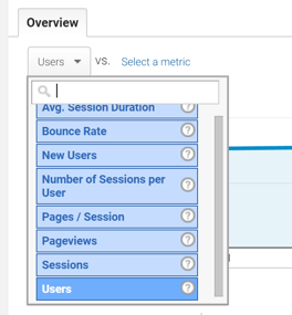
Illustration of different Metrics for the Overview Graph
3. Time Period → This widget controls the amount of time represented by each dot in the graph. “Day” is selected by default, but you can change the graph to display data in hourly, weekly, or monthly increments.
Combining these first three controls (Date Range, Metric Selector, and Time Period), we can create a detailed and useful chart such as the chart displayed below: Users vs Bounce Rate monthly since January 2017.
Information like this shows you trends and anomalies that can help you frame a conversation with your client about how to improve the quantity and quality of traffic. In the example below, you can see that the number of Monthly Users has steadily declined from nearly 5 million to below 2.5 million, while Bounce Rate has held relatively steady.
However, you can also see, in the highlighted circle, that a change occurred in July 2017. July 2017 was a very positive month, where Users rose dramatically and Bounce Rate fell. Therefore, you and your client might want to investigate what happened that month. Was there new content that really resonated with the audience? Was there a new paid social campaign that generated a ton of website hits? Did you attend a trade show or other networking event? Identifying what improved your metrics can help you and your client develop new strategies and prove the value of your work to the client.
.png?width=1600&name=ga-audience-overview-timeseries%20(1).png)
Illustration of Users vs. Bounce Rate monthly since January 2017
4. KPIs → A KPI is a Key Performance Indicator. The eight KPIs display the absolute value of the eight Metrics discussed above for the entire date range. For each KPI there is also a sparkline chart (a small line chart without axes or coordinates, showing the general trend over time).
.png?width=1083&name=pasted%20image%200%20(16).png)
Illustration of the eight different KPIs
5. New vs Returning Visitors → This graphic is a pie chart showing the percentage of total users divided into new and returning visitors. You can hover over the graphic to display how many users comprise each percentage. To marketers, this graphic is not always useful in a broad sense - most marketers are looking to bring in more new visitors in addition to bringing returning visitors to the site again and again. However, this data can be useful if you are developing a campaign specifically targeted to one group or the other - a campaign to re-engage visitors who have only been to your site once or a campaign to target an entirely new audience.
At the bottom of the page is another series of graphics that can give you a general overview of audience demographics at-a-glance.
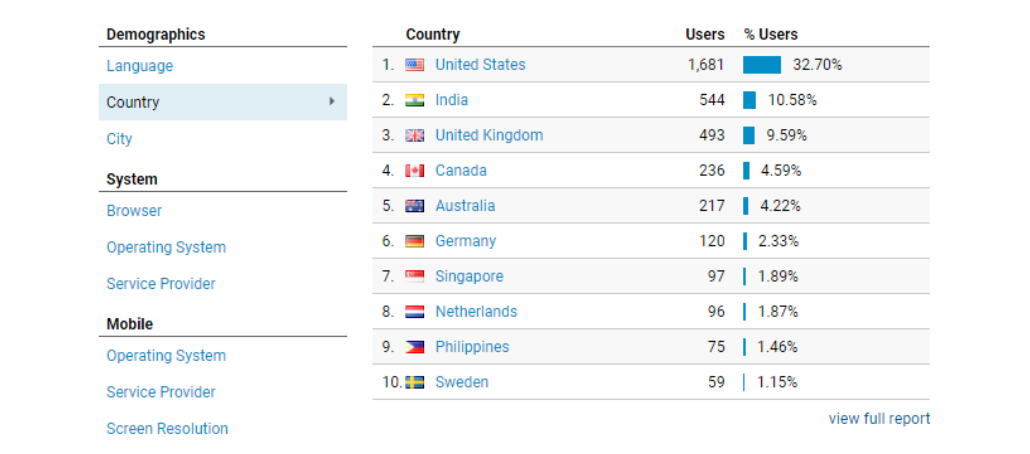
Illustration of Overview at-a-glance display
This display gives an overview of information that can be accessed more in-depth by individual reports later in the Audience reports section. By clicking “view full report”, you can easily navigate to the more detailed report for whatever section you’re looking at.
The display will show you the top nine different varieties of whatever variable you’re currently looking at by variety, a total number of users and percentage of users. Clicking on the different cities, OSes, browsers, etc. can take you quickly to the portion of the Audience reports giving you more detailed information on that segment of your audience.
- Language → displays users by the language visitors access your site in. If there is more than one subset or dialect of that language (for example, English (UK) / English (US) / English (AU)), they will be displayed as different languages.
- Country → displays the different countries visitors access your site from.
- City→ drills down further to the different cities visitors access your site from.
- Browser → displays the different internet browsers that visitors use to access your site.
- Operating System → displays the OS that visitors use to do their computing, such as Windows, Mac, and iOS.
- Service Provider → displays the different utility companies by which visitors are connected to the internet.
- Mobile: Operating System → displays the OS data only for mobile users.
- Mobile: Service Provider → displays the Service Provider data only for mobile users.
- Screen Resolution → displays the size and dimensions of the screens on devices that visitors are using to access your site.
Active Users Report
The Active Users report displays a graph of the number of unique users that have accessed your site for different periods of time (1, 7, 14, and 28 days) over the designated date range. It’s important to remember that active users do not, in this case, refer to real-time users; if you would like real-time user data, refer to that report under Real-Time reports.
By comparing this data, you can easily see how you are attracting and retaining active users over the course of a campaign, a quarter, or any other period of time you deem valuable. You can use this data with clients to identify problem areas with retention.
-1.png?width=923&name=pasted%20image%200%20(2)-1.png)
Illustration of Active Users report for 1 Day and 7 Day Active Users
The Active Users report is most useful for measuring the success of a promotional campaign. You can easily see if numbers are above, below, or meeting expectations for a time period and measure that against other metrics, such as social media impressions or conversions, to try to identify problem areas or parts of a campaign that have been more successful. By comparing the different time segments, you can see when interest begins to drop off and use that information to keep interest going in future campaigns. For example, if you have a lot of 1 Day users but not many 7 or 14 Day users, perhaps visitors are excited to download your free trial but do not find it useful enough to keep engaging with your client.
Lifetime Value Report
This report is, at time of writing, still in beta, so some functionalities may change or be removed or added.
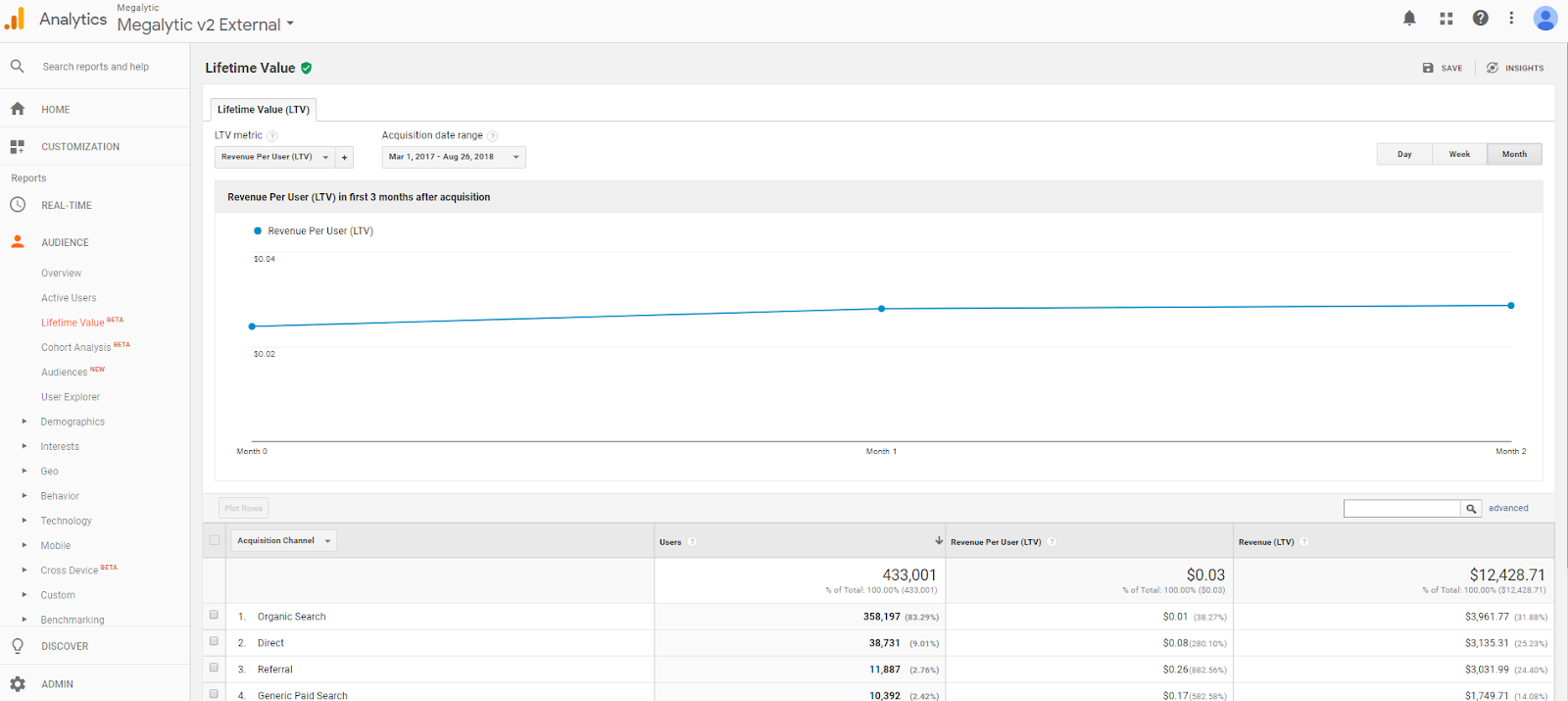
Illustration of Lifetime Value report
This is a dynamic report that helps you to determine how much revenue is being generated by any visitor to your website. You can use this report to analyze what brings high-value, long-term users to your site, what demographics of visitor tend to become high-value and long-term, when high-value visitors tend to visit your site, and a wide variety of other information that can help you finely tailor your site to create more high-value users from search to landing to conversion.
The Lifetime Value report is organized by an Acquisition Date Range, like the Overview Date Range, that narrows the data by the date that a user first arrived on your page. There are six predetermined date ranges, or you can choose a custom one suited best for your needs. For example, if you ran a two-week-long promotion, you can segment your audience by those two weeks to determine the lifetime value of those visitors.
There are six LTV Metrics you can sort this report by:
- Goal Completions Per User → measuring LTV by conversions.
- Pageviews Per User → measuring LTV by raw pageviews.
- Revenue Per User → measuring LTV by generated revenue. This metric is best used if you are using this report in combination with e-commerce data.
- Session Duration Per User → measuring LTV by duration of the average session.
- Sessions Per User → measuring LTV by raw sessions.
- Transactions Per User → measuring LTV by number of transactions performed on your site.
You can also use the + button to choose a second metric, creating a comparison graph. These metrics will then generate a readable graph of data within the Acquisition Date Range that you can easily sort by day, week, and month using the buttons in the top right of the graph.
Below this graph is a table of data related to LTV. You can sort this spreadsheet by four different types of Acquisition:
- Acquisition Channel → sorts your table by the kind of traffic that brought visitors to your site. (direct, referral, paid search, social, etc.)
- Acquisition Source → sorts your table by the website that brought visitors to your site (Google, direct search, Hubspot, Facebook, etc.)
- Acquisition Medium → sorts your table by the kind of traffic source that brought visitors to your website (referral, CPC, PPC, etc.)
- Acquisition Campaign → sorts your table by the campaign that brought visitors to your website.
The table will then display the kind of Acquisition, number of Users, the LTV metric you’ve selected above, and Revenue. The first line of the table will display the total, and the following rows will display the number per segment and the percentage of the entire segment. In the example below, a marketer looking for information on the Revenue Per User for visitors coming from Google would note that it was $0.02 or 58.30% of the total Revenue Per User. Remember, this table will only display data for the chosen Acquisition Date Range.
.png?width=693&name=pasted%20image%200%20(3).png)
Illustration of Lifetime Value report table sorted by Acquisition Source
This table can display a different number of rows chosen by you, to drill down to specific segments or compare larger segments of data. There’s also an Advanced Search (accessed by clicking the Advanced link next to the search bar at the top right of the table) that will let you search even more specific segments of LTV data.
Lifetime Value can be an incredibly important tool in determining the long-term success of marketing programs, campaigns, and your overall impact on your client. If a campaign brings in an influx of new visitors to the site, and a significant number of them make conversions - but few of them are actually making your client money, it may be a less successful campaign than it appears on the surface. You can drill down into this report to try to locate where you are losing customers. You can also use this report to determine how valuable each conversion has been to your client - if you’re generating few conversions, but those leads are then making big purchases, you can use that data to show your client the value of the conversions you are making. The Lifetime Value report can help you show your client very specific data on how their customers operate long-term, and where you can improve or expand on programs.
User Explorer Report
This report is unique in GA for giving you data about individual (anonymous) users that visit your website or app; every other report displays aggregated data on groups of users. In other reports, users are broken down by dimension, including city, landing page, referral source, channel, etc. (e.g., Revenue by Channel).
In the User Explorer Report, the data is broken down by the individual user, represented by a number called a Client ID. This user is displayed in a table showing different metrics for that specific user, compared to other individual users who visited your website or used your app during the same time period. You can sort users by Sessions, Average Session Duration, Bounce Rate, Revenue, Transactions, and Goal Conversion Rate.
.png?width=766&name=pasted%20image%200%20(4).png)
User Explorer Report. Indicated is the Client ID with the highest Revenue for 30 days.
You can click on a Client ID to see extensive further details for that one particular website visitor.
.png?width=1033&name=pasted%20image%200%20(5).png) User Explorer Report displaying first 10 visits of the top revenue Client ID for the last 30 days.
User Explorer Report displaying first 10 visits of the top revenue Client ID for the last 30 days.
The individual table for each user, as shown above, displays each of the sessions that the top revenue customer created over the selected time period.
Each session is detailed by:
- when it was (date and time - multiple sessions in a single day are displayed individually)
- how long it lasted
- the medium by which it was accessed (desktop, web browser, etc. - you can hover over this icon for a further data breakdown)
- how the user arrived at your website
- how many Events and Goals they achieved
- how many page views they made over the course of that session.
Additionally, the Client ID page displays a range of other data points. At the top of the table, a scrollable list details the various Lifetime Values for this Client ID. To the left, a list displays the various data points surrounding that Client ID’s first visit to your site.
This report is used by most marketers to try to understand the behavior of high- (or low-) performing Client IDs in greater detail. For example, your agency could use this report to pull the 100 highest revenue-producing users’ Client IDs, then create a Segment to filter the GA data in other reports, such as Demographics, to show data for just these top spenders. Studying these “top spender reports”, your agency can advise the client on which ads ultimately brought in the best customers, or which landing pages are attracting the best customers via organic search.
You can only see this report for GA accounts that have enabled the User-ID feature. Setting up the User-ID feature and extracting insights by reading complex reports requires technical expertise that is most likely beyond what your clients would feel comfortable doing on their own - so getting to know this report can be a high-value service for your agency.
Demographics Subsection
This is a useful report that can give you important information about the kind of visitors that are coming to your website or using your app.
Demographics is a subsection, divided into three different reports:
- Overview → a snapshot of the demographics of your visitors
- Age → demonstrates more details about the age range of your visitors
- Gender → provides more information about the gender split of your visitors.
Overview
In the Overview report, you can get the essential data about the age and gender of your visitors in the chosen Date Range. A bar graph on the left of the page displays Age, while a pie graph on the right of the page displays Gender. You can use the drop-down menu labeled “Key Metric” to choose the metric by which your visitors are sorted, including Users, Sessions, Pages/Session, Average Session Duration, and Bounce Rate.
.png?width=805&name=pasted%20image%200%20(6).png) The Demographics Overview Report displaying Age and Gender for percent of Sessions
The Demographics Overview Report displaying Age and Gender for percent of Sessions
Age
In the Age report, you can get a variety of data about the ages of your visitors. At the top of the page, a line graph displays the total number of visitors divided into five age ranges: 18-24, 25-34, 35-44, 45-54, and 55-64. You can arrange this graph by Day, Week, and Month for the given Date Range, and you can easily change the line graph to display user age ranges for a variety of metrics by using the drop-down menu at the top of the graph. You can also use the drop-down menu to choose two different metrics as points of comparison.
Below the line graph is a table that displays data about each different age range. Each age range is by percentage of Users, Sessions, Revenue, Transactions, Avg. Order Value, E-commerce Conversion Rate, and Per Session Value.
.png?width=1053&name=pasted%20image%200%20(7).png)
Age report displaying Users over a given Day
You can click on each age range to drill down into the report for more detailed data on the activity of users of that age range.
.png?width=512&name=unnamed%20(2).png)
Age report drilled down to the 25-34 age range
The drilled down report shows a line graph for only that age range, giving you a more detailed picture of the activity of users of that age. In addition, it displays a table with the same data points as the larger report, divided by gender (so you get data for Males and Females 25-34, in the above example.)
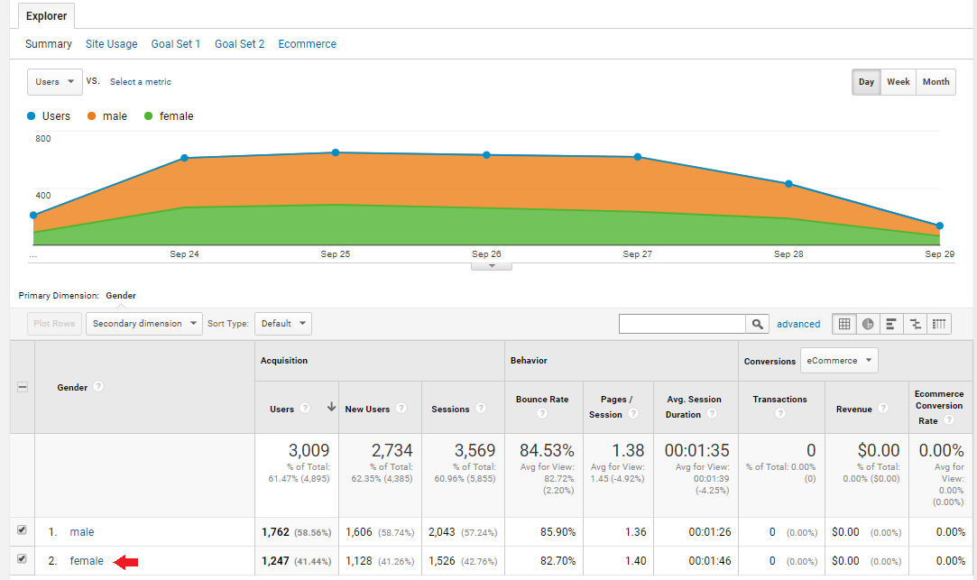
Gender
In the Gender report, you can get further data on the gender of your users. It is very similar to the Age report in the values it displays data for, and can be used in a similar way by clicking “male” or “female” to get a drilled down report on the activity of male and female visitors to your site.
Gender report displaying Users over a given Day
The drilled down Gender report acts as the inverse of the drilled down Age report - giving you data on the age ranges of the chosen gender group. In the example below, we have a graph about female visitors grouped into the given age ranges.
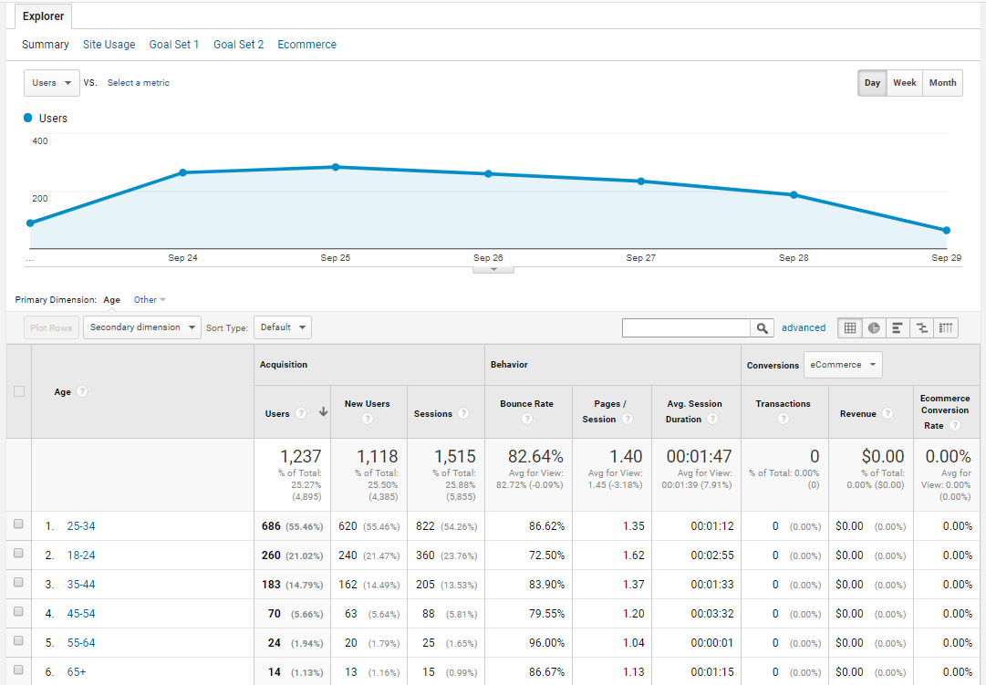
Age report drilled down to show data for female visitors
The Demographics reports can be used to understand what types of content and advertising will be most effective to reach your audience. By segmenting your audience into different gender groups and age ranges, you can learn what sort of advertising to tailor to groups you want to reach more, or which groups you are already targeting well. For example, if your report shows a high number of females aged 25-34 with a high percentage of sessions and a low bounce rate, then you might want to try Instagram ads which have been demonstrated to reach that demographic.
Interests Subsection
The Interests subsection is a highly useful group of reports that provide you with insights into what your visitors are interested in and search for online. This subsection of reports uses data from Gmail, Youtube, browser searches, and others to make a highly educated guess as to the major interests of your visitors. Interests is divided into four different reports: Overview, Affinity Categories, In-Market Segments, and Other Categories.
Overview
In the Overview report, you can get an idea of the interests of all of the visitors to your website. It displays several bar graphs showing the percentage of visitors associated with a specific interest. You can use this report to easily get a basic idea of what interests the visitors to your website. Affinity Category refers to broad categories of interest, such as “Technology”, In-Market Segment refers to visitors looking to purchase in their interest, and Other Categories refers to more specific rather than general interests, such as “Tablets & Ultraportable Devices”.
You can easily sort this report by a variety of metrics using the drop-down menu, and clicking the link on top of the bar graph will take you to the more detailed Interests reports.
Overview Interests report
You can also drill down these categories to get demographic information for age and gender of the given segment. For example, if you click on “Shoppers/Value Shoppers”, you can drill down to the age ranges and gender split of all users who have displayed interest in that category.
Affinity Categories
Affinity Categories refers to the general interests of the visitors to your website. These are large areas of interest that cover a wide variety of more specific interests indicated by your visitors. These interests can include “Health & Fitness”, “Travel”, “Movie Lovers” and other general categories. This report is useful for getting an idea of the categories that interest the viewers to your website and under which interest you may be able to target your desired visitors.
.png?width=1087&name=pasted%20image%200%20(8).png) Affinity Categories report displaying Users
Affinity Categories report displaying Users
This report, like others in the Interests subsection, displays a line graph of users over a set Day, Week, or Month in the Date Range above a table of more specific data for different Affinity Categories. You can easily sort the data by a variety of metrics using the drop-down menu in the top left.
The table at the bottom of the page displays a ranking of different Affinity Categories for various metrics. You can sort this table by clicking on the metric that most interests you. The metrics displayed in this table are Users, New Users, Sessions, Bounce Rate, Pages/Session, Avg. Session Duration, Transactions, Revenue, and E-commerce Conversion Rate. The table displays the raw number of users and the number as a percentage of total users.
In-Market Segments
This report shows the interests associated with your visitors that they have been categorized as actively interest in purchasing. This is a critical report for anyone looking at managing their conversion numbers and understanding the segment of their visitors that are ready to convert.
.png?width=1007&name=pasted%20image%200%20(9).png) In-Market Segments report displaying Users
In-Market Segments report displaying Users
This report, like others in the Interests subsection, displays a line graph of users over a set Day, Week, or Month in the Date Range above a table of more specific data for different In-Market Segments. You can easily sort the data by a variety of metrics using the drop-down menu in the top left.
The table at the bottom of the page displays a ranking of different In-Market Segments for various metrics. You can sort this table by clicking on the metric that most interests you. The metrics displayed in this table are Users, New Users, Sessions, Bounce Rate, Pages/Session, Avg. Session Duration, Transactions, Revenue, and E-commerce Conversion Rate. The table displays the raw number of users and the number as a percentage of total users. In addition, you can sort the kind of conversions made by these visitors by your e-commerce data or different Goals set by you, which can help you determine what the interests are of visitors actively converting on your site.
Other Categories
This report shows you highly specific data about the interests of your visitors. While the Affinity Categories report shows you general interests, and In-Market Segments shows you specifically purchase-related interests, this report gives you data about the narrower, more specific interests of your visitors. This report can be very useful in determining exactly what separates your visitors from the general population.
.png?width=945&name=pasted%20image%200%20(10).png)
Other Categories report displaying Users
This report, like others in the Interests subsection, displays a line graph of users over a set Day, Week, or Month in the Date Range above a table of more specific data for different Categories. You can easily sort the data by a variety of metrics using the drop-down menu in the top left.
The table at the bottom of the page displays a ranking of different Categories for various metrics. Other Categories as defined by GA can include, for example, “Dictionaries & Encyclopedias”, “Celebrities & Entertainment News”, “Productivity Software/Spreadsheet Software” and other highly specific categories. You can sort this table by clicking on the metric that most interests you. The metrics displayed in this table are Users, New Users, Sessions, Bounce Rate, Pages/Session, Avg. Session Duration, Transactions, Revenue, and E-commerce Conversion Rate. The table displays the raw number of users and the number as a percentage of total users.
The Interests Subsection generates four reports that can help you understand what interests the visitors that are already coming to your website and what interests might help you target your desired audience. If a new interest appears in a report, you can look into where you are targeting advertising that is bringing those visitors to your site and increase that segment of advertising. If you are missing what you believe to be a critical interest- for example, you want to target an In-Market Segment of tablets, but few visitors appear with that interest- you can change tactics to better target that segment.
Geo Subsection
The Geo subsection is a duo of reports that provide you with essential information that is critical to your campaign. The Language report shows you data on the different languages spoken by your visitors, while Location shows you where your visitors reside or are accessing your site.
Language
Language Report displaying Avg. Session Duration
The Language report displays a line graph of users over time for different variables chosen in the drop-down menu, as with other reports, and a larger table of the most utilized languages by your visitors. You can sort this table by Users, New Users, Sessions, Bounce Rate, Pages/Session, Avg. Session Duration, Transactions, Revenue, and Ecommerce Conversion Rate.
This report is extremely useful for determining possible expansion opportunities or necessities for your marketing campaigns. If significant Spanish-speaking users are accessing your site, you may want to pursue creating a version of your site in Spanish. If a large percentage of your visitors use Australian English, you may want to ensure that your e-commerce pages are capable of displaying Australian currency and conversions - or maybe you now need to expand your shipping options to Australia.
Location
.png?width=881&name=pasted%20image%200%20(12).png)
Location Report Map Overlay displaying Users in USA
The Location report can display the line graph and comparative table of other reports-- showing your users from different locations across several metrics. The Location report, however, also displays a convenient Map Overlay function, helping you easily visualize the area from which higher and lower concentrations of visitors are accessing your site. You can easily click on an area of this map to drill down from world map to country, to state or region, to city. The table below the Map Overlay will adjust to show the relevant data from the displayed area.
Much like the Language report, the Location report can be used to more accurately target campaigns or advertisements by understanding where the majority of your visitors, high-LTV consumers, and conversions are taking place. If California is bringing in a large number of visitors, you may want to look into inbound content that you can target to Californians. If you are looking to expand further in India, you may want to see where in India people are already accessing your site and target ads to people in those regions.
The Geo subsection helps you to determine how better to target your efforts, what changes might need to be made to your site to improve accessibility, and whether your efforts are reaching the clientele you expect - or whether more expensive efforts in brand-new or little-tested regions can help you expand your reach and help to further your goals.
Behavior Subsection
The Behavior subsection is divided into four reports that give you wide-ranging data on the behavior of your visitors. User-ID Coverage is only functional if you have enabled the User-ID feature in GA, and we will not cover it in this primer.
New vs. Returning
The New vs. Returning report displays a line graph and a table comparing metrics for visitors that are brand-new to your site and visitors who are returning. It displays a line graph of users over time for different variables chosen in the drop-down menu, as with other reports, and a larger table of different values for New and Returning visitors. You can sort this table by Users, New Users, Sessions, Bounce Rate, Pages/Session, Avg. Session Duration, Transactions, Revenue, and E-commerce Conversion Rate, and it will display New and Returning visitors as a raw number, and as a percentage of the total visitors.
.png?width=1007&name=pasted%20image%200%20(13).png)
New vs. Returning report
This report can be helpful in determining engagement with your content or the success of a campaign to retain visitors. By comparing the number of new visitors with returning visitors for a given Date Range, you can determine how successful you are in bringing returning visitors or new visitors to your site, and by comparing other metrics, you can determine problem areas and retool campaigns if they aren’t as successful as you like (or, if you are wildly successful, you can display your success to your client).
Frequency & Recency
The Frequency & Recency report is a simple report that is displayed differently than other Audience reports in GA. There are two ways to read this report-- by Count of Sessions, or by Days Since Last Session. Both display a simple bar graph showing the number of Sessions and Pageviews for the chosen data set. The bar graph displays the raw total of Pageviews and Sessions, but you can easily hover over the bar to get the number as a percentage of the total.
.png?width=715&name=pasted%20image%200%20(14).png)
Frequency & Recency report displaying Count of Sessions
This report is useful for determining how engaging your site is to both new and returning visitors. By looking at the number of sessions and pageviews, you can determine how often a new visitor comes back to your site, how often they return, and how many visitors return very often. You can also determine what percentage of pageviews come from visitors who return to your website again and again, and what percentage of sessions lead to a high number of pageviews from these loyal visitors.
With this data, you can help to determine how well your content is connecting with your visitors, and by manipulating the Date Range, which content is bringing the most visitors to long or complex sessions with your website or app. This is highly useful in determining what content is high value for your visitors and what topics resonate, helping you plan campaigns and content.
Engagement
The Engagement report provides data similar to the Frequency & Recency report, with a higher level of specificity. This report displays a bar graph similar to the Frequency & Recency report, instead arranged either by Session Duration or Page Depth. This data helps you further determine what content hooks your visitors and gets them to spend significant time on your site.
.png?width=723&name=pasted%20image%200%20(15).png) Engagement Report displaying Session Duration
Engagement Report displaying Session Duration
This report is most useful for understanding the success of different campaigns and what content or style of campaign is most likely to make a visitor convert. By determining what session durations and page depths make up the majority or minority of sessions and pageviews, you can better tailor your content to your audience and improve their journey through your site to conversion.
The Behavior subsection provides you with three reports that help you to create specific, tailored campaigns that best suit the way your visitors are already using your website. It can also help you easily identify problem areas and better tailor your digital marketing strategy.
Technology Subsection
The Technology subsection provides you with information on the technology visitors are using to access your content. It contains two reports: Browser & OS, which gives you an overview of the browsers your visitors are using to access the internet and the specs of the computers they are using, and Network, which details the Internet Service Providers (ISPs) that your visitors are using to connect to the internet.
Browser & OS
This report displays a line graph of Users over a set period of time in the Date Range above a table of more specific data for different Browser & OS categories. You can easily sort the data by a variety of metrics using the drop down menu in the top left. You can segment the data in the table in several ways: by Browser, Operating System, Screen Resolution, Screen Colors, Flash Version, and Java Support. Data will be displayed, as with other reports, for Users, New Users, Sessions, Bounce Rate, Pages/Session, Avg. Session Duration, Transactions, Revenue, and Ecommerce Conversion Rate.
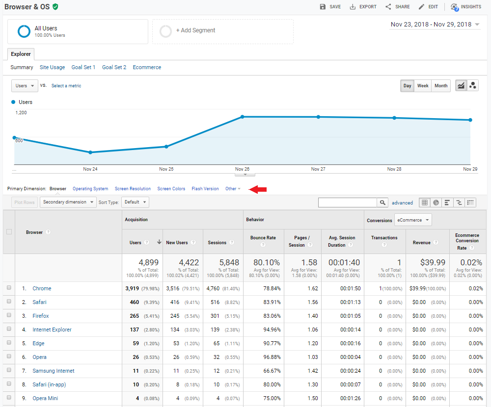
Browser & OS report displaying Browser
Network
The Network report shows which ISPs your visitors use to visit your content. It is not particularly useful to marketers, and we will not cover it in this primer.
In your agency, website designers can use the Technology reports to understand what technology your website must support in order to best serve your audience. For example, the Microsoft Edge browser behaves differently than the Chrome browser (from Google), so if your client has a lot of visitors using Edge, then your website design team needs to be sure to optimize and test with the Edge browser in mind.
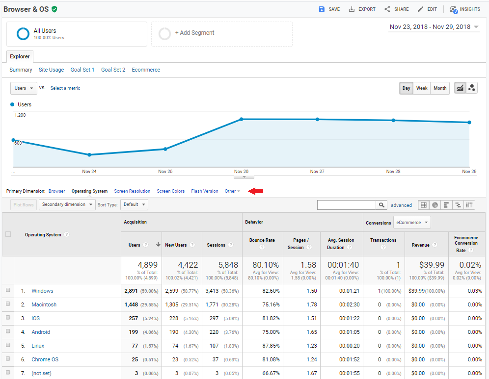
Browser & OS report displaying Operating System
Mobile Subsection
The Mobile subsection provides you with information on the different devices that visitors are using to access your content.
It contains two reports:
- Overview → provides basic information on the kind of devices being used
- Devices → goes into more detail about the make, model, and other device data.
Overview
This report displays a line graph of Users or other chosen metrics over a set period of time in the Date Range above a table of more specific data for different device categories-- showing you which users are utilizing desktop computers, mobile devices, and tablets. Data will be displayed, as with other reports, for Users, New Users, Sessions, Bounce Rate, Pages/Session, Avg. Session Duration, Transactions, Revenue, and Ecommerce Conversion Rate as a raw number and as a percentage of the total number of Users.
 Mobile Overview report displaying Device Category
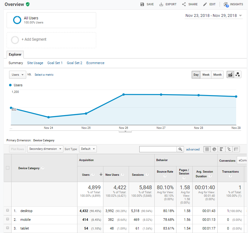
Devices
The Mobile Devices report drills down further into the kinds of devices that your users are utilizing to access your website. This report, like the Overview report, displays a line graph of Users or other chosen metrics over a set period of time in the Date Range. It sits above a table of data showing you the metrics for different brands and models. Data will be displayed, as with other reports, for Users, New Users, Sessions, Bounce Rate, Pages/Session, Avg. Session Duration, Transactions, Revenue, and E-commerce Conversion Rate as a raw number and as a percentage of the total number of Users. You can change the Primary Dimension of the table to sort by Mobile Device Info, Mobile Device Branding, Service Provider, Mobile Input Sector, Operating System, and Screen Resolution.
Mobile Devices report displaying Mobile Device Branding
In the above example, the report is displaying the different brands of the device (Mobile Device Branding) that users are using to access your site, including Apple, Samsung, LG, and Xiaomi.
The Mobile subsection reports can help your marketing team to better understand your persona - are they mobile, “on the go” or desktop “at work” users? By finding more detailed information about their devices, your website team can optimize the site for the device compromising the biggest segment of users, design graphics to be best viewed at the most utilized screen resolution, or ensure functionality for a certain OS. Your marketing team can also use this information when purchasing ad space to prioritize funds for the most-used platforms.
Benchmarking Subsection
The Benchmarking subsection provides you with information on how your website is performing when compared to other websites in a variety of verticals.
It contains three reports:
- Channels → benchmarks your data against other websites for different kinds of traffic
- Location → benchmarks your data against other websites for different locations your visitors are located in
- Devices → benchmarks your data against other websites for different devices your visitors are using.
Channels
The Benchmarking Channels report shows you how your website is doing for a set of metrics when compared to other websites for your industry or another vertical.
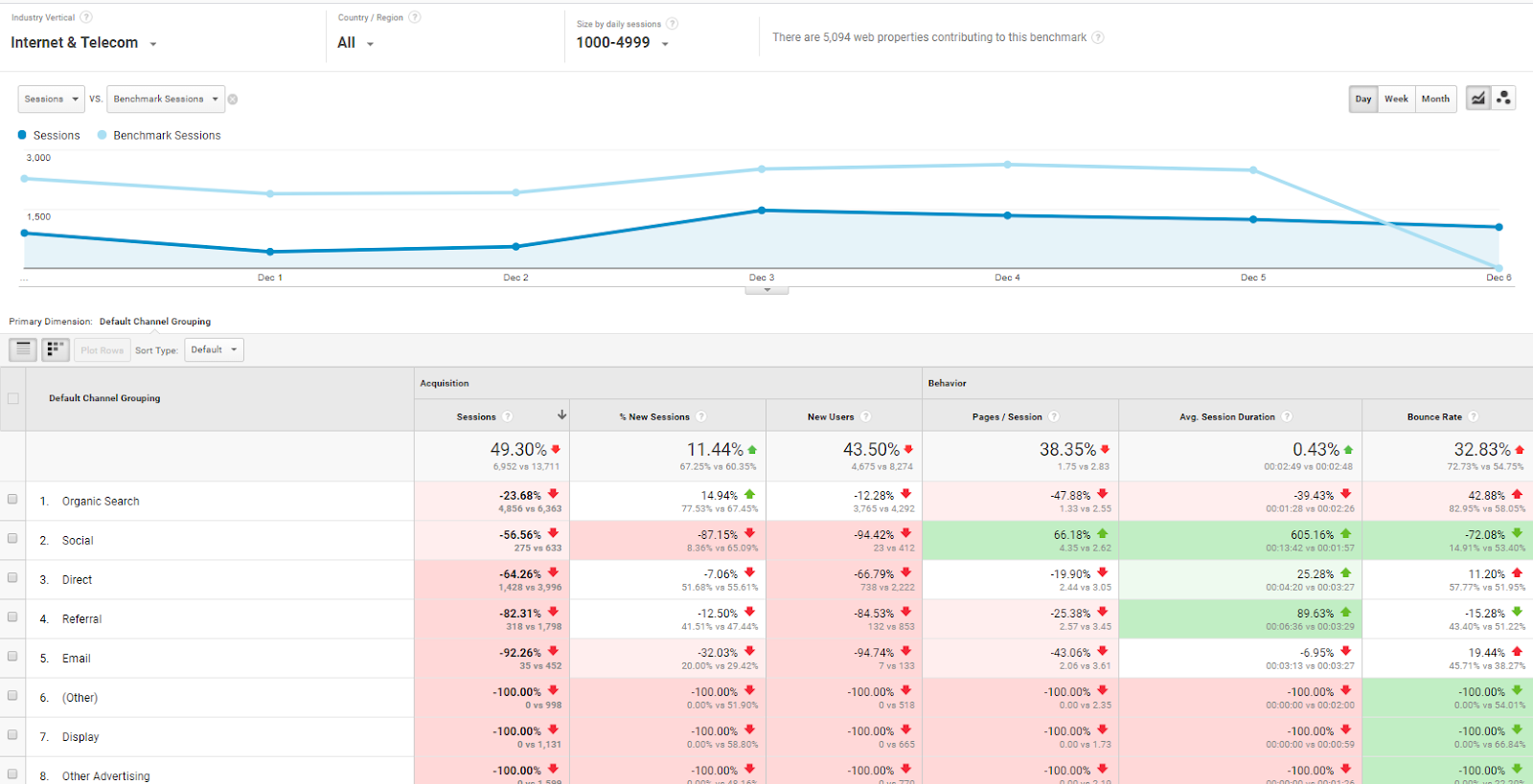
Channels report displaying Internet & Telecom Benchmarks for All regions and 1000-4999 daily sessions
As with other Benchmarking reports, you can filter your Channels against different Industry/Vertical, Country/Region, and Size by Daily Sessions benchmarks. Choose the filters that are right for your business.
The report displays a graph of your chosen metric against a graph of the benchmarked metric (in the above graphic, this is your Sessions against Benchmarked sessions) for comparison purposes. Below the graph is a table displaying your most popular channels from which you receive website traffic compared via six metrics: Sessions, % New Sessions, New Users, Pages/Session, Avg. Session Duration, and Bounce Rate. These metrics are displayed for each channel as a percentage and are colored green if they are higher than the benchmark and red if they are lower for at-a-glance comparison.
Location
The Benchmarking Location report shows you how your website is doing in different countries or regions for a set of metrics when compared to other websites. It utilizes similar metrics and filters to the Channels report but displays data comparing the top countries from which you are receiving visitors to your website.
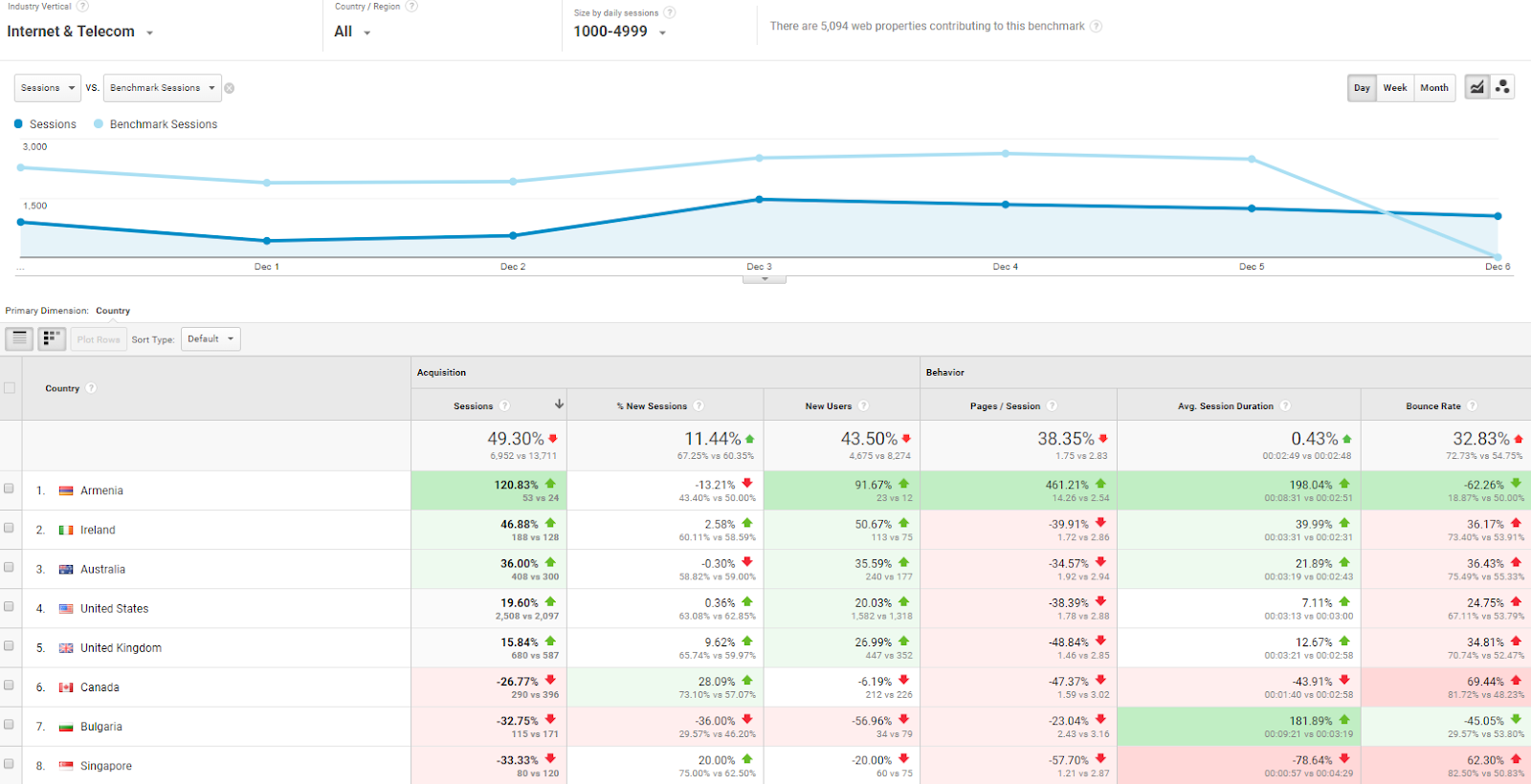
Location Report displaying Internet & Telecom Benchmarks for All regions and 1000-4999 daily sessions
This report helps you determine how your website is performing in specific locations. If your business recently expanded into a new region, it can be useful for determining the performance of your campaign and how your website is doing in comparison to other businesses’ in your industry. You can also use this data to determine languages you may need to translate your website into or browsers your website may need to optimize for (for example, if you have significant South Korean traffic, you may need to optimize for Internet Explorer).
Devices
The Benchmarking Devices report shows you how your website is performing on different devices (desktop, tablet, and mobile) for a set of metrics when compared to other websites, as in the other Benchmarking reports. It utilizes similar metrics and filters to the other Benchmarking reports but displays data comparing the top devices from which you are receiving visitors to your website.
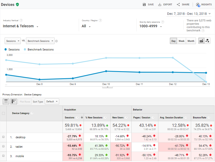
Devices Report displaying Internet & Telecom Benchmarks for All regions and 1000-4999 daily sessions
The Devices Benchmarking report provides you with valuable information as to how your website is doing on different devices compared to other websites in chosen industries. You can use this information to optimize different your website to ensure that it meets industry standards that are expected by your visitors. If much of your traffic comes from mobile users, especially compared to overall mobile traffic from benchmarked sites, optimizing your website for mobile could give your website a boost.
The Benchmarking reports give you valuable comparison data as to how your website is performing in comparison to other websites. They let you know if you are falling behind industry standard or if there’s a market segment in which you are performing well and can focus more on. The Location and Devices reports give you drilled-down benchmarked data by country and device, helping you find out where you’ve fallen behind or where you’re pulling ahead.
Users Flow
The Users Flow report is a unique report in Google Analytics that shows you the paths users take through your site in an easy to read flowchart. It begins in the country of origin and flows through the first page they land on to every subsequent page until they exit your site. Below is an example of the Users Flow report. At the top left of the flowchart is a drop-down menu labeled “Level of Detail” that allows you to increase or decrease the number of interactions displayed in the graph.
Each individual bubble on the flowchart contains further information if it is hovered over with the mouse. The pop-up window that displays will show you the number of total sessions on which this page is the starting (or 1st, etc.) page and the percentage of users who flowed to another page vs. dropped off your website entirely.
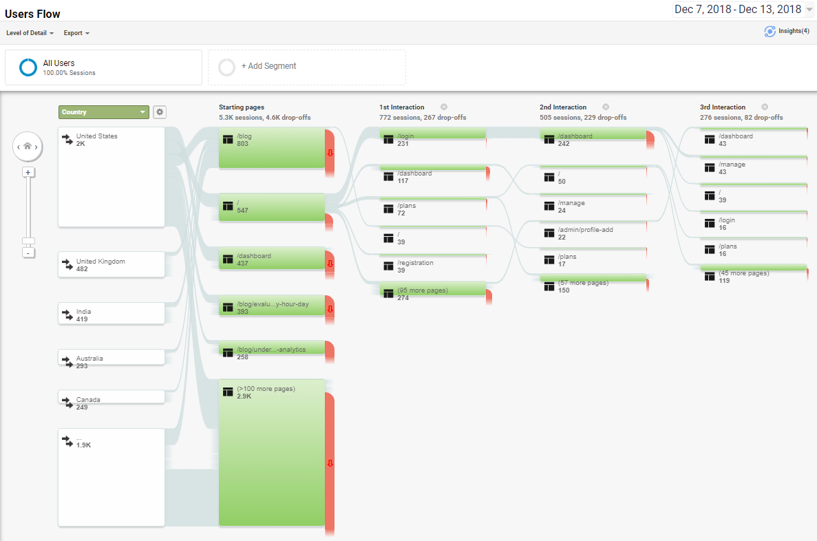
Users Flow report
The Users Flow report is useful to marketers for examining the traffic patterns through your website. This allows you to examine the results of A/B testing-- if A is sending far more traffic to a certain page than B, or causing more dropoffs, you’ll see those results displayed in this report. You can also easily spotlight problem pages that cause significant dropoffs or easily segment your audience.