
Megalytic provides the Double Axis widget to enable you to compare two metrics in a single chart. The name “Double Axis” comes from the fact that the chart will automatically scale the metrics so that they fit together on the same chart and their values are read of two different axes.
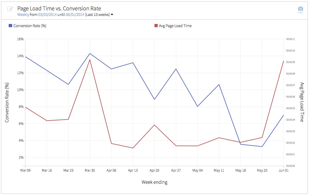
Here is an example that shows how to use this widget to chart Avg. Page Load Time vs. Conversion Rate.
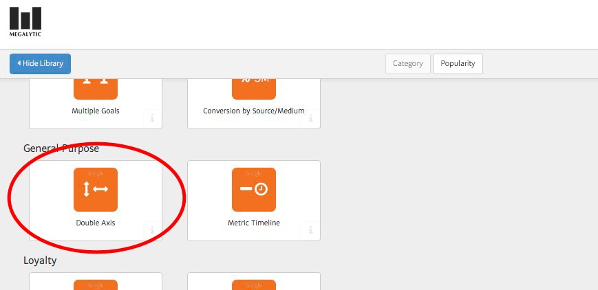
First, select the Double Axis widget from the library. You can find it under the “General Purpose” heading.
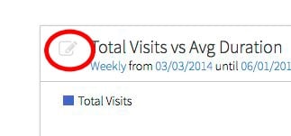
By default, the Double Axis widget graphs Total Visits vs Avg Duration. But you can change that by opening the widget editor (click in the upper left).
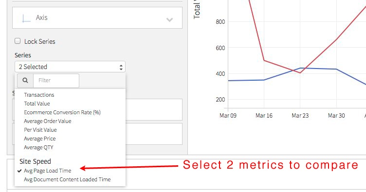
Inside the editor, scroll down to the “Axis” section, and select the metrics you want to compare from the “Series” selector.
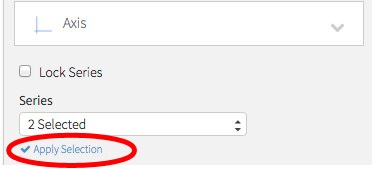
After picking your metrics, you need to click “Apply Selection” to apply them to the chart.
The resulting chart shows the metrics graphed together, with one using the scale on the left axis, and the other using the scale on the right axis.
In this case, you can further adjust the conversion rate by selecting a goal. See: Selecting Goals in Megalytic.