
May 21, 2024
Using Analytics to Plan Content
By Megalytic Staff - June 25, 2014
Whether you’re putting together your next blog editorial calendar, redesigning your site or looking to undergo a “content refresh,” analytics can help you better plan that content and make more informed decisions about where content is needed.
How should analytics be used to plan for content?
Identify Your Best Existing Content
Before you plan for new content, you want to know what’s already working for you. If it’s blog content, what content gets shared and sees the most interaction? If it’s site content, what pages are leading to conversion and generating revenue?
Look under Behavior > Site Content to look at stats by page. First, the All Pages report shows complete data by page and is helpful for viewing overall engagement metrics.
For example, we can see that our post on How to Make a Web Analytics Presentation To The CEO saw a healthy dose of traffic compared to other content on our site, and kept that traffic engaged. This can help us identify the keywords customers are searching for, new pain points to address, show how customers are finding our content and what they’re finding useful.
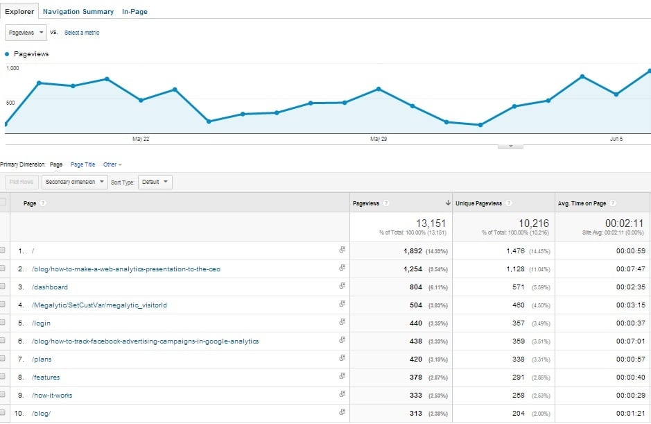
On the All Pages report, you can also see which topics your customers are most interested in reading about. For example, if a post on gluten free recipes receives five minutes on-site, while posts on sinful desserts receives less than 10 seconds, you know what your audience is most after.
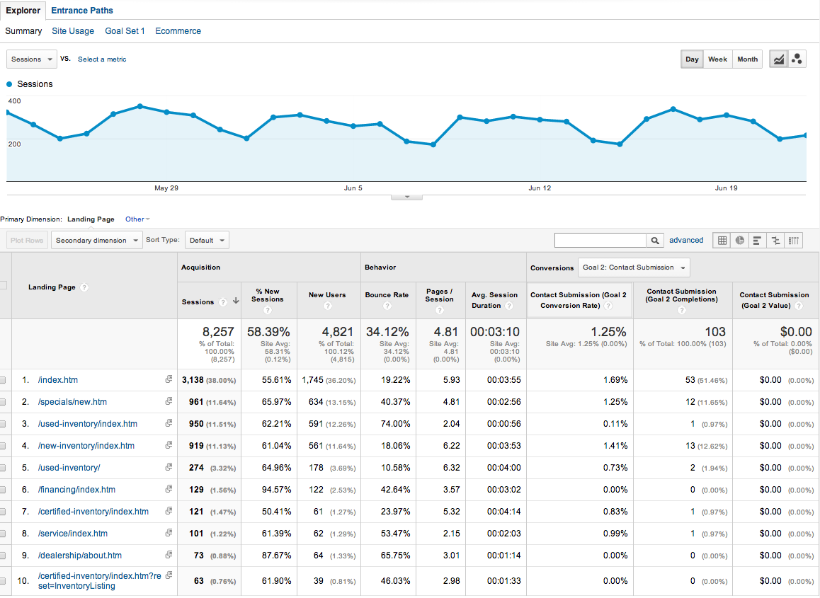
Next, the Landing Pages report shows stats specifically for which page was a person’s first contact with the site. This report will help you identify where customers first land on your website and where your referral traffic is coming for your most popular content.
A high percentage of ‘new visits’ may indicate the post is ranking well in Google and that we’ve hit on a keyword or problem of great relevance to our customers. Or, if you see your top entry pages are content written from six months ago, this is a sign that content is becoming “evergreen content” – content your audience will always find useful and relevant – and that you should be creating similar content pieces.
For example, in the screenshot below we have grabbed a Landing Pages report from a local automotive retailer. Here we can see that more people land on used inventory than new inventory. However, we can also see that a lot fewer form submissions occurred on used vs. new. This may be a signal to improve layout and wording on the used inventory page to improve conversions there.
Identifying your top pages and keywords can also help with content planning or to guide your next sitemap. Even with the “not provided” issue , keyword information found in Webmaster Tools data, AdWords search queries and internal site searches can help you understand what your customers are looking for, where they land most and the level of interaction with the page.
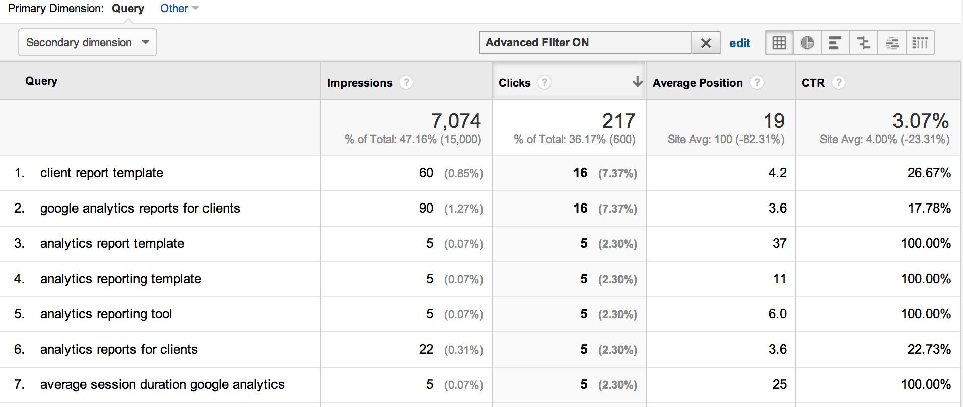
If you link your Google Analytics account with Webmaster Tools and/or Adwords , you can get these keyword reports right inside of analytics.
For example, after linking to Webmaster Tools, to see the keyword data, look under Acquisition > Search Engine Optimization > Queries. Below, you can see that we are getting a high number of clicks for “client report template” and “google analytics reports for clients”.
Identify Your Worst Pages
While you’re on the All Pages report, you can identify pages that have an unusually high bounce rate. Your bounce rate refers to the percentage of users who landed on your site and left quickly, almost as if they were in a hurry to get off your site and onto something more useful. A high bounce rate isn’t always something to worry about. For example, a high bounce rate on a blog post where someone reads the information they came for and exits isn’t something to worry about. However, for other pages on your site, it can be a sign that something is wrong with the content – either in messaging or placement – and that it should be addressed during a content plan.
For example, if you find that people are landing on your contact form and then quickly leaving without filling it out, this could be a sign the form is too long, that it’s confusing or that it’s not presenting a clear enough call to action for why it should be filled out. Based on this, you can decide to dedicate content hours to improving your form and experimenting with different button types, fields or design elements.
See Which Pages Drive Revenue
While traffic is nice, conversion is better. Use the Page Value metric to see which pages convert and drive the most revenue to your business. Google Analytics calculates page value by adding up all revenue from the sessions in which that page was viewed prior to a purchase or goal conversion. The total revenue is then divided by the number of sessions involved. To use this feature, you must have already set up ecommerce tracking and/or assigned values to conversion goals in the site. Google provides more information here .
When using this metric, look for pages that get a low volume of traffic, but a high Page Value. This is a sign the page is valuable, but may not be getting the attention the page deserves. These would be good pages to promote via social media, email campaigns or through additional search engine optimization efforts.
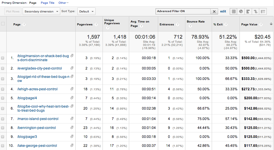
To find this information:
- Go to Site Content > All Pages.
- Click the Page Value column to sort the landing pages according to Page Value, highest to lowest.
- To just look at the pages with low pageviews, click advanced next to the filter box at the top of the table.
- In the filter dialog, specify Exclude Pageviews Greater Than ___. Click Apply to activate the filter.
In the example below, you can see two blog posts with just three Page Views each have a combined value of more than $800.00. That is powerful information when determining the content our audience is interested in and what drives conversion.
Who Refers Your Most Engaged Readers (Where Should Content Be Targeted?)
The Referrals report can help you identify your most engaged readers by tying what they did to where they came from. This report may tell you that though you receive a lot of traffic from Reddit, the traffic is less engaged than the traffic you receive from LinkedIn. Or, you may find the traffic you receive from a certain industry blog is more engaged and converts at a very high rate. This is a sign you may want to establish a relationship with this blog as their audience probably aligns well with yours.
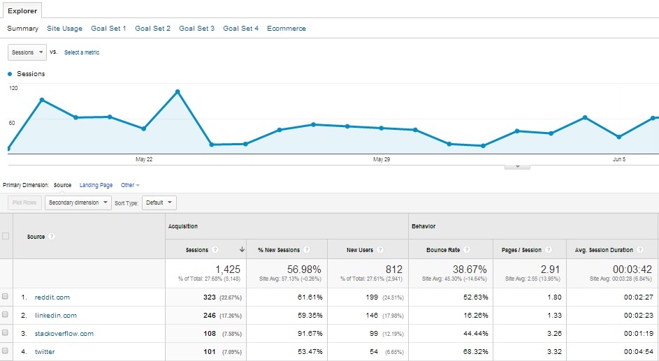
Based on this information, you can understand who you should be crafting content toward, where you should be promoting and which communities you’ll want to build relationships with to increase awareness.
Traffic By Technology
As important as what your customers are reading is how they’re accessing that content. Use analytics to create a customer segment based on technology to examine site usability and compare values of customers across devices and platforms. Are customers accessing your site via mobile? Which devices are most commonly used?
Identifying what devices and browsers people use to access your site can help in making sure your site is accessible to everyone in your audience. Make sure you test your site as your users are viewing it to ensure no technical issues are detracting from their experience in tablets and mobile devices. For example, if a lot of people are visiting from the latest Galaxy phone, is text being cut off in the browser on that particular screen size? The best content in the world won’t provide much value if people have a subpar experience trying to read it.
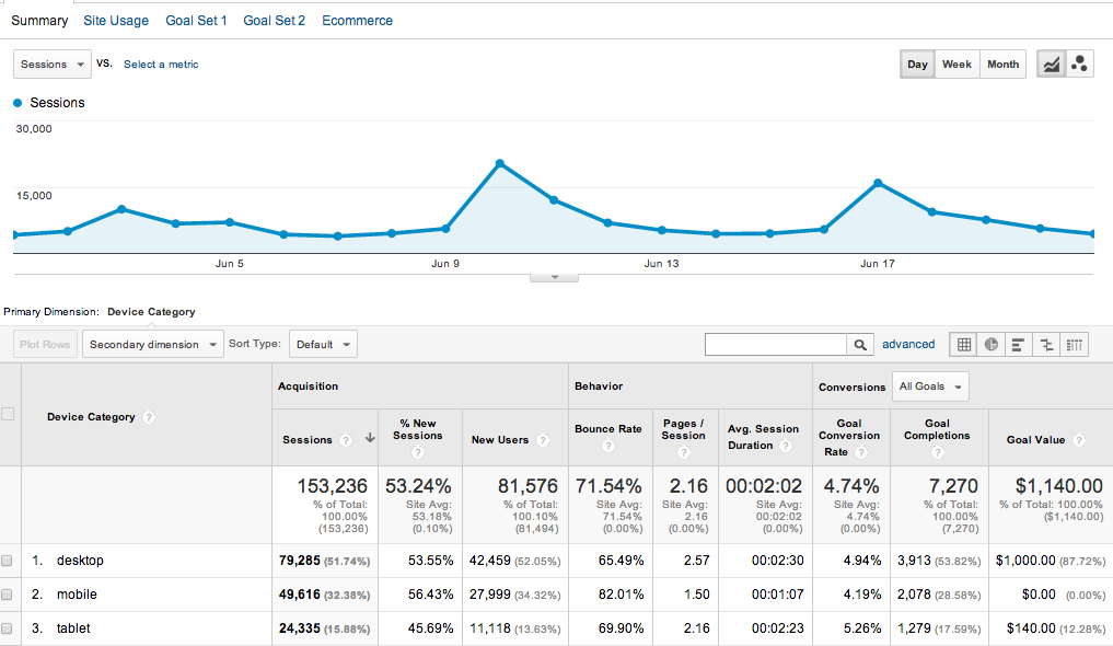
Also, look at how people are engaging with your content from various devices. Abnormally high bounce rates from phones may indicate a need to test interface changes or a fresh call to action in order to get people to go further into your site after landing on a content piece. For example, in the screenshot above, we see mobile users engage considerably less than desktop and tablet viewers. This is a great indicator we need to do a better job optimizing our site for the mobile experience.
Conclusion
Thanks to the content marketing revolution, we’re all talking about content a lot more. We’re talking about creating blog posts and whitepapers, but we’re also looking at the content on our website to understand whether it’s solving customers’ needs and what additional content should be created. Thankfully, by tapping into our analytics and using it to understand not only what has happened but to also inform future decisions, we can create better content that satisfies our customers and generates revenue.