
May 21, 2024
Understanding the Treemaps Report in Google Analytics
By Megalytic Staff - January 28, 2016
Understanding the Treemaps Report
First, if you’re unfamiliar, the term treemapping refers to a method of displaying hierarchical data by using nested rectangles. Treemaps let you visually identify trends and trouble spots across your account with speed and insight that is hard to get when looking at numbers alone.
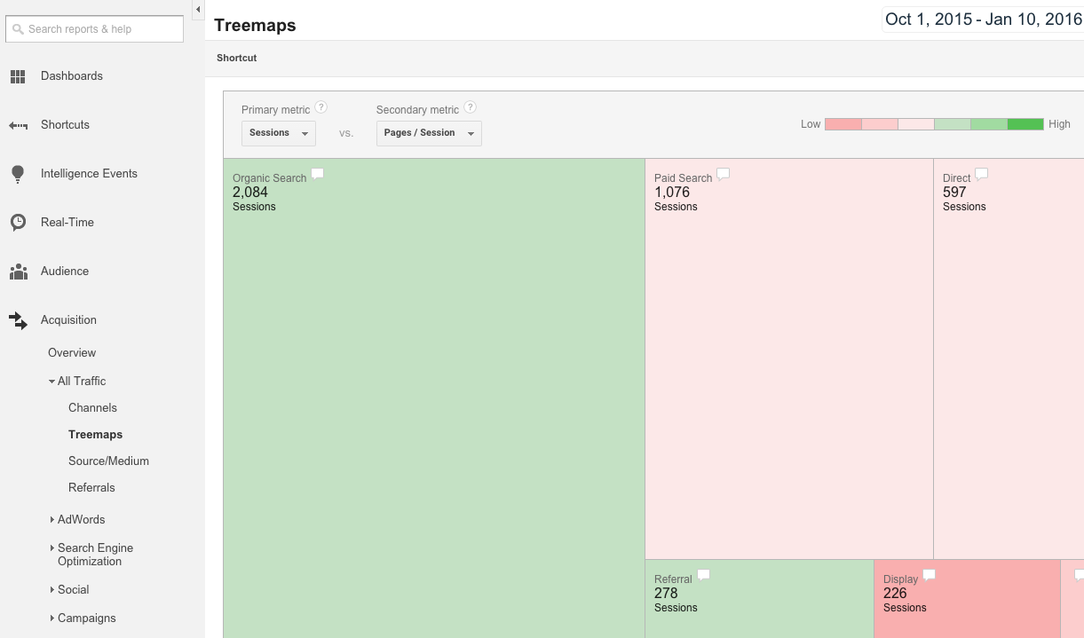
To get to the main Treemaps report in Google Analytics, go to Acquisition > All Traffic > Treemaps. When you first look at the report, you’ll see a colorful chart breaking down Sessions by channel.
To read this report, note the “Primary metric” and “Secondary metric” dropdowns at the top.
The primary metric relates to volume of activity on the site (e.g., number of Sessions) and is represented by the size of the rectangle for each. Choices for primary metrics include the following:
- Goal Completions
- Goal Value
- New Users
- Sessions
The secondary metric relates to the quality of visits on the site and is represented by the color of each rectangle. The darker the green, the more positive the metric; the more red the rectangle, the more negative the metric. Choices for secondary metrics include the following:
Filtering by Channel
The Treemaps report doesn’t allow you to apply Segments, so what if you want to see data specifically for paid search? Thankfully, you can still easily drill down to data by channel.
Search
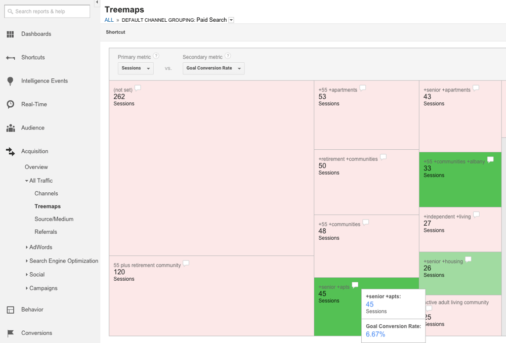
Within the chart, you can click the rectangle for any channel to see a further breakdown of data. For instance, upon clicking “Paid Search,” you’ll now see a chart showing the top keywords from PPC campaigns.

We’ve changed the secondary metric to Goal Conversion Rate, so we can see which keywords were most likely to drive lead submissions on this retirement community’s site. As we analyze the data, we see that the highest volume keywords don’t always drive the most qualified traffic. While 55 plus retirement community drove 120 Sessions, it contributed to no conversions and therefore is red in the chart.
However, +senior +apts drove only 45 Sessions yet shows green for driving conversions. Upon mousing over this keyword’s speech bubble, we see a 6.67% conversion rate. We can note this keyword is likely to drive conversions despite having fewer clicks than others above it. To see more data related specifically to AdWords performance, use the AdWords Treemaps report, which we’ll cover later in this article.
In addition to paid search, you can see keywords for organic search by clicking through to that channel. However, note that the majority of organic keywords appear as (not provided) , so you’ll get limited data.
Referrals
To break down performance by referring website, go to the Referrals channel from within the main Treemaps chart. You’ll then see a breakdown of the domains that drove traffic to your site.
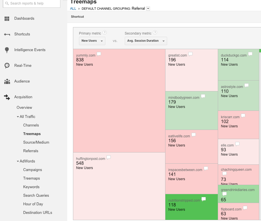
In this example, we’ve chosen to look at New Users as the primary metric, allowing us to see data for unique individuals who are coming to the site for the first time. In addition, we’ve selected Average Session Duration as the secondary metric to measure engagement by how much time these users spent on the site.
As with keywords, we see that the highest volume site referral isn’t the one that necessarily drives the highest quality traffic. Yummly.com shows, by far, the most New Users, however, the box is red, indicating a lower average time on site. Conversely, sites like mindbodygreen.com and nutritionstripped.com show lower volume but are green in the chart, indicating visitors who enter from these referrers spend a higher average time on site.
You can click on any of these domains to drill further and uncover the actual URLs driving traffic to your site. For instance, if your site was mentioned in multiple articles on the Huffington Post, clicking on the URL will allow you to see which articles were most likely to get qualified visitors to your site by uncovering the specific page.
Social
Selecting the Social channel will break down traffic by social networks. The screenshot below shows Facebook, by far, drives the majority of New Users.
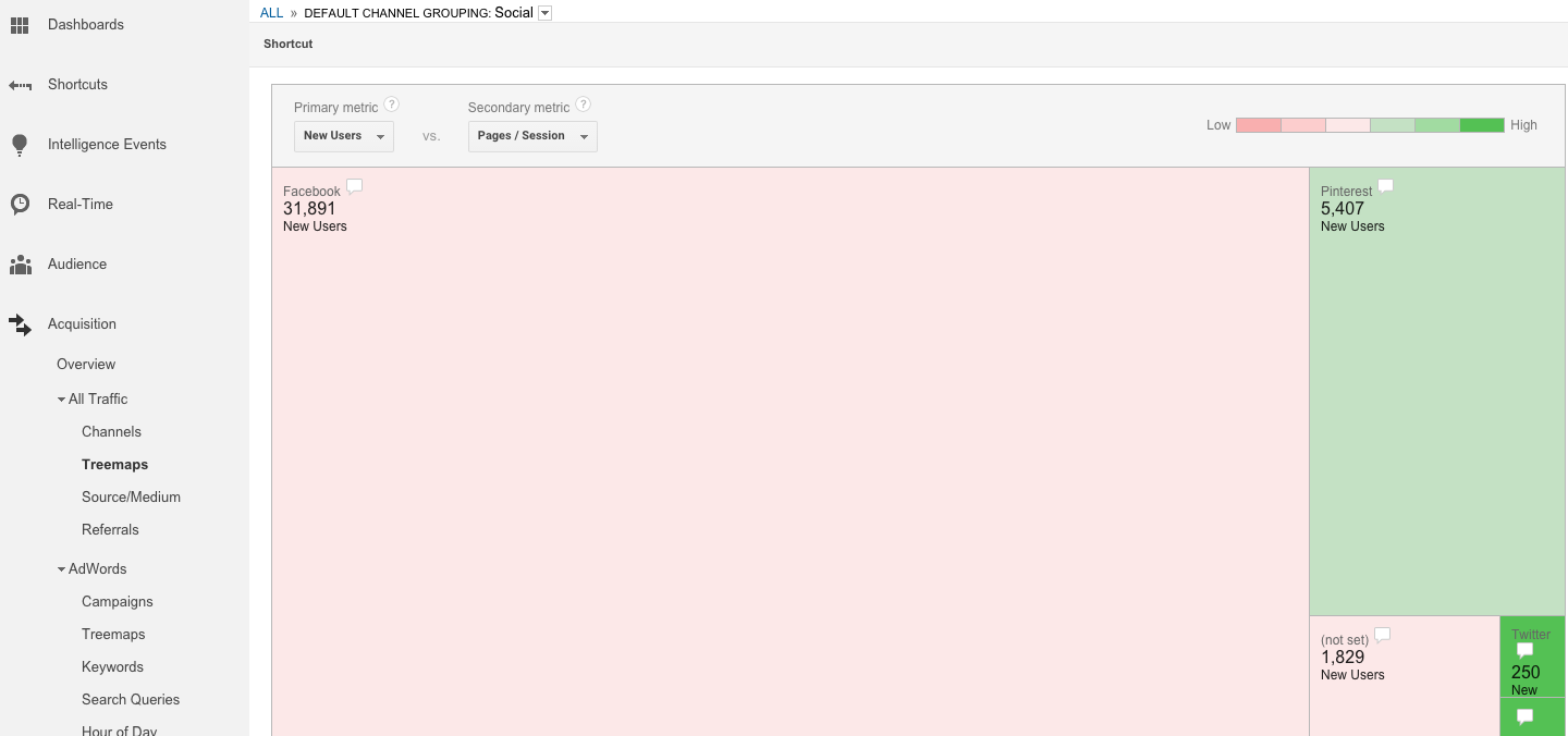
However, we don’t want to look at traffic alone. The data shows that Pinterest and Twitter, while lower volume, drive more engaged traffic based on Pages/Session. In fact, Twitter, with relatively few visitors, shows as a dark green, indicating a higher average Pages/Session than the other networks in the chart. Based on this data, this brand would do well to share the site more on Twitter, as well as increasing efforts on Pinterest.
AdWords Treemaps Report
Marketers actively running ad campaigns (and who have linked their AdWords account to Analytics ) will be interested in a Treemaps report specific to AdWords. This will allow you to further break down performance by campaigns, ad groups, and keywords within select ad groups.
When you first look at the report, you’ll see your top campaigns represented on the chart. This report provides a few more metric options than the All Traffic Treemaps report, integrating AdWords-specific metrics.
Primary metrics include the following:
- Clicks
- cost
- Impressions
- Goal Completions
- Goal Value
- New Users
- Sessions
Secondary metrics include the following:
- CPC (cost per click)
- CTR (clickthrough rate)
- % New Sessions
- Avg. Session Duration
- Bounce Rate
- Pages/Session
- Goal Conversion Rate
In the example below, we see campaigns with a primary metric of Sessions and a secondary metric of Goal Conversion Rate. We can note that two campaigns labeled for NY Capital Region show as green, indicating a higher likelihood of conversion in this region.
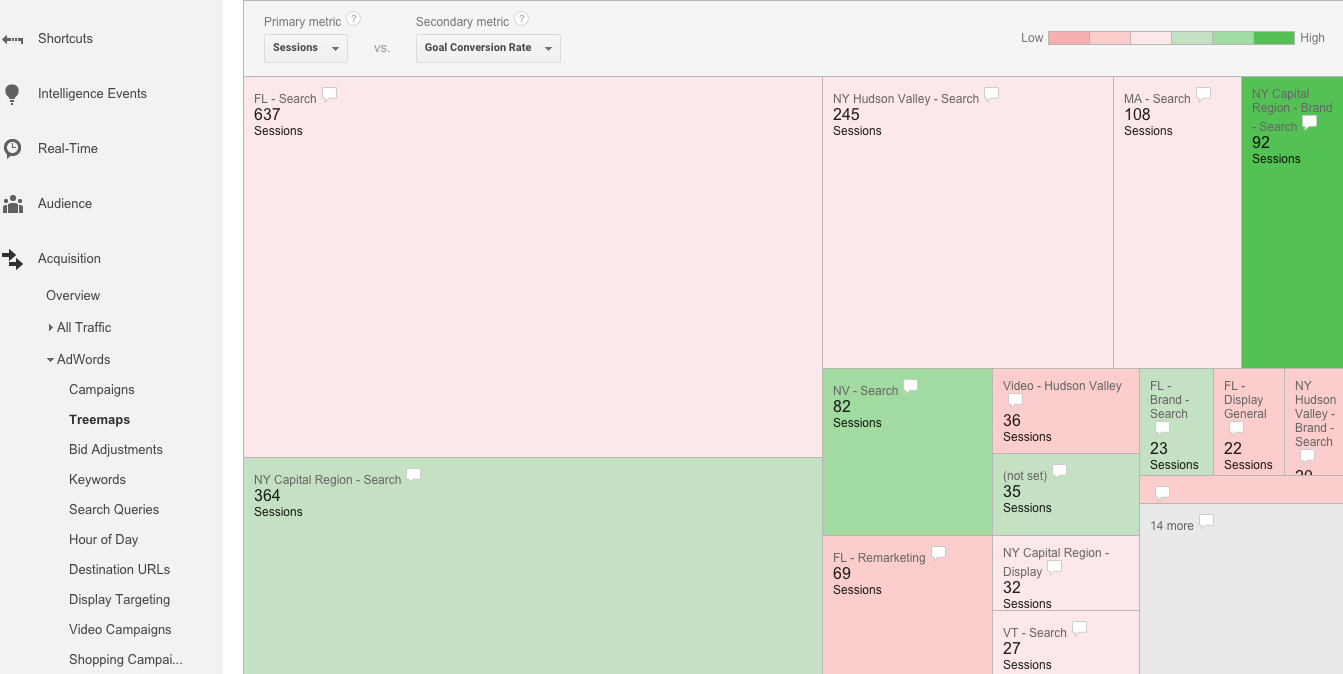
We can also see that the highest volume campaign, FL - Search, shows a lower conversion rate. Based on this data, we may want to go back to that campaign and look for opportunities to improve conversion by testing new ads or focusing on different keywords.
If you click a campaign in this report, you’ll see the chart update to show ad groups from that campaign. Here, we’ve updated the secondary metric to reflect CPC for each ad group. In this example, for a pest control company, we can compare which categories of pests tend to have more expensive keywords.
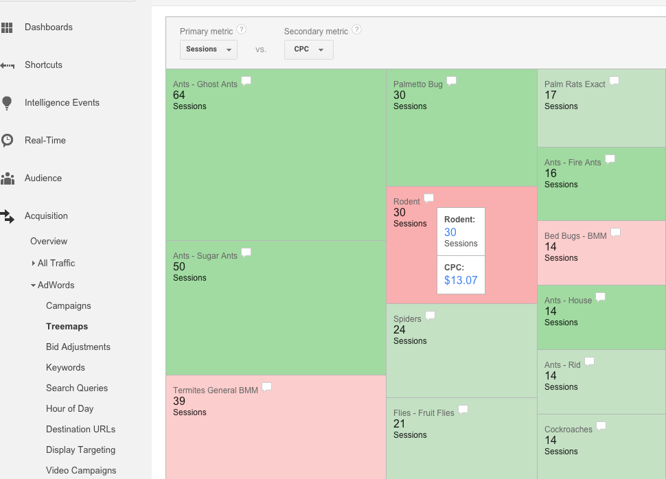
Based on color, we can see the dark red on the Rodents ad group indicating that those keywords are the priciest, while various categories of ants appear to be the cheapest. Mousing over the speech bubbles will show us the CPCs for each. Based on this data, we can quickly identify higher volume but expensive ad groups to dive into, looking for opportunities to bring costs down.
Conclusion
The Treemaps report offers you a way to quickly call out high performers and low performers across marketing channels. If you haven’t spent time in this report, take the time to evaluate the data here and look at your web traffic in a new way. You just may find new opportunities to improve your social, organic, and paid presence on the web.