May 21, 2024
Tips and Advice for Landing Pages
By Megalytic Staff - February 15, 2018
Basic Principles of Landing Page Design
1) Keep the layout simple and purpose driven . A landing page should be designed with a purpose; a driving focus on a clear and meaningful outcome. That outcome, or conversion, is a specific behavior that you want the page visitors to engage in. These behaviors can range from form fills or downloads to newsletter subscriptions or even phone calls.
Anything that detracts attention from that specific action is typically best removed. There are some “more is more” tendencies in marketing but when it comes to landing pages, the opposite is true – less is more. This means that standard web page elements, like navigational menus, can be omitted and marketers should avoid the impulse to cram every last bell and whistle into their offers. Keep your audience focused, engaged and on-task by removing anything that is not pertinent to the specific desired outcome.
2) Use white space, small text blocks and bullets. Here’s a basic test for a landing page: take someone unfamiliar with the page, have them look at it for 5 to 10 seconds, tops, and then ask them what the desired outcome or user behavior is. If they can’t tell you, it might not be because the CTA is missing. It might just be hidden or buried in a cluttered design.
Studies have researched the way that people read online. We most often skim text, search for headlines and section headings and seek out navigational cues for determining “what’s next?” Landing pages with long, un-interrupted blocks of text are not going be to read. Overly flashy templates with competing calls to action or distracting design elements will most likely convert at lower rates. Generous use of white space and breaking up blocks of text into smaller sections or bulleted lists are good layout strategies.
3) Keep your ad copy, landing page headlines and CTAs consistent. You’d be surprised how often even veteran marketers break this principle. Whether it’s a calculated bait and switch or just an unintentional incongruence, this mistake can cost you money and conversions. Make sure your landing page headlines and Calls to Action (CTAs) align with whatever you are promising or promoting.
Potential leads will become frustrated by a “promise” for a promotion or trial that turns out to be loaded with terms, conditions, and exceptions. They will be equally frustrated by page content that doesn’t match the expectations set by the original ad copy. High relevance is also cost-effective. AdWords Pay-Per-Click (PPC) calculates Quality Scores based in part on the landing page and ad congruency. Poor Quality Scores, over time, mean higher Costs per Click.
4) Ask only for what you need on forms. This best practice is also often forgotten in the pursuit of valuable lead data. Forms with extraneous fields in them, however, may often lead to the exact opposite outcome: no lead data. Research has indicated that form fill rates inversely correlate to the number of fields within the forms. This means if your landing page has 4 fields instead of 3 you should have a clear reason, which aligns with a specific marketing and business objective, for why you need the additional field. If you don’t have a reason you can easily articulate, look to shorten the form.
5) Include Calls to Action beyond “Submit”. Have you ever met a prospective customer who was really excited to “submit?” Most likely not. Prospective customers have a wide range of needs and desires, but submission is not one of them. However, this clunky and generally meaningless verb is still used in CTAs every day. Even basic CTAs like “Sign Up” or “Get Started” are going to be clearer and more compelling than a “Submit” button.
But if you want to really engage with, and motivate, your audience, look toward an old school copywriter’s playbook and use compelling power verbs: Save, Learn, Enjoy, Reduce, Join, Increase, etc. All of these verbs now tie the simple act of button clicking (Submit) to the specific value propositions laid out on the landing page (Reduce your Costs, Join a Growing Community, etc). If you want to take your CTA copywriting a step further, consider A/B testing your verbs to see which ones motivate your audience segments the most!
Mastering Your Audiences
1) Consider multiple landing pages for different audience segments. Marketers will often spend countless hours conducting customer research and audience segmentation. but too many of them still spool up a single landing page for an offer or campaign. But let’s be honest. Does a 20-year-old single urbanite sign up for online banking the same way, or for the same reasons, a 50-year-old suburban parent does? Probably not.
Even when the product or offer are fundamentally similar, if there are different audience segments for it, then the landing page experiences should be tailored to those segments. If you are targeting adults over 50, are your font, color and contrast choices mindful of vision impairments? Have you effectively identified how the “pain points” of a 50-year-old differ from those of a 20-year-old? The best choices for visual design, values/benefits expressed in the landing page copy, and the particular verb(s) used to motivate action in the CTA can all vary by audience.
2) Speak in terms of value or benefits, not features. A marketer may try to sell non-corrosive, adamantium-alloy tipped, variable speed drill bits, when all the customer wants is a half inch hole in the wall. This is the fundamental gap between how businesses and customers think and communicate. Bridging this gap is one of the fundamental missions for marketers.
Businesses are built on products and services and stakeholders come to be quite proud of them. From inside a business we tend to think in terms of features: we have X, Y and Z, which no competitor can match. Yay! But unless those features immediately translate to the benefits or value of using the product, a features list is not as compelling from a customer standpoint. Always look to swap out jargon-filled feature talk (non-corrosive, alloy tipped) with more value-talk (bits last longer, no maintenance needed, 20-year product guarantee.)
3) Use statements, badges and symbols to communicate privacy and compliance assurance. This matters most when it comes to asking for particularly sensitive and/or private information. Even if you’re only asking for an email, a name, an address or phone number, security matters. Customers are quite sensitive these days to the never-ending news of corporate data breaches and unauthorized uses of their private information.
To instill peace of mind in wary customers, be sure to include elements of assurance. This might include a small Privacy Statement on intended information usage. It can also involve “trust” badges tied to compliance or 3rd party verification – McAfee, Norton, BBB, TrustE, etc. And of course, any industry specific certifications or compliance levels that are important.
4) Include testimonials or social proof of value. Beyond safety and privacy concerns, users have other proof needs, particularly social proof. This is why word-of-mouth and testimonials are a pillar of marketing that will never go away, even as the mediums and technologies change. Just one or two testimonials from happy customers can go a long way toward improving conversion rates. But if you are using audience segmentation within your landing pages, take the testimonials up a notch by including audience-specific testimonials. Again, a 50-year-old parent’s decision process may be more effectively influenced by someone within their own demographic.
5) Include some contact information. Including contact information on a landing page serves at least 2 purposes. First, it conveys a modicum of authenticity for a business. “Real” businesses have phone numbers, or addresses, or emails. “Real” businesses don’t throw up landing pages with promises and forms, without providing other ways to engage with the brand. To pass a basic “sniff-test” from a customer, have at least one other way to contact you beyond the CTA or form.
Contact information can also help extend and widen the engagement. Maybe the landing page doesn’t answer a key concern. Maybe the terms of the offer need clarifying. Maybe someone just prefers to call. A simplified form cannot speak to a prospect or answer their questions. Only people can. Do not be so consumed with form engagement that you do not allow for, or facilitate, other forms of communication. Today, call tracking solutions and dedicated emails all allow for the same level of measurement and reporting that form captures do. So be sure to provide at least one other (measurable) contact method on your landing pages.
Intermediate to Advanced Tactics
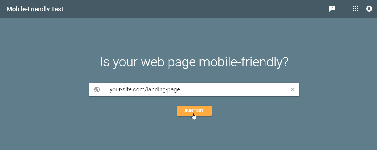
1) Test how they look and flow on mobile. Landing pages emerged long before the mobile web. But even in an age of mobile dominance they are still often designed with bigger monitor screens in mind. From the consumer side, desktop usage peaked quite a few years ago and the mobile share of traffic and ad spend continues growing every year. So it’s important to be sure your landing pages work effectively on mobile devices!
Templates and designs that appear spacious and open in a 3 column layout become suddenly cramped on smaller screen sizes that can only accommodate 1 or 2 columns. Even when properly tiled out, landing pages become “longer” on mobile devices. If you know particular audience segments are more mobile intensive than others, start your landing page designs with a mobile-first focus.
2) Embed video when you can. Remember how we mentioned that visitors skim text? And that mobile devices make blocks of text seem even longer? Well, video offers a different and versatile medium to engage users. Video doesn’t require active reading or extended scrolling, and it can co-exist right alongside great copy.
A well-scripted video can walk a lead through the entire pitch, often in under a minute: demonstrate a problem, identify the solution, emphasize value benefits, highlight testimonials, and provide Calls to Action. You don’t have to reinvent the wheel in terms of video production to have a compelling and conversion friendly piece of content.
3) Offer More than One CTA. For many years, conventional wisdom held that a landing page should have only one CTA: multiple CTAs would only confuse or distract the lead, like multiple salesmen yelling at them at the same time. And you know what? Many landing pages with multiple CTAs were guilty of that.
However, there is a big difference between confusion and choice. The former inhibits conversion by obscuring the next steps and user paths. But the latter simply offers multiple paths to a similar destination. This actually empowers your prospective customers giving them control and agency, creating positive feelings, rather than confusion or frustration.
Don’t emphasize your secondary CTAs the same way you feature your primary CTA, but if you cannot get a lead to download a demo, can you gain a newsletter subscriber? Someone who will sign up for your RSS feed? Micro-conversions allow you to keep the prospect in the funnel and know where they entered. Secondary CTAs like social sharing and review opportunities can also can help facilitate business and marketing goals that do not tie directly and immediately to lead generation.
4) Remarket to page abandoners. Remarketing is a popular strategy for a number of reasons. It’s effective and it’s scalable. When a user has visited a landing page, but didn’t convert, that’s still a valuable interaction. That person becomes part of a new type of audience – those who have already demonstrated some level of interest in your products or services without committing.
Perhaps they abandoned the landing page because of inconvenient timing. Perhaps they are still in a higher funnel research stage. Maybe their kids were screaming. Rather than start the conversion all over, often at higher costs, remarketing allows brands to re-engage these prospects and keep brand visibility and awareness at the top of their minds.
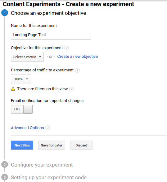
5) Commit to A/B testing and experimenting. By now, you’ve seen there’s some basic principles for landing pages that apply to most of them, but if there’s one takeaway we’d like to leave you with, it’s: ABT (Always Be Testing). For all the creative aspects of marketing, there’s science and empiricism are also necessary. This is even truer for landing pages. The odds that you’ll nail the winning landing page “recipe” for your business and audiences on the first try is infinitesimally small.
Help foster a data-driven culture within your company by experimenting and testing your landing page elements: audiences, design, colors, fonts, copy, calls to action – all of it. Be disciplined in your testing, have a hypothesis, keep your variables to a minimum and accrue statistically significant sample sizes before drawing conclusions. But do not be so confident in even high-performing landing pages that you are not looking for further improvements
Conclusion
Creating effective landing pages is a precise and strategic endeavor. Their overall aesthetic is important, of course, but every choice is a meticulous decision. There should be a rhyme and reason to every aspect included from the number of words on the page to the form fields and all of the other conscientious details we’ve discussed. Consider every individual component, and their cohesion as a collective, and test multiple options. Whether you’re new to landing pages or a seasoned veteran of paid marketing there’s always a new way to be inspired and increase results.


