
May 21, 2024
Reporting Long Term Trends in Digital Marketing Performance
By Megalytic Staff - October 08, 2014

Compare Date Ranges
A simple way to track long term trends is to add date range comparisons to every report you provide your boss or client. Both month-to-month and year-over-year comparisons can help show how metrics have increased or decreased over time, providing context to the most recent numbers.
Many businesses are seasonal. For example, a website selling Halloween decorations or one renting beachfront condos, will expect interest spikes and drops during certain times of the year. A Halloween estore, for example, would likely expect a drop in traffic in November after October’s high. Obviously, November’s stats should be compared with November of last year, not the preceding month. Success might be measured in terms of improved traffic and sales over last year resulting from better marketing of a clearance sale.
Other sites, especially in the B2B niche, will see steady volume throughout the year and will work toward general upward trends from month to month. However, looking at change long term (not just month to month) will show how much growth the business is seeing. For example, a business owner may notice a decrease in leads from the past month, but note leads are still up from six months ago. B2B firms may notice that some months, like August when customers may be on vacation, are just slow. In addition to comparing to the previous year, comparing quarterly stats can smooth out monthly fluctuations and give a better indication of progress.
Google Analytics allows for easy comparison of date ranges for any timeframe. Once you’ve selected an initial date range, use the “compare to” selector to quickly populate a past date range to compare, or manually select the dates.
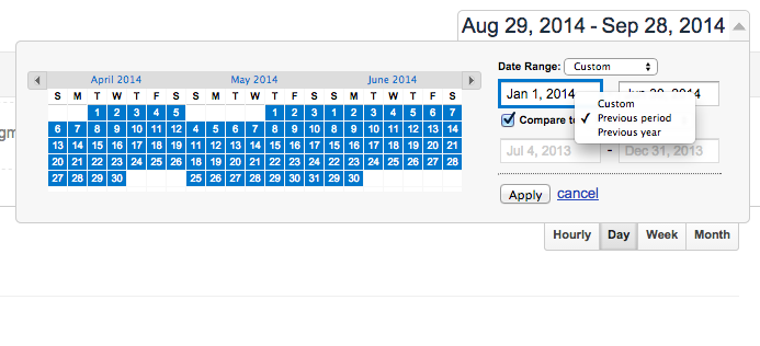
If you’re using Megalytic for reporting, see our instructions for comparing date ranges .
Once you’ve set your date range to look at a longer period of time and compare to previous ranges, what should you look for?
Changes in Metrics
Look for major changes that have occurred in metrics over time. These changes could either indicate success or alert you to problem areas on your site. Let’s take a closer look at a year-over-year comparison from a site.
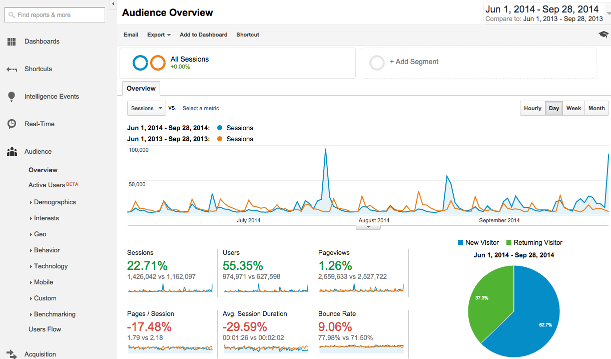
First, we note a significant increase in sessions (+22.71%) and users (+55.35%), with pageviews remaining nearly flat (+1.26%) since last year. This flags that the increase in traffic has come at the expense of engagement on the site. And this fact is born out in the engagement metrics: Pages per session (-17.48%) and average session duration (-29.59%) have dropped while bounce rate (+9.06%) has risen. From this data, we want to dive deeper to determine what sources of traffic contributed to the drop in engagement.
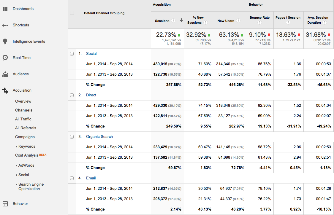
Here, we see the Channels report (Acquisition > Channels), which provides a high-level overview of what online channels drove people to the site. Immediately, we can see the drops in engagement did not occur across the board, as organic search shows minimal change.
However, we note that social media saw significant drops in session duration and pages per session, as well as an increase in bounce rate. Email shows minimal change in bounce rate and pages per session, but does show an 18% decrease in average session duration. This may lead to tweaks made in our social media strategy, either trying different methods of engagement or abandoning networks that don’t convert well.
As a side note, this report shows an exceptionally high volume of Direct traffic, the “bucket” Google Analytics uses for any traffic with no source determined. Likely, much of this traffic is coming from social media and email marketing, so a conversation about campaign tracking should follow to ensure sessions are being attributed to the right sources.
Watch for Spikes
In addition to noting major changes in metrics over time, also note abnormal spikes in sessions (or whatever metric you’ve chosen to show). Going back to the year-over-year example shown, we see a few spikes showing significantly more sessions than usual. Looking closer reveals the client sent out email newsletters to exceptionally large audiences on those days, resulting in heavy traffic to blog articles.
Other reasons for spikes may include product releases, new website launches, press placements, and one-off ad campaigns. Take the time to understand the causes for major increases in traffic to determine what methods of promotion have worked best. Of course, also look at the engagement from traffic on these days, as well as the impact on conversions.
Keeping in mind our goal of looking at longer term trends, let’s look at a month’s range around one of the larger traffic spikes to see the impact specifically on an eguide purchase promoted via this website.
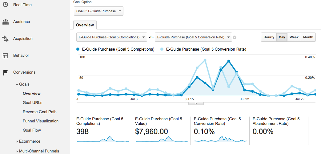
Here, we can see the spike in eguide purchases (dark blue) on July 20, the date the major spike in sessions occurred. However, note that average conversion rate (light blue) actually dipped down from the level of some surrounding days with the volume of extra people on the site on July 20.
As a word of caution, when looking at longer data ranges, watch for periods of time when data may not have tracked properly. For example, the analytics code may have dropped out of the site during an update, with a few days’ worth of data lost before the issue was caught and corrected. Watch for days where data drops abnormally and note any site issues that occurred in that timeframe. Add annotations in Google Analytics to remind yourself of incidents that may have interfered with accurate data.
Megalytic Feature: Rolling Averages
When you build analytics reports in Megalytic, you’ll find several useful widgets that expand on the data available in Google Analytics to help you better evaluate performance over time. The widget shows weekly visits but also calculates a rolling average based on a larger period of time (30 days, 90 days, or more) to show a bigger picture of how average statistics are changing.
To add this widget, select “Add Widget” and use the search bar to find the Rolling Average widget. Drag it into the main report to add it. You can then select the gear symbol on the widget to select further options, such as the number of days to use for the rolling average.
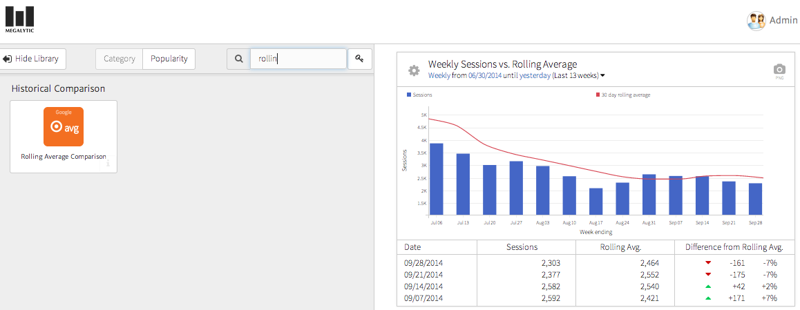
In this example, you can see the line graph (a 30-day rolling average) follows a smoother course than the bar graph (weekly sessions), In addition, you can see how weekly sessions compared to the rolling average in the table beneath the graph. For this site, a seasonal business that sees traffic rise in the summer and decrease in fall, we can use the rolling average to better visualize how volume lessens later in the year.
Conclusion
To fully evaluate the performance of a website over time, move beyond simply reporting weekly and monthly statistics to look at data on quarterly and yearly levels, while comparing to previous periods. Use the tools available through Google Analytics, as well as reporting platforms like Megalytic, to analyze the data and present it in a format your boss or client will understand.