
May 20, 2024
How to make a Web Analytics presentation to the CEO
By Megalytic Staff - May 19, 2014
Have you ever been asked to give a web analytics presentation to senior executives? Did you struggle with how to go about the task? This blog post describes a situation I was in where I needed to present to the CEO. It breaks down the steps I took to be successful.
Hopefully, my experience can help you.

The challenge of presenting web analytics to senior executives makes many talented web analysts nervous. When recently asked to present to the CEO, I was not only nervous, but unsure how to proceed. Ultimately, I was successful because I broke down the process into a series of manageable steps.
Background
The CEO of one of my clients had asked me to give him a “web analytics presentation”. That was it – no other information was provided.
This made me nervous and I had a lot of questions. What, exactly, did he want to know about analytics? How technical should the presentation be? Is there a particular business issue that he is concerned about? What type of insight is he looking for?
This client is an online publisher. They have teams of writers and editors creating original content. The entire organization cares deeply about creating compelling news stories and attracting readers to their website.
The company was only 9 months old and had been running Google Analytics for about 6 months. They had only recently started looking at the data coming out of Google Analytics and trying to make sense of it.
Step 1 – Find Out What the Executives Care About
A common problem you’ll encounter when presenting to senior executives is that the purpose of the presentation is often not well defined – at least in the precise terms that web analysts are used to. If this is the situation you are in, start by finding out what business issues the executives are currently focused on. The best way to do that is to ask the marketing and operations people you interact with to see if they have any insight.
In my case, I was fortunate enough to have a good working relationship with an operations manager who knew the CEO well. She was able to provide some insight into the CEO’s web analytics concerns.
It may seem obvious to ask around for insight into senior executive thinking. But, you’d be surprised how many web analytics professionals walk into an executive meeting without this background. Often times, analytics professionals assume that their role in the meeting is to be an oracle – to interpret the data coming from the analytics software. However, the senior executives will expect you to do more than interpret data. They are looking for insights to address their business concerns. So, before preparing a presentation, you’ll need to know a bit about those concerns.
What I learned from talking with the operations manager was that the CEO was concerned about the accuracy of data and how to understand the engagement of their audience. Engagement was a critical concern – and different metrics were painting different pictures of engagement. Given his concerns about accuracy, he wondered if some metrics were just wrong, and how to reconcile what he was seeing on the dashboard to provide a coherent picture to guide strategy.
Step 2 – Understand the Data behind the Executives’ Concerns
Once you have some understanding of the executives’ concerns, the next step is to get deep into the data behind those concerns. This part of the process is where you get to use all your web analytics skills. Once you deeply understand the data behind the concerns, you can then formulate how you want to address them in your presentation.
As a web analyst, you know what metrics track what aspects of visitor behavior. In my case, the CEO cared about visitor engagement and accuracy. As you know, three key metrics for engagement are Bounce Rate, Average Session Duration, and Average Time on Page. (Average Pages / Visit is also a good one, but not discussed in detail here.)
Bounce Rate
At my client, the CEO already knew that the Bounce Rate reporting was erratic – it usually hovered around 75%, but occasionally dropped down in the 5 – 20% range. His staff had explained to him that these dips resulted from programming errors in the Google Analytics tracking code that had been customized for the company’s site. He was very upset about this. He wanted to make sure he was seeing reliable bounce rate reporting and wanted to know why these bugs were happening and what could be done to prevent them.
The Google Analytics chart below shows the daily Bounce Rate since the beginning of 2014.
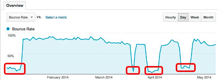
As you can see, the Bounce Rate dropped dramatically 4 times during the year. When you see something like this, you need to be all over it and understand what is going on, because you are going to get questions about it. In this situation, you would investigate what causes Bounce Rate to get skewed downward dramatically. A little Google searching would uncover that it is probably related to Google Analytics Events being improperly coded with the opt_noninteraction flag either not set or set to false.
In fact, buggy Event tracking code was the cause of the inaccuracy at this client. The developers knew that and had corrected the problem in each case after several days. Sometimes, production schedules prevented them from pushing out fixes quickly. The buggy code would remain on the site for a week or more, driving down the bounce rate as shown in the chart above.
As you learn about the data, write up your findings and file them. When it is time to start putting together the presentation, you can refer to these notes. Don’t try to start creating your presentation at this point. You are researching individual concerns and don’t have the big picture yet. For your reference, the notes that I created for Bounce Rate are included in Footnote 2 – Bounce Rate Bugs .
Average Session Duration and Average Time on Page
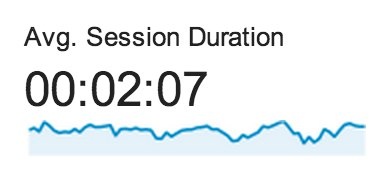
The next metric I looked at was the Average Session Duration. This metric was hovering around 02:07 (2 minutes 7 seconds). The CEO and his staff also felt that this was inaccurate because it conflicted with what the Average Time on Page metric was telling them.
As a web analyst, you know that the Average Time on Page and Average Session Duration often provide very different indications of engagement. But executives don’t usually understand the nuances of these two metrics.
In this case, the Average Time on Page metric indicated that visitors were spending on average almost 4 minutes on each page. Naturally, the executives wanted to know how, if users are spending nearly 4 minutes on a page (article), could the average session duration be only 2 minutes?
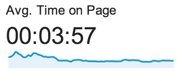
Some of you probably know the answer to this question. If you don’t, a few Google searches will turn up lots of articles explaining how this can happen. Google Analytics counts bounces as zero time sessions and this drives down the Average Session Duration calculation.
As with Bounce Rate, I analyzed the client's Average Session Duration and Average Time on Page data and wrote up detailed notes explaining the seeming discrepancy. You can see my notes in Footnote 1 – Time on Page vs. Time on Site .
Step 3 – Step Back and Grasp the Big Picture
Once you understand the data in detail, step back and grasp the big picture. Take what you know from the data and find a way to express it that will be relevant to the executives.
The first step in formulating a big picture is to put aside any data that does not provide much insight into core business issues: think of this as “peripheral data”. In my situation, the analysis of bounce rate bugs falls into this category. Sure, the client should implement better testing for this issue before putting new analytics tracking code into production. That is a best practice for the development team, but it does not touch on any core business issues. “Peripheral data” like this can be included in an executive presentation, but it should not be the primary focus.
So, once you have put aside the “peripheral data”, how do you formulate a big picture? This is more art than science. Start by thinking about what the executives care about (Step 1), and look at what you learned about the non-peripheral data (Step 2).
In my situation, I had learned that the CEO cared about engagement. My analysis of the data showed that the Average Time on Page was hinting at pretty high engagement, while the Average Session Duration was indicating much lower engagement. To me, this indicated that the relatively high bounce rate was driving the Average Session Duration way down. Since these visitors only look at one page, and we don’t know how long they are spending on the page, we don’t know much about them. They could have been highly engaged reading an article or watching a video, and just not navigated anywhere else on the site. Since we don’t know much about them, I decided that we should ignore them when measuring engagement. This is how I formulated the “big picture” that I wanted to convey to the CEO:
To understand engagement on your site, look at the engagement metrics for only the non-bounce visitors.

Step 4 – Have Exactly One Big Insight
The final step, before putting together your presentation, is to decide on exactly one big insight that you want to get across. To engage senior executives, it is important to have one major point. The impact of exactly one point is much greater than two and infinitely more powerful than a list of recommendations.
Why? Because senior executives spend all day in meetings. How much can they possibly remember, much less act on, from the information presented at all these meetings? Given this reality, the best approach is to focus on one big insight. A single insight can be remembered. It can spark discussion. Generating discussion and questions is your goal.
Try to have a single slide or graphic for this one big insight. When that slide goes up, you want it to generate animated discussion and ideas. If that happens, then it doesn’t even matter if you get through the rest of your presentation. You have succeeded in making an impact. Follow-up discussions can cover all the details.
While you want to have “one big insight”, don’t walk into the meeting with a presentation containing a single slide! It is important to be ready with detailed answers to all the questions that might come up. You need to be prepared and on top of all the data.
So, what to choose for your single big insight?
Of course, that depends on your situation. But it needs to combine the executives’ concerns (Step 1) with the big picture (Step 3).
In my case, the CEO’s biggest concern was getting a handle on visitor engagement. What I wanted to communicate was that, excluding the bounces, the visitors to his company’s site were highly engaged. I needed a visual that would demonstrate that in a way that he, and others in the meeting, could quickly grasp.
Since I knew that the CEO was looking at the dashboard, I figured that was a good place to start. After all, he was familiar with the information on the dashboard. Maybe it could be tweaked in some way to get across my “one big insight”.
As it turns out, the answer was simple. On the dashboard was a widget displaying the Avg. Visit Duration. It looked like this.
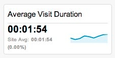
All that I needed to do was include the Google Analytics segment for Non-bounce Sessions, to show the dramatic difference in average engagement when throwing out the bounces.
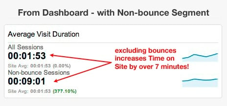
“Eureka!” I thought, “This will have an impact”.
Step 5 – Show your Best Stuff First
Your audience will be paying the most attention near the beginning of the meeting. Not the exact beginning, because they need a few minutes to get settled. But, a couple of minutes into your presentation – that's when they will be the most “tuned in”. So, have a quick warm-up topic and then present your “big insight” at the moment when people are settled and “tuned in”.
In my case, the meeting was scheduled near the end of the day – around 4:00pm. I knew the CEO and others there would already have sat through many other meetings that day. They would most likely be a bit tired and tough to engage. In this situation, it was particularly important to get right to the “big insight”.
While people were filtering in and getting settled, I quickly presented my findings regarding the bugs causing bounce rate and how we could prevent them. This material is shown in Footnote 2 – Bounce Rate Bugs . I wanted to “check the box” and make it clear that I had looked into that issue, but not let it be the focus of the presentation.
Once people were settled, I put up the “big insight”. I explained that Avg. Visit Duration was fooling them into thinking visitors were less engaged with their site content than they really were. I showed them that a sizeable chunk of their visitors (the non-bouncers) were averaging more than 9 minutes on the site.
This led to some discussion about how Google Analytics works. For this, I essentially covered the material in Footnote 1 – Time on Page vs. Time on Site . However, we quickly moved off that topic and started talking about what actions could be taken based on this insight.
This was exactly what I was hoping for. The audience was engaged and asking questions. They were discussing the matter amongst themselves and moving from insight to action.
When you a presenting to executives, moving from insight to action is the measure of success. If your presentation has sparked a discussion that leads to actions aimed at improving the business – then you have done your job well.
Actions and Impact
After digesting the “big insight”, one of the website designers in the room mentioned that he felt that the site was unfairly penalized on Bounce Rate because a lot of content was being served through AJAX. There was a lot of in-page navigation through content that did not cause the URL to change, instead serving up new content on the same page URL. He guessed, correctly, that this navigation was not increasing the Pageview count, and instead causing many highly engaged visits to be classified as bounces.
The group decided, based on this discussion, to make some changes to the navigation and AJAX implementation, so that new Pageviews would be registered whenever the visitor was viewing truly new content. This would result in more accurate insight into visitor engagement.
The CEO was pleased because the metrics now made sense and confirmed his intuition about what was happening on the site. He was even more pleased that the group had come up with some relatively simple changes that would help bring the Avg. Visit Duration more in line with the actual visitor behavior on the site. This would provide a solid foundation for measuring the progress of the business.
Conclusions
What can be concluded from this experience? Did I actually contribute much? After all, tweaking the site navigation to result in more Pageviews might not seem like it adds a lot of value.
But, actually, it does in this case. The reason is that senior management and investors in this business were looking at that Avg. Visit Duration metric and comparing it with numbers they had seen for other publishing websites. Based on this one metric, they did not feel great about how they were doing.
You might be thinking, “Well, nobody should form an opinion based on one metric without knowing what’s behind the metric.” While that is true, it is not really a practical viewpoint. The leadership at this company and in this industry had settled on this metric as a means of comparison. It was not sufficient to explain why the metric wasn’t particularly useful in their case. It was important and valuable to suggest concrete actions that could be taken so that this metric more accurately reflected the actual activity happening on the site.
As a web analyst, your most important role is often simply making sure that the business is looking at metrics that effectively communicate relevant information. Out of the box, Google Analytics, or whatever analytics tool you are using, might be providing misleading data. The data – particularly averages - can be accurate, but still misleading. In this situation, you need to help focus the business on segments that provide better insight.
When you can align the executives’ interests with a relevant set of metrics, you have provided a highly valuable service. You have provided the business with a powerful framework for measuring success that will guide better decision-making.
So, the next time you are asked to make a presentation to senior executives, try following the steps above. Most importantly, make sure you end up with “one big insight”. Your success as a web analyst will follow from the quality and relevance of your insights, not the quantity of the data that you present.
Footnote 1 – Time on Page vs. Time on Site
On some types of websites, the Time on Page average is consistently much higher than the Session Duration average. This is particularly true on news sites where many visitors may read only a single page and then leave the site.
By default, Google Analytics treats these single-page visits as bounces - and they count as 0 in the Time on Site calculation. The more single-page visits you get, the more your Average Session Duration metric gets pulled down toward 0.
Time on Page is calculated differently in Google Analytics. Single page visits are not counted at all. The last page visited by a user (the exit page) is also ignored.
The reason is that Google Analytics does not know how long the user spent on the last page (or on a single page). It knows when the visitor arrived on the last page, but not when they left. Rather than guess, Google decided to treat the last page in a visit as having a 0 value for Time on Page. These 0 length Pageviews are thrown out when calculating Average Time on Page. Conversely, bounces are included a sessions with length 0 when Google Analytic calculates the Average Session Duration. As a result, bounces drag down the Average Session Duration, but do not affect the Average Time on Page.
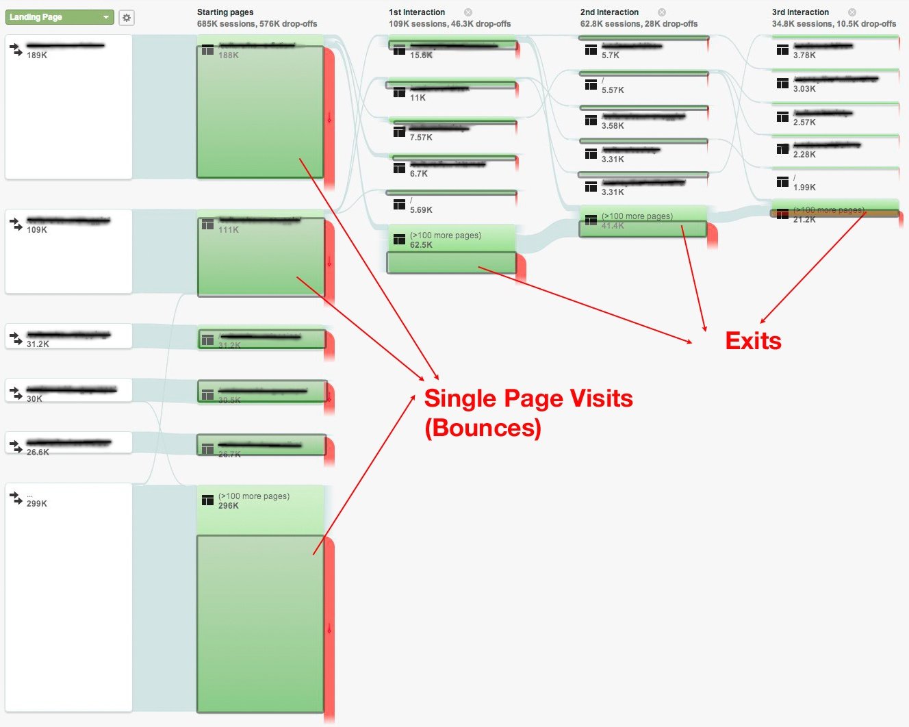
On my client’s website, there are lots of single-page visits (bounces), or 2-3 page visits. The Google Analytics page flow chart below shows that. The green boxes represent the total number of Pageviews, arranged in columns by what order they were viewed (1 st , 2 nd , 3 rd , etc.). I’ve added a gray box overlay to show all the Pageviews that are exits, including bounces. As you can see, it is a high proportion of the total Pageviews. All the time spent by visitors on these pages is counted as 0 toward the Average Session Duration but is excluded from the Time on Page.
We actually do not have any way of knowing the time spent during the visits that I’ve highlighted in gray. Since this is a large percentage of the visits, we cannot really expect the site average metrics to be particularly helpful.
Footnote 2 – Bounce Rate Bugs
Bounce rate sometimes gets skewed downward because of tracking that is introduced on the site to measure visitor interaction with the UI. This problem can be avoided by proper coding of the Google Analytics tracking events.
There have been a few instances where incorrectly coded JavaScript tracking events caused this skewing to occur.
These problems are difficult to detect on the development server because there is very little traffic there and the bounce rate is always very low. Nobody visits the development server and looks at only one page - they are on that site doing work and testing.
The problem can be minimized by alerting me 48 hours in advance of a push to all changes being made to Google Analytics tracking and giving me time to review any changes to the tracking code. The developers can identify code changes relating to Google Analytics tracking by doing a “diff” in the Git source code control tool that they use. I can review the “diff” and flag any changes that might skew the bounce rate.
The primary cause of a skewed bounce rate is introducing frequently occurring events where the opt_noninteraction flag is either not set, or set to false. A common example is having an event fire every time a user sees the “sign-up now” modal. That kind of event does not include any user engagement, and should be fired with the opt_noninteraction flag set to true.