
May 21, 2024
Digital Marketing Reports - The Key Components
By Megalytic Staff - December 11, 2018
Whether you do digital marketing for an agency or an internal team, you probably need to create monthly reports summarizing the performance of your campaigns. These reports showcase the successes of your marketing strategies and highlight where improvements can be made. There are tons of marketing metrics out there-- it’s hard to know what to include in your monthly report and how to display the data. And the results themselves might get lost-- even if you’ve massively improved campaign performance -- if you don’t present the data in a way that your team comprehends and engages with.
In this post, we’ll look at some of the key components of digital marketing reports that add the most value for your clients and colleagues.
The Cover Page / Executive Summary
You need a strong introduction that summarizes the essential narrative points of your report. It should show where you’ve improved, where you’ve gone down, the work that you’ve done and the work you’re currently doing. You want to frame the metrics you’re presenting in a concise but thorough way.
You may ask why you need an executive summary or cover page when you’re going to be presenting metrics that basically state the same thing. There are several reasons why a summary is important. The executives to whom you’re presenting this report are probably busy people who need a succinct, big-picture, overview. Framing metrics in a narrative also helps you describe the effects that the campaigns and other work you’ve done have had on overall performance.
Some people reading your report will simply wrap their heads around words better than numbers or graphs, and describing results before presenting data can help to head off misinterpretations. By introducing your overall findings beforehand, you can highlight your team’s accomplishments. And a branded cover page with your logo and colors makes your report look both professional and custom built, helping you reinforce the effort you’re putting in for the company or client.
A strong cover page and executive summary, like the one in this example , is an important factor in the framing of your monthly digital marketing report, and can help give higher-ups the bigger picture.
Website Traffic Trend
Unless you’re writing a highly specialized report, you’re probably going to begin by showing overall website traffic. For most organizations, their website is a key component of their online presence; for many, it's the foundation of their digital marketing efforts. Overall website traffic gives context to all of the digital marketing you have done that month and makes other metrics more understandable for your audience.
A long-term trend graph, usually showing the last year, can help provide context for the entire report. Day-to-day traffic can fluctuate greatly, so it’s important to get a broader sense of how your website is trending and any seasonal cycles. To accomplish this, you may want to include a rolling average line in your chart-- a technique that highlights the overall trend in the data. For example, a 90-day rolling average charts the average daily traffic over the last 90-days. Because it’s a average taken over 90 days, it fluctuates a lot less than the day-to-day.
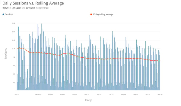
A rolling average line for Daily Sessions from Dec-Nov
The chart above is a good example of a website traffic graph with a rolling average trend line. The graph shows daily sessions to a website during the previous year. The rolling average clearly displays a downward trend in traffic, despite several seasonal upticks. In a good report, there would be some text providing context to explain the trend, such as a pullback in ad spending.
If you think a rolling average would be confusing to your audience, you can substitute a simple monthly chart showing traffic for the last 12 months, such as this one:
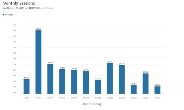
Monthly Sessions chart for Dec-Nov
This chart displays the same overall downward trend, but it’s a bit less obvious here than with the rolling average trend line.
Both of these charts help your audience gain an overall idea of how your website has performed and when the highs and lows were. This is good background information providing context to help your readers interpret the rest of your report.
Organic Traffic - Top Landing Pages
Search engines are a major factor in bringing visitors to most websites. Many marketers rely heavily on being displayed organically in search engine results, rather than paying to display ads. Visits originating from clicks on organic search results are called “organic traffic”. Organic search traffic results when your pages are ranked high by search engine algorithms-- showing up near the top of the page when someone make a search query for information that your website provides.
As a marketer, if you are concerned about generating organic traffic, you’re likely optimizing your website content to rank high in these results by employing various Search Engine Optimization (SEO) practices. In that case, it’s important to measure the success of your website content in your monthly digital marketing report. So it’s useful to show the pages getting the most organic hits. Many marketers decide to show the top 10 pages. Here’s the top 10 for Megalytic’s website over the last year:
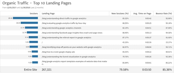
Megalytic’s Top 10 pages over the last year
Megalytic’s top pages are almost all blog posts, because our strategy is to provide useful content in our blog as a way of attracting visitors. We hope that a reasonable percentage of these blog readers go on to other parts of our website to learn about Megalytic.
The metrics in this table are useful for showing the success of different pages. Sessions indicates the number of times that page has been landed on by organic search traffic. New Sessions (%) indicates the percentage of sessions from brand-new users who have not been to your website before. A high percentage indicates that the page is good at bringing in new visitors. Average Time on Page shows how long a visitor spends on that page, on average-- useful for determining whether your content is holding people’s attention. Bounce Rate is essentially the opposite-- how often visitors navigate away from your website after visiting only that one page. A marketer’s goal is always to increase Average Time on Page and decrease Bounce Rate.
Displaying these metrics for organic search traffic can help you demonstrate the success of your SEO practices, your content, and the overall capability of your website to attract visitors.
Paid Search Advertising - Spending and Results
In addition to organic search, your company or client may also spend money on paid search, like Google Ads, to drive traffic to your website. If paid search is a part of your program, your monthly report should include a summary of both spending and key results. A good starting point is a small table showing some Key Performance Indicators (KPIs) . KPIs are the statistics that your organization has chosen to monitor performance.
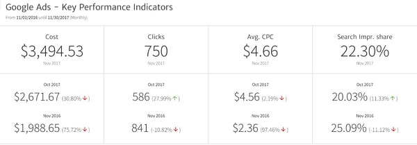 Some KPIs for Google Ads
The table shows monthly results for four KPIs that are commonly used to track the performance of Google Ads campaigns.
-
Cost is the total amount spent on Google Ads over the month.
-
Clicks is the number of times that people clicked on your ads in the Google search results.
-
Avg. Cost Per Click (CPC) is the ratio of the two previous KPIs, providing the average amount paid for each visit. This metric helps you determine if you are spending wisely. For most businesses, there’s a limit to how much they want to spend to acquire a visitor.
-
Search Impression Share (Search Impr. Share) is the percentage that your ad actually displayed in search results out of the total possible times it was eligible to be displayed. If it is low, or moving down, your competitors are being displayed instead of you-- and your team should review your paid campaigns to determine if there is a problem.
KPIs can help demonstrate the value of your paid search campaigns or point to areas that need improvement. If they’re off target, there can be several reasons: from too small of a budget, to bids that are too low, to poor quality ads. If they exceed expectations, they’re a good indicator of value to show your executives or clients, and can help indicate where you can put in further effort.

Year-over-Year and Month-over-Month Date Comparisons
Date comparisons are an important component of digital marketing reports. Most organizations measure their performance against prior time periods, most commonly the prior year or month. But it’s not just the base KPIs that should be shown in date comparisons; it can also be useful to break down the data along key dimensions, such as age, geographic region, marketing channel, etc.
Here’s an example of website traffic in August broken down by country and compared to the previous year:
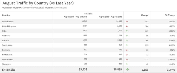 August Traffic broken down by Country
This chart both breaks down the data and shows a summary comparison for the total traffic in the last row so that you can see how much each country contributes to the total. From the last row, you can see that Sessions increased overall by 1,156 (3.24%). However, you can also see that not all countries had increased traffic-- US traffic was down 3.95% while traffic from India was up by 13.91%. This could indicate a problem if the company’s primary market is the United States. It could also indicate success if the company was marketing heavily in India.
Adding date comparisons to your report can help you demonstrate the success of specific initiatives or show where you need to invest more time and effort
Drill Down on Issues
If you notice an issue, like the drop in US traffic we discussed above, you should drill down into the data to find out more about what’s going on.
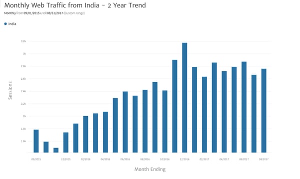
Monthly Web Traffic chart for India over 2 years
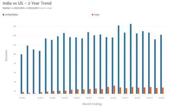
India vs. US traffic chart over 2 years
Above we’ve displayed the monthly traffic for India and then the India traffic compared with the US traffic over the same two year period to better understand what is going on. India grew strongly and leveled off toward the end of the period. In contrast, the US leveled off much sooner and looks like it may have begun to decline. Perhaps India is following the same trend as the US, but lagging by a year. If that’s true, the company should concentrate on restarting growth in the US and assume that India will follow.
When you see a drop in a KPI, like US website traffic, it’s a good idea to drill down and look at what the trend has been. At this point, you can see a disturbing trend in US traffic that was hidden when looking at the aggregate numbers. Your next step should be a detailed analysis to determine the causes of the downward trend. That kind of analysis should be presented in a separate report. It is outside the scope of a monthly summary.
Social Media - Organic and Paid Results
Most businesses maintain a presence on the major social media platforms like Twitter, Facebook, Instagram, and LinkedIn. Some have developed substantial audiences organically and run content campaigns to engage with their followers. Other businesses focus on paid social media advertising and content promotion to further their reach. Many do both. Both types of social media marketing, organic and paid, should be covered in your monthly report.
It can be tempting to include visible, easily understandable social media metrics in your report, such as Facebook Likes or Twitter Followers. For organic social media, avoid these vanity metrics, unless you are running an active campaign to grow them. Charts of this data usually hold fairly steady and convey very little information, unless you have an active campaign. The chart below is a good example of why charts like this aren’t particularly interesting.
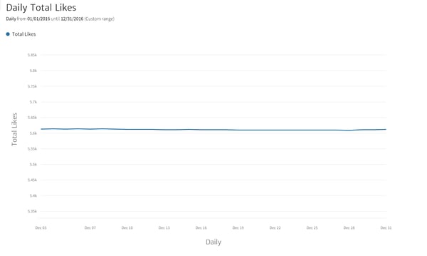 Chart of Daily Total Facebook Likes
This flat line doesn’t give you any actionable information about how your social audience is reacting to your brand’s content and how much engagement is being generated.
Data that is both interesting and useful to your business is much more specific and helps you target growth areas and possible problems. For example, it can be helpful to look at the top cities where your Facebook audience is located. This is the kind of data, especially for a local business, that can help management determine where to advertise or invest in a new retail presence.
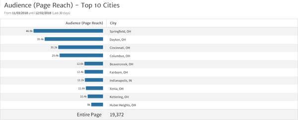 Top 10 Cities accessing Facebook brand page
This table gives much more usable data showing where your social campaigns are successful-- if your goal was to reach Ohioans, you’ve been very successful! If your goal was to reach Indianans, you might want to retarget your efforts. But, if you’ve been investing in awareness in Columbus, this chart shows that your efforts are paying off.
If you’re running a paid social campaign, comparing results to how much you’ve spent is a good place to start. You’ll probably want to include a table of all your social campaigns, sorted by how much you’ve spent on them (highest on top). Include in this table the metrics that are important to your campaigns. If your goal is for people to click through to your website, include Clicks. However, that may not always be the most important metric. If you are promoting a video, you might find “10-Seconds Video Views” more helpful in measuring the success of your campaign. No matter the metric, your company will find it helpful to be able to see the relative performance of all your campaigns in a single table. For example, in the table below, you can see that some campaigns deliver a much lower “Cost per Click (CPC)” than others.
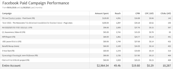 Facebook Paid Campaign Performance table
The third campaign in this table was comparatively a bargain at $0.15 CPC for a reach of 2,000 and over 550 clicks-- this company might want to investigate what went right with that campaign and applying what they learn to other campaigns.
It’s also important when reporting on social media to include a summary of the latest posts you’ve made. Note any that are doing particularly well (or badly) and identify themes and types of post that produce the most “Engaged Users”. One of the primary business purposes of social media is for people to engage with your brand, so it’s important to review which content is working the best.
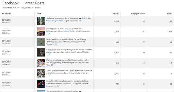
Facebook Latest Posts comparison table
The above table lists the latest Facebook posts along with data about how much engagement there was with each post. The post “It’s impossible to beat a sunset” stands out with the most engagement, so more posts like that may be a good investment.
With social media metrics, it’s important to keep your focus on what’s important. You want to be utilizing social media to grow your brand, increase conversions, and ultimately drive sales. Though you may be tempted to simply report how many people “Like” you, focusing on other metrics in your monthly report provides more value.
Conclusion
There are many different ways of writing up a monthly digital marketing report, but the key components summarized above provide a good foundation of useful information that is relatively easy to understand. Organizing your report into sections by channel or platform makes it easy to digest. Selecting data visualizations that cover only the most important facts about the performance of each channel can also help the reader to quickly comprehend the results. Drill down into the details when there is an important issue to address, and get feedback from your audience before finalizing your report format. You can iterate your digital marketing reports to make them better month by month. Feel free to contact us if you would like help designing your next report!