
May 21, 2024
Custom Analytics Reports – How to Present the Right Data to your Client
By Megalytic Staff - January 16, 2015
- Use historical context
- Include text to describe the data
- Drill down on high level stats
- Understand, define and report on Goals

Use Historical Context
Pulling together data about your client’s business is good. But pulling together data about your client’s business when compared to prior historical periods is even more useful (and more interesting)!
For example, rather than simply showing them data for the last 13 weeks, compare those results with the same time frame one year ago.
The chart below uses Megalytic’s Metric Timeline widget to show weekly Sessions over the last 13 weeks.
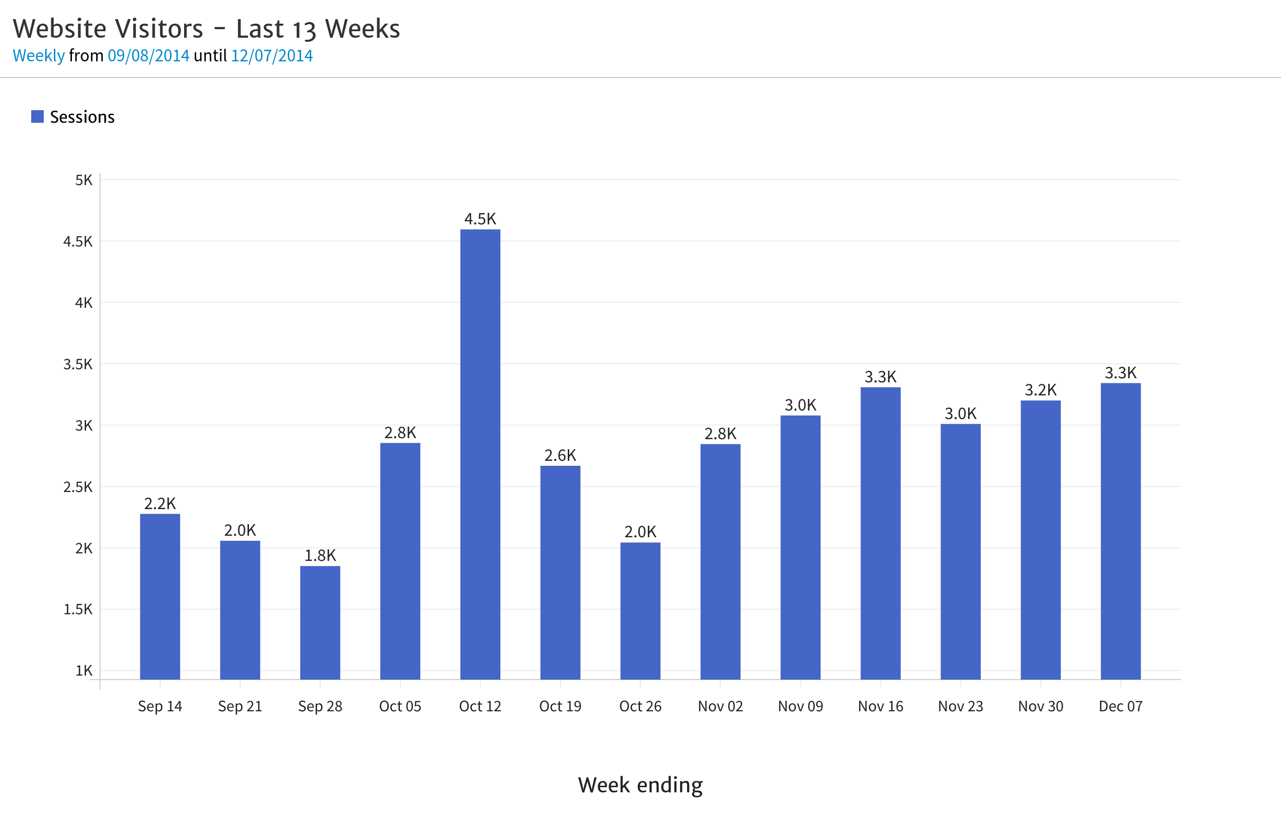
If you presented this to your client, they may not know if the results they’re seeing are good or bad. They may have immediate questions like, “What caused the spike on the week of October 12?” While this is an important question, it misses the bigger picture because you’re not showing them the big picture. You’re showing them data without the historical context.
However, if you show your client the chart below – which contains the same data, but compared with the year-ago period – they will ask different, more important questions such as, “How have we been able to grow traffic so much compared with last year?”
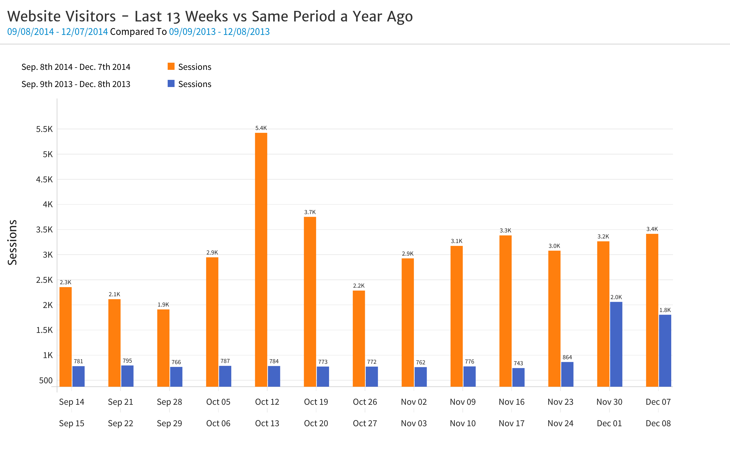
The second chart, which includes historical context, is more valuable because it helps your client to see the big picture and to ask more telling questions. In addition to focusing on the spike during the week of October 12, they will naturally want to know how traffic has grown so much over the past year.
Megalytic makes it fairly simple to do date comparisons, as described in this support document . If you do not have a Megalytic account and would like to follow along with this post, you can create a free 14 day trial account .
Include text to describe the data.
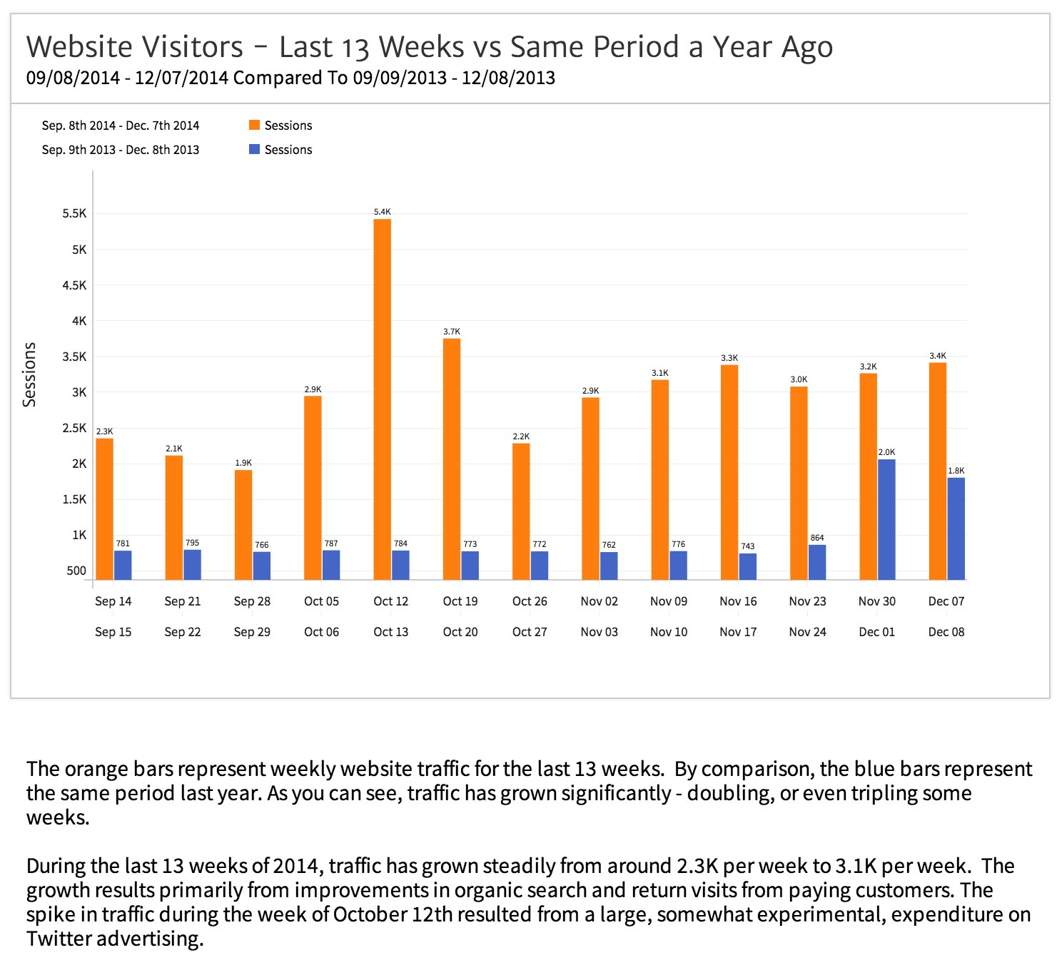
Another best practice is to use text to describe the data shown in the charts and tables that you create. The combination of hard data – proving evidence of results – with a text description, will hold your client’s attention better than charts or text alone. It will also help your client to better understand what the data is telling them.
As you can see below, by using text to explain what the images convey, it makes it easier for the client to grasp and provides a lot of useful information for the client.
Drill Down in to High Level Stats
In the example above, your client will be thrilled to see traffic has grown by a factor or 2-3x over the last year, but will want to know more – specifically, where did the growth come from? Anticipate this question by including drill-down data for high-level metrics like Sessions.
Megalytic allows you to drill down along any number of dimensions (e.g., acquisition channel, campaign, geographic region, etc.). Select one or two drill down dimensions that you think will provide your client the most insight.
In this particular case, we would choose to drill down on Sessions by Channel, as the growth in Organic Search has been phenomenal and that is the insight we want the client to take away.
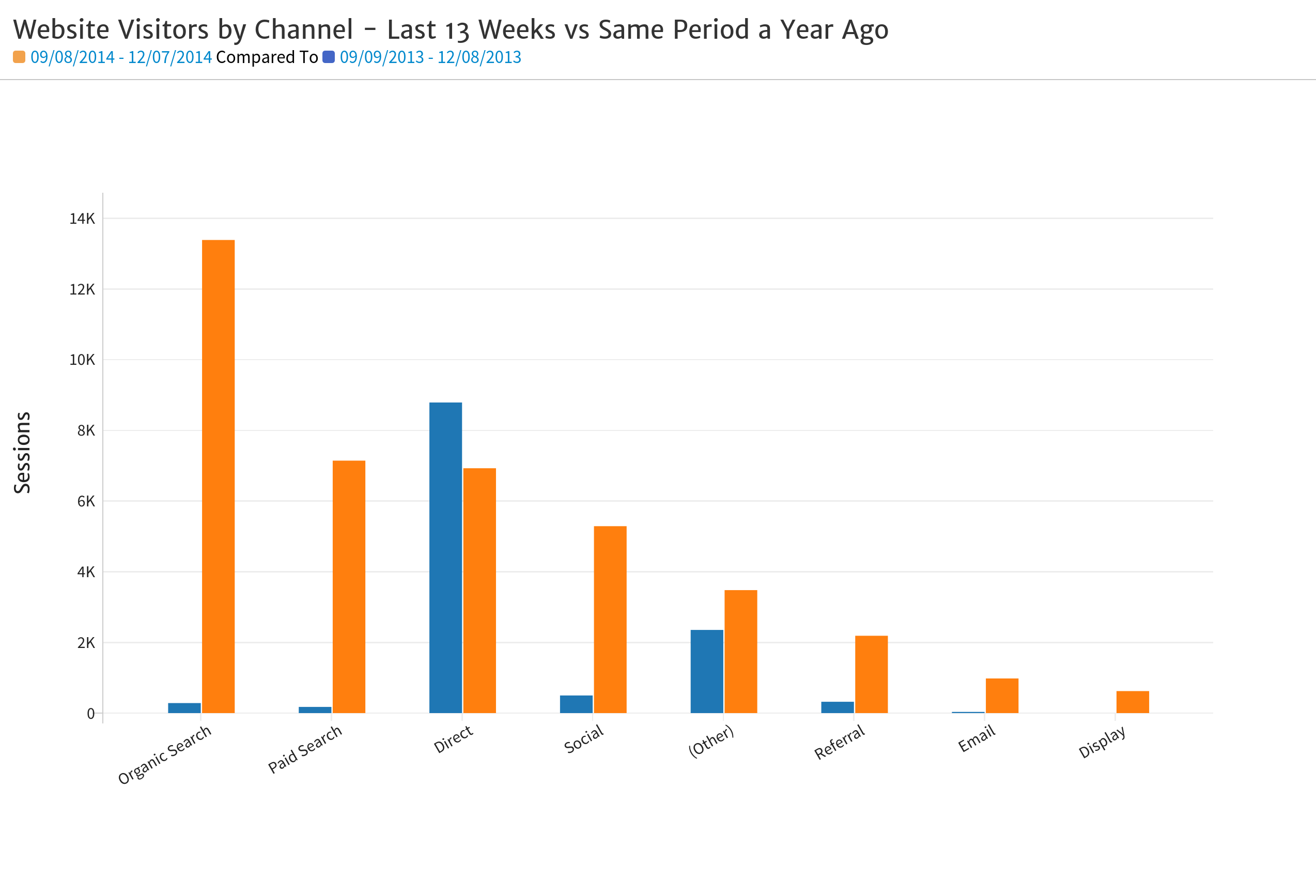
The chart above compares the last 13 weeks (orange) with the same period a year ago (blue). As you can see, there has been growth in all channels except Direct, but Organic Search has gone from a small contributor to the dominant source of traffic.
Along with this chart, you would also include text explaining what caused the huge growth in Organic Search – in this case, a combination of SEO, blogging and press relations.
Understand, Define and Report on Goals
Generic metrics like Sessions (website traffic) are often useful to analyze, but most clients will also want you to look at measures specific to their business. To provide these measures, you need to set up and report on Google Analytics Goals .
Goals measure specific actions on the website that are meaningful to the client’s business. Examples include ecommerce transactions, trial accounts, newsletter subscriptions, help desk tickets, etc. Knowing what Goals to measure for your client, and how to set them up, is something of an art (see: Translating Business Goals to Analytics Goals ).
Once you and your client have decided what Goals to measure, the reporting will center on the Completions and Conversion Rate metrics. The Completions metric simply counts the number of times the Goal is completed – e.g., number of newsletter signups per week. The Conversion Rate metric is the ratio of Completions divided by Sessions – e.g., the percentage of visit that resulted in newsletter signups.
A simple, but useful chart is to simply show Completions over the last 13 weeks – or whatever timeframe is most relevant to the client. Slightly better is to show weekly Completions together with a rolling average.
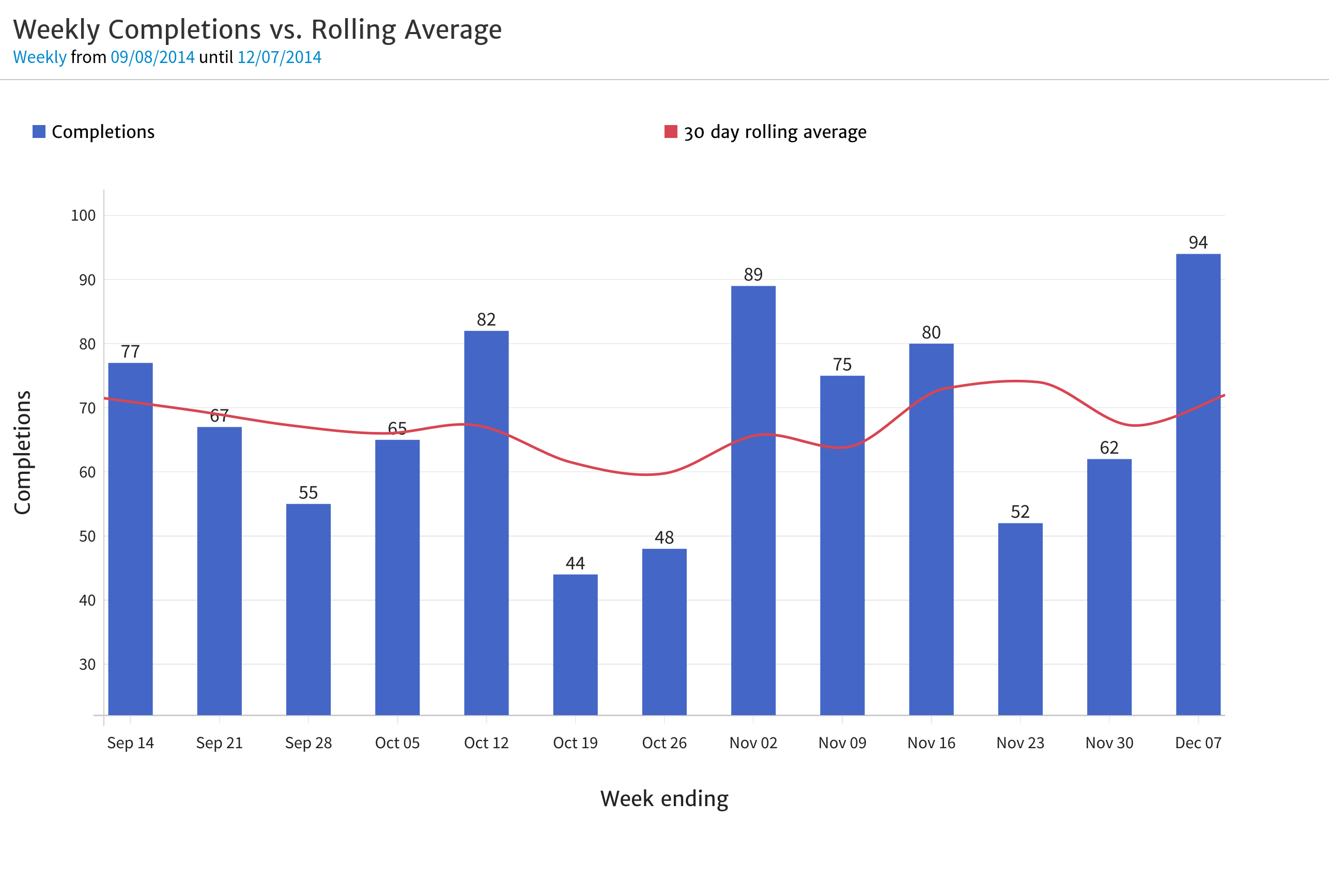
The rolling average (red line), as in this case, is useful because it smooths out the ups and downs in Completions from week to week. During this 13 week period, Completions ranged from a low of 44 to a high of 94 – but the rolling average shows the average number of Completions per week stayed relatively constant.
In addition to Completions, consider the Conversion Rate, which provides your client with a measure of how traffic quality is changing over time. If Sessions are increasing, but Conversion Rate is coming down, that indicates the site’s visitors are becoming less qualified.
Sometimes a lower conversion rate is the unavoidable consequence of growth. But, sometimes it can be a useful warning the client’s marketing campaigns are not attracting the right kinds of visitors.
It is useful to plot Conversion Rate in the same chart as Conversions, as show below. This helps you understand if your Conversion Rate is holding up as your business grows.
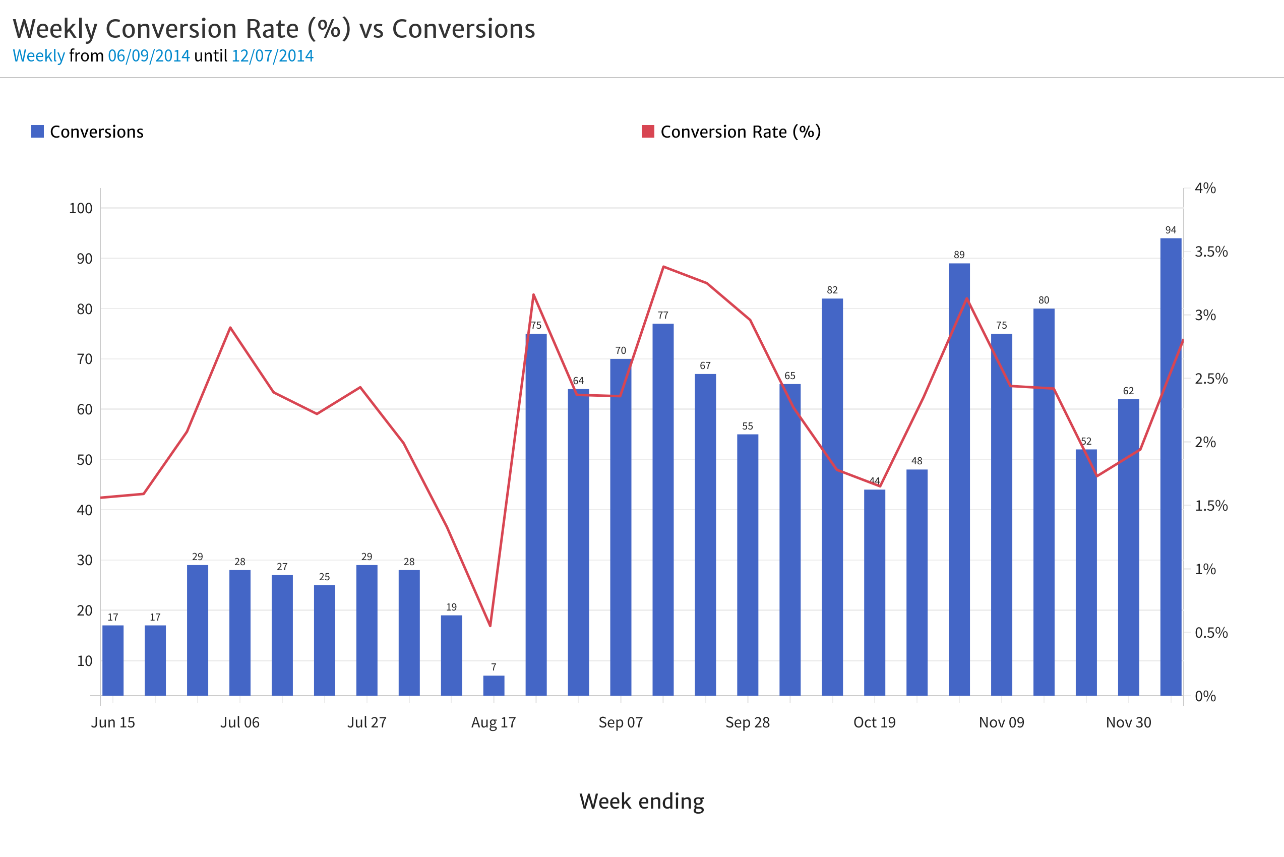
Here, the client can see that conversions increased significantly starting in September. Even better, it seems as though the Conversion Rate (red line) varies around an average of 2.5%, and has increased slightly over this half year period.
Conclusion
Being faced with creating a custom analytics report for a client for the first time can be a daunting task and it can be hard to know what data to include. By following the guidelines outlined above, you can produce a useful starting point you can feel comfortable sharing with your client. Once the conversation is started, be sure to ask for feedback so you can continue to improve upon your reports.
[For more on the importance of getting feedback and talking with your client about what they want to measure, see: How to make a Web Analytics presentation to the CEO .]