
May 21, 2024
3 Ways to Make Your Analytics Reporting More Visual
By Megalytic Staff - July 27, 2017
“Visual aids add a new dimension to presentations. When used properly, they can help you to more effectively deliver your message by adding impact and interest.”
Formatting
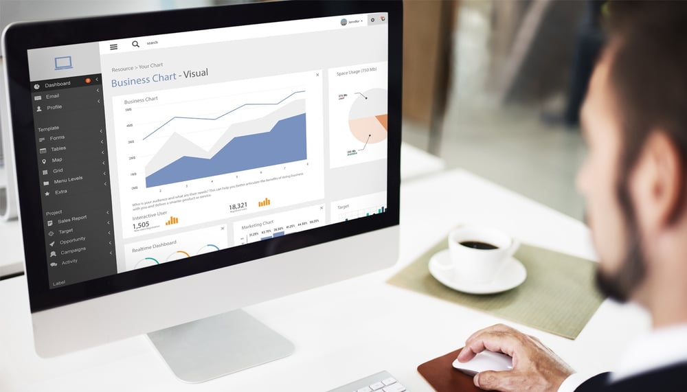
Let’s be honest, reports get points for presentation. No digital agency that plans to stay in business is sending a few metrics via email and calling it a day. We go out of our way to create clean, professional reports. Some organizations use PDFs, Google Docs or spreadsheets. Others have client portals and dashboards or platforms like Megalytic. While you may have put a great deal of thought into your format, how much have you considered your formatting ?
While formatting seems like a simple thing, there are a few key factors that can affect how your report is received at first glance without even considering the data.
Make them easily scannable. While we want our clients to read every word we’ve painstakingly written, make sure they don’t have to. For web reports, larger sans serif fonts can be a bit easier to read. Bullet points, short paragraphs, margins and white space will also help readers skim content. But refrain from putting important text on top of images or background patterns, as it can be harder to read.
Use headings and sub-headings. A main heading will provide a clear statement of purpose, but don’t stop at one. Headings throughout a report organize your information and provide a visual contrast that makes them essential for scanning. They can also allow readers to navigate directly to the points they care about most. While it’s tempting to center justify these pages, a left hand justification is a better bet to ensure they won’t be missed.
Be consistent. We all love to be a little creative, but for reports, consistency is key. From page layout to font sizes, colors and styles, once you’ve established a convention, stick to it.
Follow a hierarchy. You wouldn’t start telling a story in the middle, so avoid doing so with your reports. Reporting should be treated like a narrative. A high-level executive summary allows for a “nutshell” overview of performance, while the rest of the report fleshes out the details that went into the overall result.
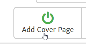
Other formatting choices may not be mandatory but they can enhance a report’s appearance and functionality. As the logical extension of a hierarchy, a table of contents establishes what is included, and where it can be found. This allows your viewer to locate exactly what they are looking for or to set expectations about what they will be reading. Cover pages provide opportunities for branding, dating and, generally speaking, add to the professionalism of a report.
Finally, make sure that your reports can translate effectively in print. No matter how we try to make our web reports easy to consume, for some it will always be preferable to read text on a page.
Graphs, Charts and Tables
If you deal with digital reporting you know that data surrounding KPIs, growth and trends are a big part of evaluating and demonstrating results. When it comes to making that information more accessible and easier to digest there’s nothing more helpful than visual aids. Google Analytics is filled with graphs of all kinds, but a marketer’s challenge is choosing the right data and the right visuals to highlight the most important points.
Graphs come in a variety of styles and we’ve gone into great detail about graphs in the past . Here, we’ll look at a few general points.
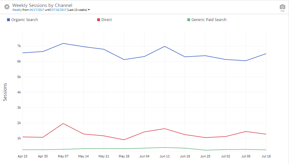
Line Graphs. To show trend lines across continuous data points, a line graph is often preferable. For example, to show month over month website traffic trends, you’ll probably want a line graph. But be careful not to use too many lines as more than three can become confusing.
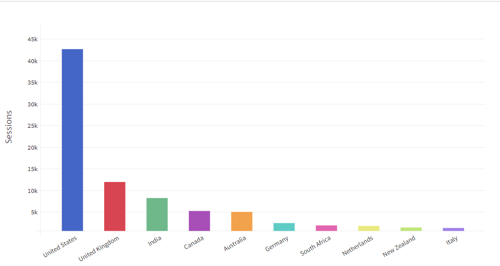
Bar Graphs. If you’re showing discontinuous data, a bar graph is probably the preferable option. For instance, if you’re comparing traffic by country, a bar graph will allow you to easily compare popularity by nation. With bar graphs, though, it often helps to sort with the highest bars on the left and lower bars on the right.
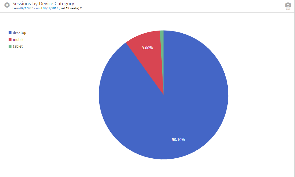
Pie Charts. Pie charts are often best used to illustrate the parts of a whole. Keep the number of parts to a minimum, though. When the “slices” become too small or there are too many similar colors, it can quickly lose its value and become less effective. So pie charts should be used when there are minimal segments. A dark to light progression can also be used to demonstrate distribution.
Venn Diagrams. Most of us started playing with Venn diagrams in elementary school, but they can also be useful in digital reporting. The best time to incorporate a Venn diagram is when there is value to showing commonality between separate entities to identify overlap. For example, isolating the portion of a customer base that has subscribed to a newsletter, tried a free demo and have signed up for a subscription.
Test-based Tables and Charts. Sometimes when you’re comparing multiple metrics in a single view, your information may be best illustrated in a table or chart. Data values in multiple categories, like keywords with their respective rankings or visitor behaviors by landing page, beg to be in a table. But simple techniques like gray dividing lines rather than black, or alternating shaded rows can make them easier to read.
When preparing your reports, it’s important not only to utilize graphs and charts to enhance conceptual understanding through visuals, but also to choose the right one and use it properly.
Images and Colors
Data is often best represented in a graph or chart, but they aren’t the only way to bring imagery and color into a report. There are multiple ways to create a visual impact while also conveying important insights.
Colors. Light text on a dark background may be striking but the most easily consumable text color is black on white. Fortunately, color can be used in other ways throughout your reports. Color can be integrated with headings to help bring a reader’s eye directly to important points. Drastic color contrasts in graphs can help make the difference between values more dynamic. Color can also stimulate emotion and distinguish quickly between “good” and “bad.” For example, where green arrows are used to show increases and red arrows are used in cases of loss. Finally, utilizing a client’s brand colors into a report can add to the customization and personalization of the report’s overall appearance.
Screenshots. If you’re a regular Megalytic blog reader, you know how much we love our screenshots. They are among the best tools we have to help our clients or readers see through our eyes. They are also extremely useful for capturing a moment in time regarding something that may change. Screenshots can be used to show how a Display Ad actually appears in the wild, or as instructional guides. When an action on the part of the client is required, screenshots may help the reader to visualize the steps involved in the process. They can also be vital for showing an accomplishment that might be temporary. This often applies to Google Search results. If a client has a first position ranking or snagged a Featured Snippet, while we hope it holds, search is mercurial by nature and a screenshot will help to capture a meritorious occurrence.
Graphic Stats or Infographics. While these take a little more effort, sometimes a picture can be used to highlight a single point or a process. Milestones, benchmarks or landmark achievements might warrant being visually called out in a report as a graphic. For example, if a client had a record month for conversions. Or if an effective content migration resulted in traffic growth of 3 or 4 times the usual quantity.

At the culmination of a long or multi-step process, an infographic may be used to illustrate the steps, micro goals, cross-discipline components or omni-channel use cases. It’s one thing to explain how a long term effort was executed, but when you can show a client how many touchpoints were involved, it can add value to their understanding of the campaign’s ROI and the complexity of the project itself.
Visual aids like screenshots, graphics and colors are a way to influence both comprehension and user experience by adding depth and additional layers of insight to your reports.
Conclusion
Reporting is a process agencies and in-house marketers go through in order to prove the value of resources contributed to an endeavor. Whether that’s the monthly spend with a firm or the three hundred man hours dedicated to a content initiative. We often look at reporting as a routine matter without trying to make our reports exceptional. If it’s been a while since your reports got a makeover, take a look at what you’ve been doing and use these tactics to enhance your presentation. After all, if you’re excited about what you’ve done (as you should be), make the reporting of your efforts equally exciting. With a little work, visual aids and a clean format can turn reports from rote requirements into exceptional storytellers.