
A Case Study – Comparing Two Campaigns
Suppose your client just switched campaigns and they want a report comparing the before and after performance. This report will help them gauge early success of the new campaign, and see if it’s more or less profitable than the earlier campaign. Start off with a simple chart that shows the traffic generated by the two campaigns.

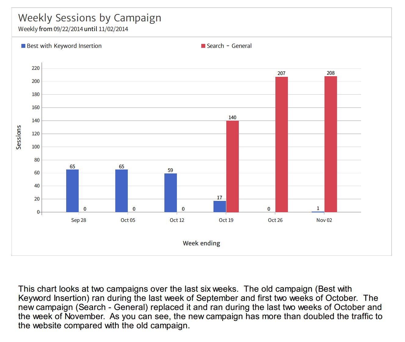
The new campaign is named “Search – General” and it has been running for three weeks. You can see from the chart above we have six weeks’ worth of data for the two campaigns – the last three of the old campaign (in blue), which is named “Best with Keyword Insertion” – and three weeks from the new campaign (in red).
This chart shows Sessions (or visits to the website) from new users, and it looks like the new campaign is generating more than twice as much traffic as the old campaign. Presenting this data is a good start. But remember, clients want data specific to their needs. So, we should go beyond showing just the traffic and compare these campaigns to see how well they are delivering on specific business objectives.
If you’d like to work along with this post and create a similar report using your own data, you can create a free 14-day trial Megalytic account. After each section in this case study, there is a short video tutorial showing how to use Megalytic to create the report element just described.
Video Tutorial
Learn how to compare Sessions from two campaigns
[youtube id=uQrH2liSuhk]
Comparing Lead Generation from the Two Campaigns
In this case, the client’s objective for these campaigns is lead generation. In their Google Analytics account, qualified leads are measured by Goal Completions. Specifically, the client has set up a Google Analytics Goal to measure when new trial accounts are created. To help them compare the effectiveness of these campaigns, we should provide a similar chart that measures the number of trial accounts produced by each campaign.
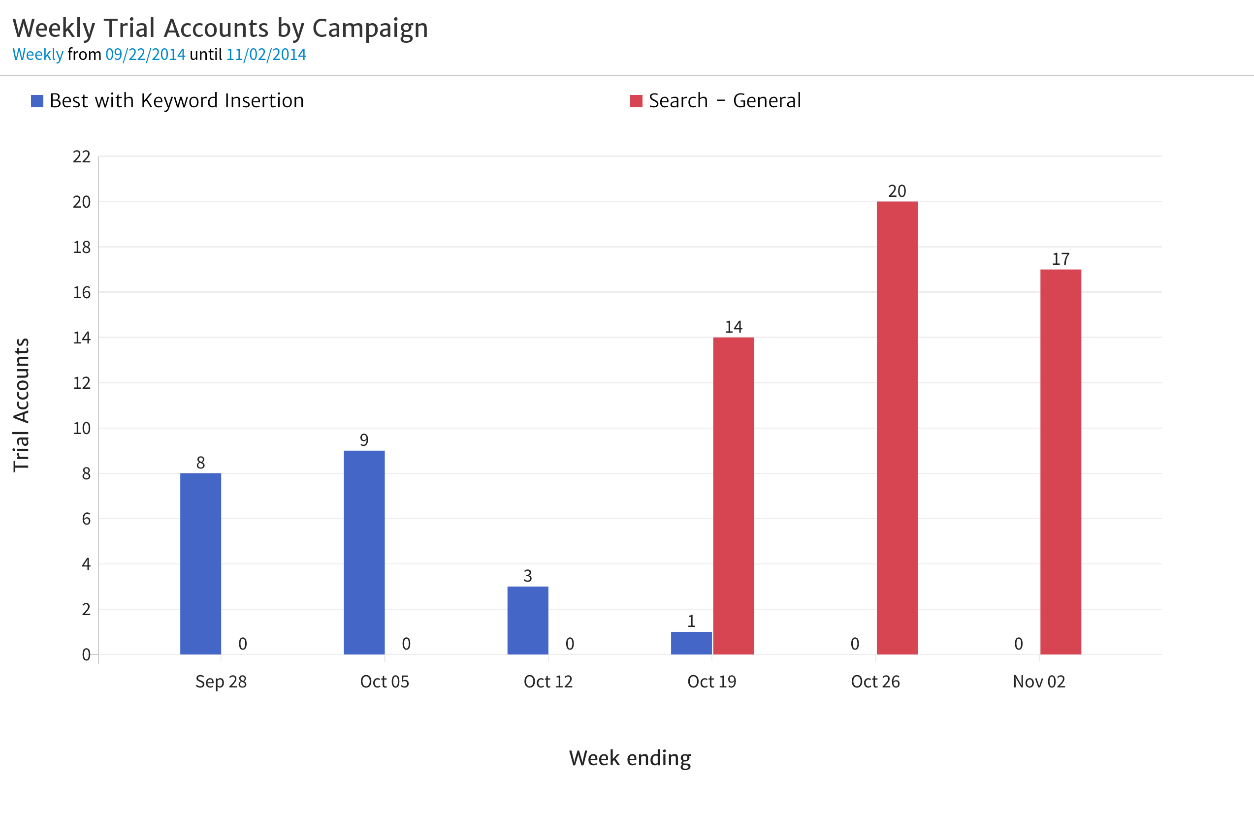
Again, the new campaign looks pretty good – it is generating twice the number of trial accounts as the old campaign.
This chart can easily be created by duplicating the previous chart and changing the metric being displayed from Sessions to Goal Completions. To see how that is done, watch this video.
Video Tutorial
Learn how to compare Goal Completions from two campaigns
[youtube id="ex7y0Wi0HRs"]
Adding a Summary Table to Compare Key Metrics
The two charts just created show campaign performance over time. To give your client the full picture, you should also include a summary table that shows some key metrics over the entire six week period.
Some reasonable metrics for looking at the performance of these campaigns are:
Sessions - to indicate the total number of visits generated by each campaign.
Bounce Rate - to measure the engagement level of the visitors coming from the campaigns.
Goal Completions - to show the total number of trial accounts created by each campaign.
Conversion Rate - to measure the effectiveness of each campaign in delivering traffic that converts to trial accounts.
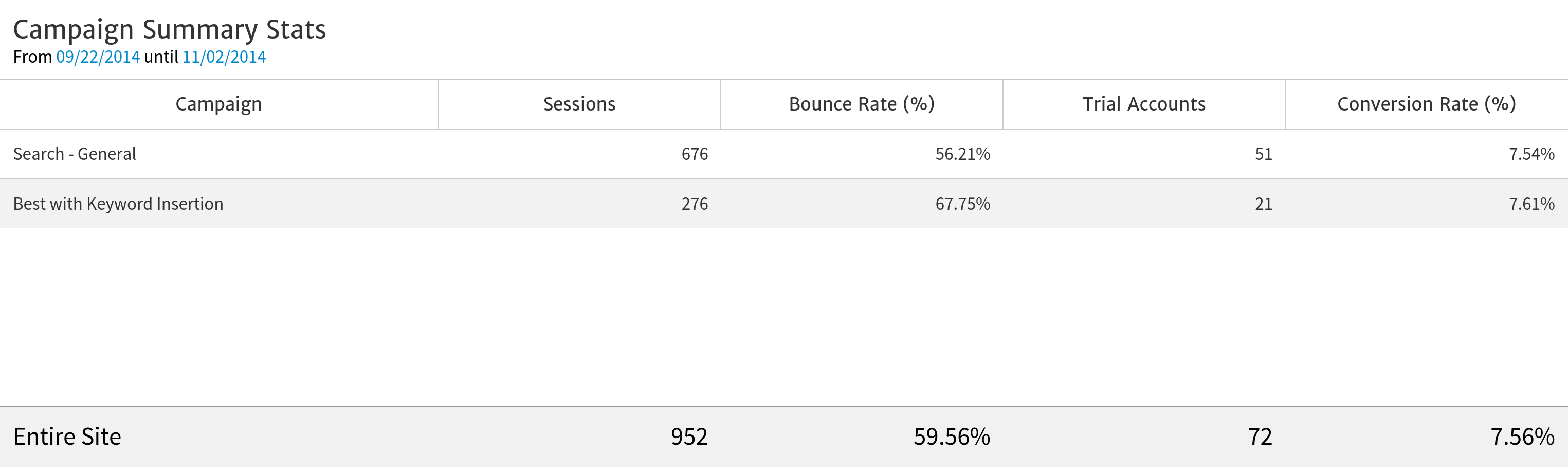
From this table, the client can quickly and easily compare the campaigns across key metrics. The new campaign is bringing in a more engaged audience – as you can tell by the significantly lower bounce rate. Although the conversion rates are roughly the same, because the new campaign is generating a higher volume of traffic, it ends up generating more than double the number of trial accounts.
In Megalytic, this table can be created simply by changing the display type of the Weekly Trial Accounts by Campaign chart (above), from a bar chart to a table. Watch the video to learn how.
Video Tutorial
Learn how to create a summary table that compares metrics from multiple campaigns.
[youtube id="JdaRg6sjjE8"]
At this point, there is still one key piece of information the client needs to completely evaluate the performance of these campaigns – the cost.
Comparing the Cost Effectiveness of the Campaigns
Since these are both AdWords campaigns, the cost information for each is available in AdWords and in the client’s linked Google Analytics account. As a result, you can use Megalytic to create a table that compares the performance relative to cost of these two campaigns. This table will include these metrics:
AdWords Clicks - to measure the number of clicks generated by each campaign. This should roughly correspond to the Sessions, but will be a bit lower, since Sessions counts repeat visits. If a user clicks on an ad, and then comes back the next day via a direct visit, then Google Analytics will count two sessions but only one AdWords click.
AdWords Cost - the total cost of each campaign.
Goal Completions - this is the number of trial accounts created, as measured by Google Analytics Goal Completions.
AdWords Cost per Goal Completion - the cost efficiency of the campaign, showing the average spend required for each trial account.
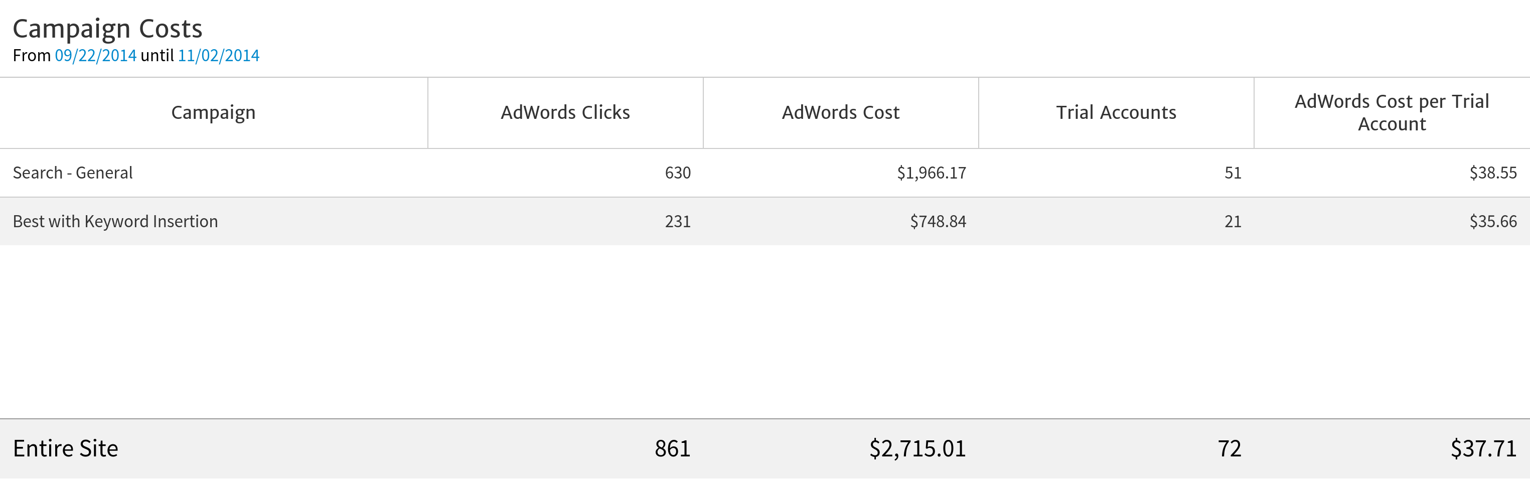
The key metric in this table is the AdWords Cost per Trial Account. The client’s goal is generating trial accounts, so they want to know the cost per trial account for running each campaign. Here, we can see that the new campaign (“Search – General”) costs slightly more than the old campaign (“Best with Keyword Insertion”).
Which campaign should the client prefer? Probably, the new one. Although it costs a little bit more to run, the “Search – General” campaign produces more than double the number of trial accounts. To answer this question definitively, we need to know the value of a trial account. Hopefully, the value significantly exceeds the cost for each campaign. In that case, the client makes more money running the new campaign because of its increased volume.
Creating this table in Megalytic makes use of one of the AdWords widgets. Watch the video to learn how.
Video Tutorial
Learn how to create a summary table that compares cost metrics from multiple AdWords campaigns.
[youtube id="5Yys45MeocY"]
Include Comments and a Cover Page
Once your report shows the right data for your client, add comments and a cover page to produce a truly professional result.
Comments, in particular, help the reader to interpret the data in your report. Not everyone immediately grasps the message conveyed by a chart or table. Text provides context, drives home the key insights and helps tell a story.
The cover page can be used to provide a short summary of what is contained in the report, the key conclusions and any recommendations. For this report, a cover page could contain text like this:
As the company has recently switched campaigns, this report compares the performance to determine which campaign is working better. It looks at the last six weeks, comparing three weeks of the new campaign with three weeks of the old campaign.
As you can see, the new campaign produces more traffic and more trial accounts. However, it costs slightly more per trial account produced.
We recommend sticking with the new campaign since the value of a trial account is still much higher than the average cost per trial account ($38.55) and the volume of trial accounts generated per week has more than doubled.
It is also a good idea to include comments either below or above any charts and tables in your report. This helps your client to understand the message behind each graphic and to move through the story the data is telling.
For example, beneath the first chart in this report (Weekly Sessions by Campaign), the following text helps your client to understand the context for the rest of the report, as well as grasp the key insight from the chart.
This chart looks at two campaigns over the last six weeks. The old campaign (“Best with Keyword Insertion”) ran during the last week of September and first two weeks of October. The new campaign (“Search – General”) replaced it and ran during the last two weeks of October and the week of November. As you can see, the new campaign has more than doubled the traffic to the website compared with the old campaign.
Here is how the comment looks with the chart positioned above it.
Megalytic includes features that make it easy to add a cover page and comments to your report. Watch this video to learn how.
Video Tutorial
Learn how to add comments and a cover page to your report.
[youtube id="IpWiur1Wy68"]
The Completed Report
The completed report can be downloaded from Megalytic as a PDF file. You can also share the report using a link to a web page.
Here is the PDF version of the report created in this blog post.
Conclusion
As marketers, we all want to do right by our clients. That means taking the time to understand our client’s business concerns, and then building customized analytics reports to specifically address them – answering both the questions they have asked and the questions you know they should have asked. Once you know what data you want to present, a reporting tool like Megalytic can help you tell that story in an attractive and easy-to-understand way. In doing so, you’ll not only help your client to succeed by reporting on the right metrics, but you’ll establish yourself as a partner in their business.

