The graphic nature of Treemaps can help you quickly identify channels that are driving low and/or poor quality traffic. From this you can determine where you may need to focus more efforts while also identifying underutilized channels.
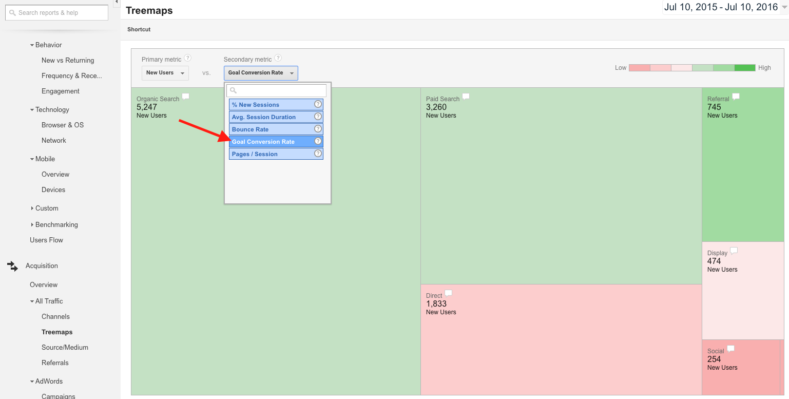
In this example, we’re looking at data by channel (the default view for this report), choosing New Users as the primary dimension and Goal Conversion Rate as the secondary dimension. This particular configuration will show us which channels are most likely to drive new, converting visitors to the site.
Now, we can make a few observations:
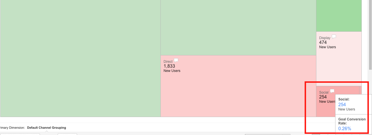
You can mouse over the speech bubble in any rectangle to see more specific numbers. For instance, here we can see that Social has a conversion rate of just 0.26%.
Comparatively, Referral traffic has a conversion rate as high as 1.49%. From this, we can infer that Referral traffic has been converting most successfully while Social is the least likely channel to drive a conversion.
In reporting performance by channel, we could recommend that this brand spend some additional time strategizing how to drive more traffic from social media. This can include changing their messaging and or cultivating more options for a socially engaged audience to convert, such as a newsletter signup.
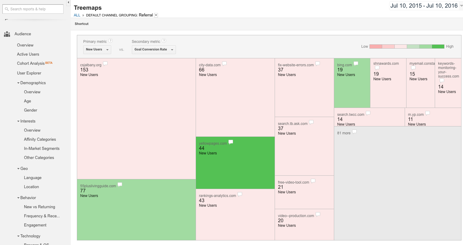
You can click any channel to see a more specific breakdown of performance by category. When you select Referral, you’ll see the sites that referred traffic to the site listed in the report. You can now easily pinpoint which ones drove conversions, as well as which ones drove lower quality traffic.
Here, we see referrals for a retirement community. Interestingly, yellowpages.com actually shows the highest conversion rate (yes, the Yellow Pages are alive and well online). 55pluslivingguide.com, a natural fit for the target demographic, also shows as green. This information can validate paid listing decisions. Finally, Bing.com shows as a converting referral, although these visits are likely miscategorized organic search visits.
Also, several of the sites in red are actually spam referrals: rankings-analytics.com, fix-website-errors.com, free-video-tool.com, video-production.com, and keywords-monitoring-your-success.com. In this case, the Treemap report helps to quickly flag these false referrals so you can segment these out of your reports. See more details on identifying and removing these metrics in our article How to Filter Out Fake Referrals.
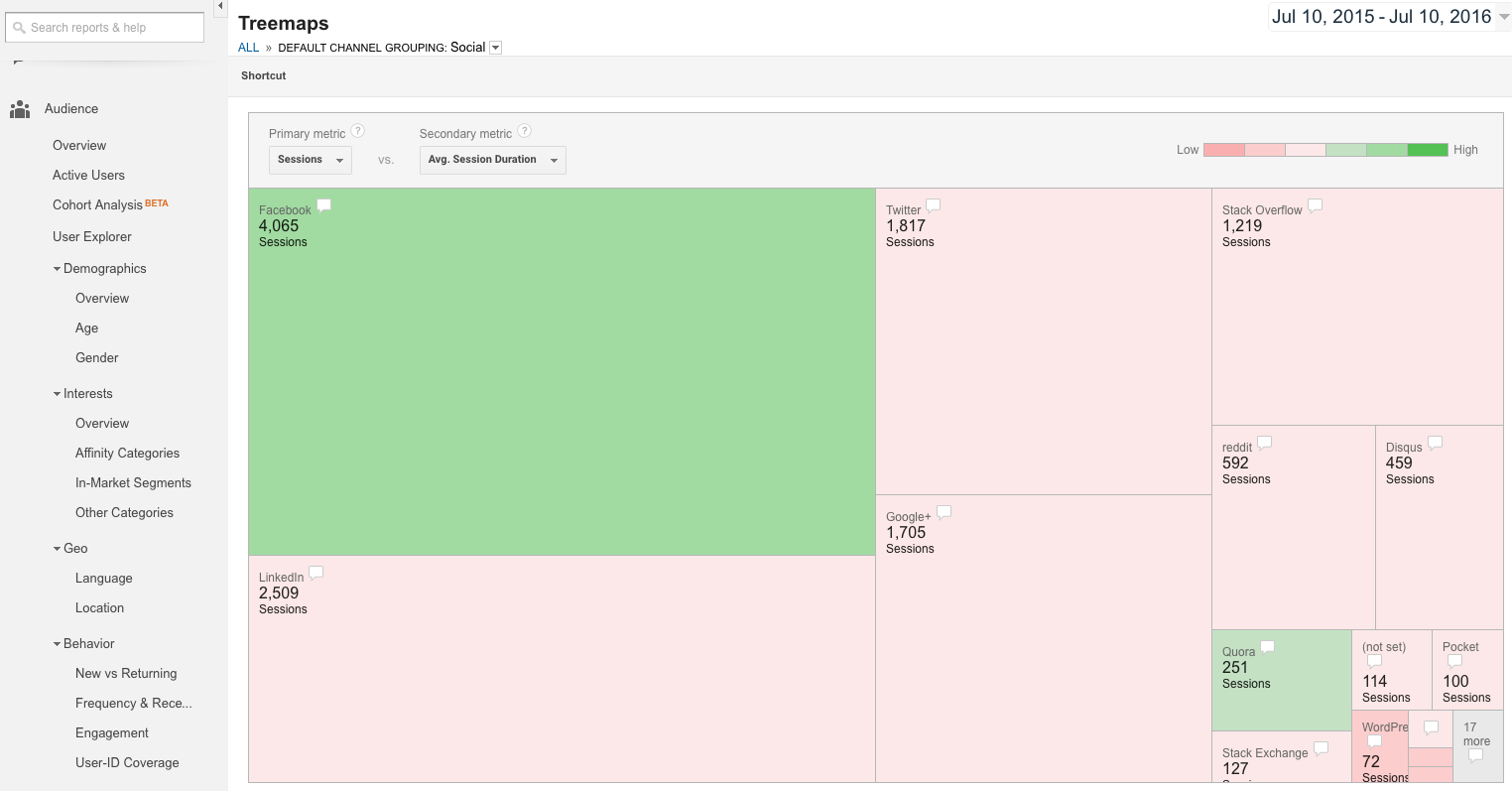
By clicking the Social channel, you’ll see performance broken down by each social network that drove traffic to the site. Here, we’re looking at social media performance for Megalytic, where people are often apt to read blog posts. By looking at Sessions as the primary dimension, we can evaluate total traffic. By choosing Avg. Session Duration as the secondary dimension, we can gauge engagement levels based on the time the average user dedicated to the post.
From this we can see that Facebook is not only the largest contributor of traffic from social media but also the network from which people tend to spend the most time reading articles. While LinkedIn also drives a decent volume of traffic, the people referred from that platform are spending less time on the site, on average.
We also notice that Quora stands out as a referrer of engaged visits. If you’re unfamiliar with Quora, this site allows users to pose public questions that anyone can answer. By establishing expertise with analytics-related questions, Megalytic has links from the site within the context of relevant discussions.
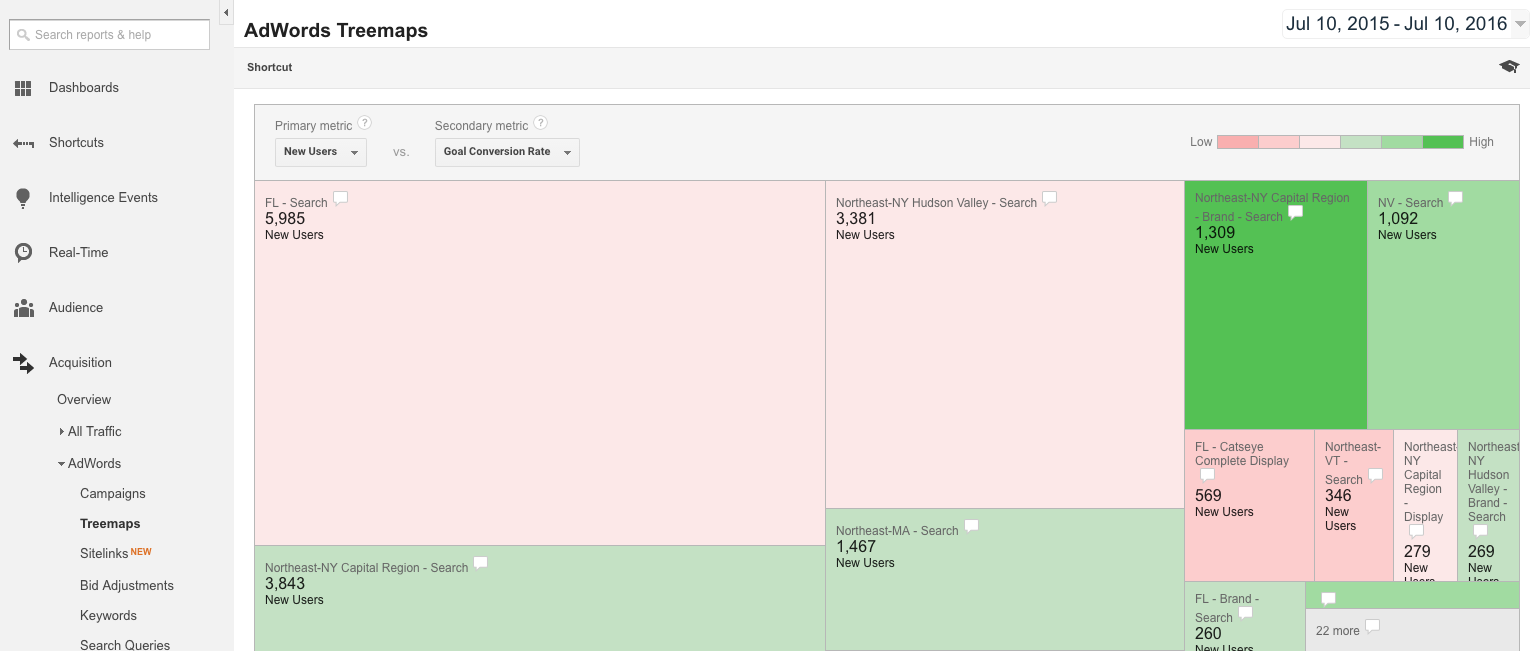
In addition to the main Google Analytics Treemaps report, you can access an additional Treemaps report specific to AdWords under Acquisition > AdWords > Treemaps. As long as you’ve linked an active AdWords account to your Google Analytics account, you’ll see data here to help evaluate AdWords campaign metrics. You can pinpoint campaigns that you should prioritize working on to improve conversion performance.
For instance, here we see performance by campaign for a pest control company serving multiple regions of the USA. Looking at New Users by Goal Conversion Rate, we can immediately see that the “FL-Search” campaign drives the highest traffic volume but has a lower conversion rate than campaigns for other areas, such as the “Northeast-NY Capital Region” or “Northeast-MA” campaigns.
Based on this data, we should focus on the Florida campaign for conversion optimization, looking at keywords, bids, ad copy, and the landing pages linked from the ads. For more on evaluating the efficacy of campaign set up, see our article on Tips for Structuring Search Campaigns in AdWords.
In this report, we’ve covered some practical applications of the Treemaps report to help improve your analysis of online performance data. This report allows you to quickly flag high and low performers among channels, while delving into specific metrics for site referrals, social media, and AdWords campaigns.
If you haven’t looked at the Treemaps report yet, take some time to review it in your Google Analytics account. You may find it will identify both opportunities and problems that may not have been seen elsewhere. The best way to improve your web marketing approach is to use all of the resources at your disposal. With this report, you have a better opportunity to see the big picture.