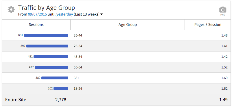
When you first add the Traffic by Demographics widget, you’ll choose a Google Analytics view to connect. You’ll then see a table graph breaking down Traffic by Age Group.
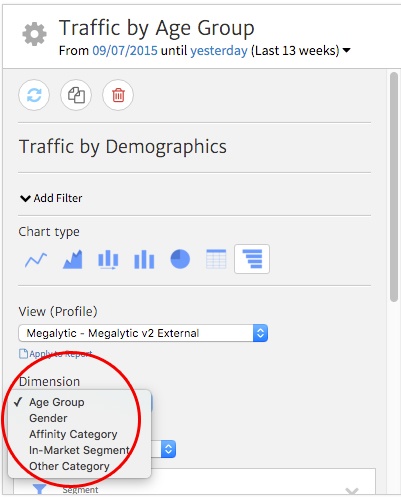
You can, of course, choose to show other data besides age here. Within the widget options, you have the option to break down data by one of five dimensions:
Google Analytics breaks down age group into six buckets.
Note that data about visitors under 18 years old will not appear in this report to keep data private for minors.
With this option, you’ll see data broken down by male vs. female. As with other demographic dimensions, this information comes from data tracked via the DoubleClick cookie (used for ad tracking) and mobile app advertising IDs. Information from Google profiles may also contribute here.
Affinity categories describe the lifestyles of your visitors based on their web browsing behavior. If they frequent sites that fit a specific topic, you’ll see that category show up in the report. Note that the same users may be counted in multiple categories where they fit. Examples of categories include:
In-market segments include users who show intent to purchase goods or services based on their general online activity. Examples of segments include:
This dimension includes highly-targeted categories that zero in on specific visitors’ interests within the broader Affinity Categories and In-Market Segments.
For example, Food & Drink breaks down into further categories, such as the following:
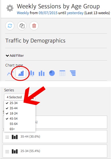
You can portray demographic data in various ways by changing the type of chart used in this widget. For instance, if you want to compare how each age group segment has contributed to traffic over time, you can select an Area Chart. This is the second icon under “Chart Type” in the widget options.
Once you’ve selected the chart type, you can then choose which categories to show in the actual widget. In this case, we want to choose the age group segments that will appear in the report. Use the “Series” dropdown to select your desired options, and click “Apply to Report” to update the widget’s appearance.
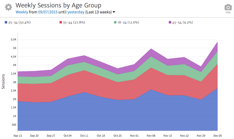
In the final widget, you’ll be able to see how each age group compares to the others size-wise, as well as how changes have occurred over time.
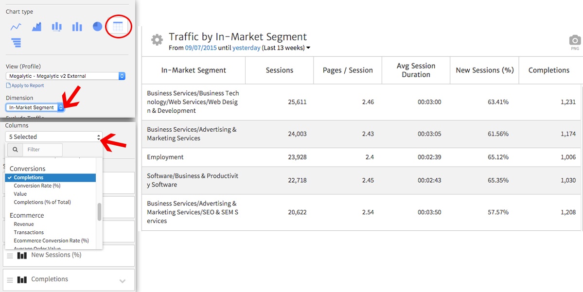
Next, for visitor interests, you may want to simply show a list of the top categories. The Table View comes in handy here to show category names, along with metrics for each.
Here, we’ve selected the Table View icon and switched Dimension to In-Market Segment. We can see traffic and engagement performance for each segment, customizing the available metrics by using the “Columns” dropdown at the bottom of the widget options. In this case, we’ve added a Completions column to show how many people from each segment actually completed a Goal on the site (in this case, a free trial signup).
Now, we can see the top In-Market Segments in which people fit when visiting your site, along with how long people are spending on your site for each and how many result in Goal completions.
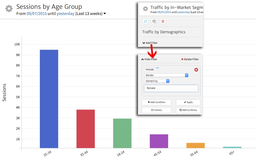
You may want to show demographic data more specifically than the default widget options allow. For instance, you may want to break down visits by age group specifically for women who came to the site. Using Megalytic’s custom filtering option, you can apply a filter to the report using one or more metrics or dimensions.
Select “Add Filter” from the widget options, and then choose the parameters for your desired filter. In this case, we’ll choose to include any sessions in which Gender contains “female,” limiting our data to women who visit the site. We’ll also choose to show a dimension of Age Group with a bar graph for chart type.
Once we’ve applied the filter and our other options to the widget, we’ll see the final data. Now, we can clearly show that the majority of women visiting the site fall in the 25-34 age bucket, with each successive age range dwindling from that point on.
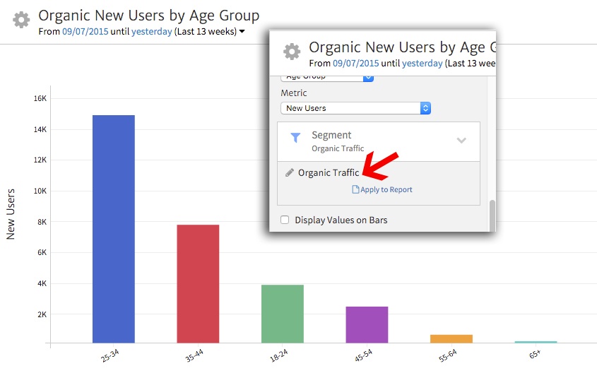
Imported Google Analytics Segments can also be applied as another way of showing more specific data. You can apply any Segments available via your currently synced Google Analytics view.
For instance, we may want to break down age groups of people who found the site via organic search. To do this, select the Segment section of widget options and click the current Segment name (default will be All Sessions) to see a list of available ones to apply.
In this case, we’ve chosen Organic Traffic, as well as selected New Users from the Metric dropdown above. The graph will now break down age groups for organic visitors tracked as coming to the site for the first time.
Megalytic’s Traffic by Demographics widget offers a number of ways to show data about age, gender, and interests for your website traffic. You can show information from beyond your website to data tracked via outside sources about people who came to your site.
By choosing from among several chart types and possible demographic information, you can portray specific data about who is coming to your site. Use segments and filters to drill down even more specifically to categories of individuals that you’d like to track.