Google Analytics segments allow you to easily look at subsets of data within your account. For example, you can apply a segment to a Google Analytics report to show only the pages viewed by visitors who arrived at your site via organic search. Google provides a built-in segment for this purpose called the Organic Traffic segment. You can also use segments to view only traffic that has completed specific goals or completed a purchase. A few caveats: Transaction- and conversion-based segments require the setup of Goals and/or ecommerce tracking in your account. Also note that some segments are based on a User (an individual person tracked via cookie or Google’s User ID feature), while others are based on a Session (a visit to the site). At the time of this article (note that Google updates these periodically), system-defined segments (i.e, built-in) include the following.
Beyond these system-defined segments, you can specify practically infinite combinations of criteria to create custom segments. See Google’s help section for more on building your own customized segments within the Analytics interface.
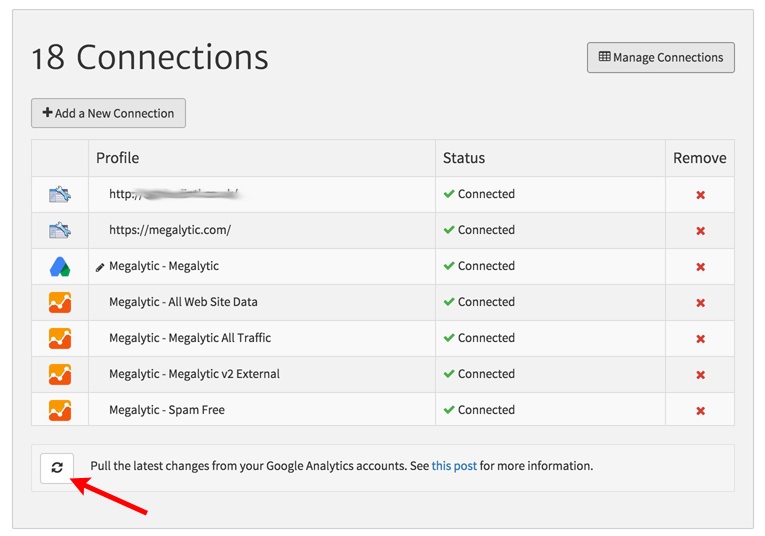
System-defined segments are automatically made available in Megalytic. Custom segments are also pulled in to Megalytic. Once you’ve created some custom segments, they will sync with your Megalytic account via connected Analytics accounts. Megalytic will automatically pull in new segments periodically, but if you want to quickly pull in a newly created segment, you can force a synchronization. Go to the Management section of Megalytic and click the icon at the bottom of the Connections section.
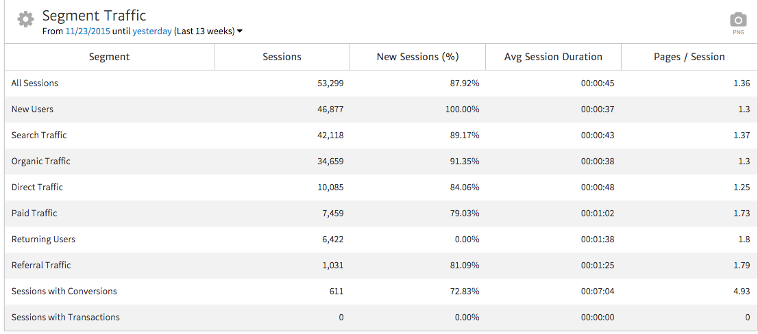
When you first add the Traffic by Segment widget, you’ll see a table showing ten default segments, with a few metrics broken out for each. To begin customizing this widget, select the gear in the upper left.
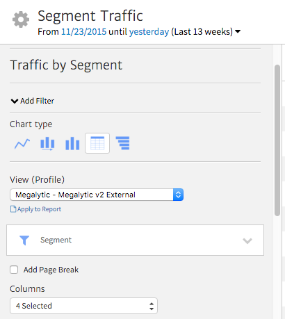
You’ll see several options customizing this widget to meet your needs. First, you’ll be able to choose from five different chart types, including a line chart, time series bar chart, bar chart, table view, and table graph. The one you select will depend on your audience and what you’re looking to convey. Each chart type target=_blank> has its own particular uses.
Next, below the dropdown where you select your Analytics view, you’ll see another dropdown to select the segments you’d like to use in your report. Click the arrow and then click any segment to open a window where you can choose from segments to apply. Here, you can select either a system-defined segment, or any custom segment that has synced from the Analytics accounts that authorized your Google Analytics connections. If the choices are too abundant, the search bar can help you quickly find particular segments you want to use.
For this example, let’s say we want to compare behavior between visits that resulted in free trial signups (Sessions with Conversions) and visits as a whole (All Sessions). We’ll select those two segments and apply them to the widget.
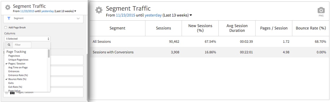
Next, we’ll choose the metrics we’d like to show in the report, using the Columns dropdown. Simply click each desired metric (click on a checked one to uncheck and remove it from the widget). Once applied, we see the final widget showing our desired metrics for each segment.
Right away, it’s apparent that there is a significantly higher Average Session Duration for visits that result in conversions. This suggests that people are signing up for the free demo and then spending time using the software. In addition, we can also note that the Pages/Session are significantly higher for visits with conversions than for visits as a whole. Finally, we can see that very few conversions occur off of first-time Sessions (only 17%), indicating that people who finally decide to sign up have spent multiple times visiting the site. This data picture can help a business better understand the on-site behaviors of converting users and then develop a marketing strategy catering to those tendencies.
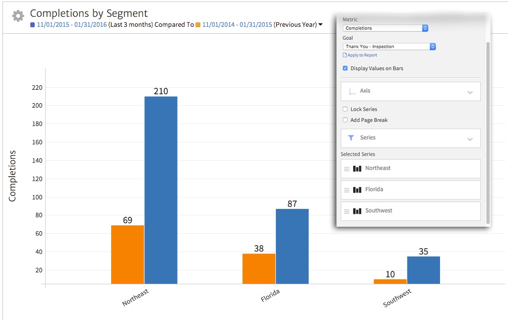
Using a bar chart allows you to easily compare high level data among segments and over time. For instance, we set up the widget to compare conversion performance across different market regions, with a custom segment setup for each region.
After selecting the bar chart, we can choose Completions as the metric. From here we’ll select an inspection request as the specific Goal. Next, we choose the segments we’d like to show via the Series dropdown. Finally, we set the date range to compare to last year at the same time. Our final widget shows total Goal Completions by market region for the current period vs. last year.
Based on this data, we can demonstrate the significant growth in lead generation across all regions, with the Northeast reflecting the highest volume and the greatest increase. By leaving the “Display Values on Bars” option turned on, we can show exact numbers for each, providing detail in our reports for clients or team members that prefer to see the specifics.
The Traffic by Segment widget provides a powerful way to customize your reports beyond the default data included in Google Analytics. By creating and syncing custom segments, you can compare performance by factors such as user subsets or market regions.
With this widget in mind, the time and energy spent setting up your Google Analytics settings for your own analysis can also be used to provide better data categorization and better reporting for internal and external clients. The level of insight you can achieve through setting and reporting segments may improve your ability to acquire and serve new customers. In the case of segmentation, often, the closer you look, the clearer the message becomes.