
May 20, 2024
Analytics Vs. Reporting: Adding Insight to Data
By Megalytic Staff - June 21, 2017
Explain the Data
Whether you’re working with a pest control company or a jewelry ecommerce store, a client’s primary concern is return on investment (ROI). It doesn’t matter how many users visited a site, how long the average session duration lasted or what pages were viewed if the website is not driving profit for the business.
When you’re building a report, keep your client’s bottom line in mind. For instance, consider the following chart that shows key performance indicators from AdWords:
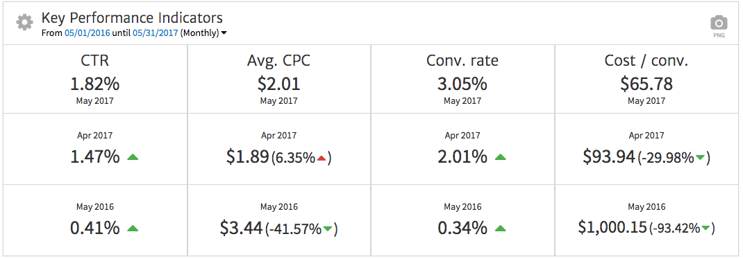
Overall, this data shows excellent performance, especially considering the numbers that are most important to the bottom line (conversions). The campaign’s conversion rate has increased significantly, while cost/conversion has decreased.
However, without an explanation, a client who looks at this chart may hone in on the one red arrow showing that CPC has gone up month over month. In turn, they may question if this increase means the campaigns aren’t going well, while ignoring the conversion data.
In this case, a simple explanation will clarify that conversions deserve more focus than clicks. The reasoning here is that conversions relate directly to people contacting the business, while clicks simply mean a visit to the site. Ultimately, paying less per conversion outweighs how much you pay per click. In addition, the cost per click increase was insignificant month over month (a few cents) while it has decreased from the previous year at the same time. Since data may vary widely from month to month, in most cases, long-term change generally works as a more effective benchmark to pinpoint trends over time.
Adding commentary to the report defining each metric, showing what is most important and explaining why it is important and how it drives strategic change will help to assuage client concerns and differentiate a well thought-out report from a data dump.
Clarify with Visualization
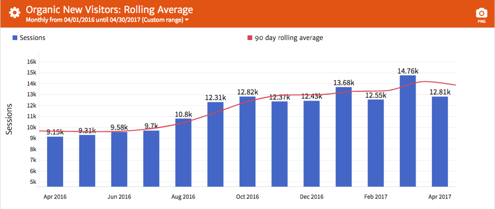
Humans tend to be visual creatures, so graphs may speak louder than tables of numbers to show trends over time. For instance, look at the following table showing organic traffic numbers over a year:

You have to take some time to look through the numbers in order to determine which months were better than others. Of course, you can still discern that there was an upward trajectory over time, but the graph below makes this trend much more visible.

Here, your client can see, at a quick glance, that organic new users have demonstrated a steady increase over time. The “rolling average” line helps to clarify this progression by averaging out data obtained over a longer period. Of course, you’d also want to add commentary to point out this improvement, along with a recap of the work you performed that may have contributed to the results.
Of course, choosing the right type of chart for the data you’re presenting is important. For more insight on this, see our series on Deciding How to Represent Website Data .
In this case, delivering either the table or the graph would constitute analytics. But reporting on the other hand is determining how to convey the data based on your understanding of what resonates with the client and determining the format that best illustrates the insights within the data.
Cherry-Pick the Most Important Data
When evaluating an analytics account, you may review numerous different metrics, assessing pages/session, bounce rate, events triggered and pages appearing in a conversion funnel to account for performance. However, unless your client comes from a highly technical background, too much data may just be overwhelming. Flooding a report with data can distract or obfuscate what’s actually important and relevant to their business.
In line with highlighting a return on investment and visualizing data where it makes sense, focus on the key metrics that actually best relate to your client’s business concerns. For instance, if you’re showing AdWords data, a CEO may not need to see pages showing the performance of every single ad and keyword in a campaign.
However, showing the top 10 ads and keywords can help provide a high-level view of key performing areas. In addition, a campaign-level breakdown shows aggregate data, which helps the client review the report quickly and see which areas are driving the most leads at the most effective cost. This can also help to show patterns that may drive decisions about bid allocations moving forward. All of which should be outlined in the commentary.
Of course, consider who you’re writing a report for. A marketing analyst may want to see more detailed breakdowns of specific numbers to help understand the performance of ad copy tests. But a “big picture”, higher level, executive will likely care more about the key performance indicators (KPIs) that are most directly tied to ROI, like overall leads (conversions), conversion rate, and cost per conversion.
Make Recommendations for Improvement
Turning analytics into reporting also means making recommendations for action that will help boost a client’s campaign. For instance, you may observe that text ads using a “free shipping” call to action (CTA) perform better than ads that say “buy now.” Armed with that insight, you can start featuring the “free shipping” message in graphic ads, taking advantage of the more effective CTA in other channels.
These recommendations show your client that you are not only actively monitoring their accounts but also looking for ways to improve their business. But take it beyond observation and make sure to communicate recommendations that relate to your client’s ROI. If you’re looking at bidding on new keywords, talk about user intent and how various queries can indicate prospective customers in market to purchase services.
As you move forward with additional tactics in campaigns, be ready to show results in the next report that you deliver. Notate benchmarks, study the data to see if new ad messaging or keywords worked to provide better conversion and continue to make recommendations based on that analysis.
Conclusion
As you build your next digital marketing reports for clients, think through the process of providing thorough reporting that goes beyond a wall of analytics data. Keep your client’s ROI-based priorities in focus and extract the most significant metrics from the analytics. Also include any data, positive or negative, that stimulates strategic ideas to show that you’re thinking forward. Finally, hone in on a method of displaying information in a way that provides clarity and accommodates their level of technical expertise. Anyone with access to their Google Analytics can see what you see, at least on the surface. What you bring to the table as an expert is your ability to see the messages inside the data. It’s also what makes you such an important part of your client’s campaign.