Time Series Bar Charts are used to show the changes in a metric over time as a series of bars.
Time Series Bar Charts are used to show the changes in a metric over time as a series of bars. You can also graph multiple series this way, to show the breakdown of a metric across dimensions, and how the values vary over time. For multiple series, the bars for each time period are clustered together, like this.

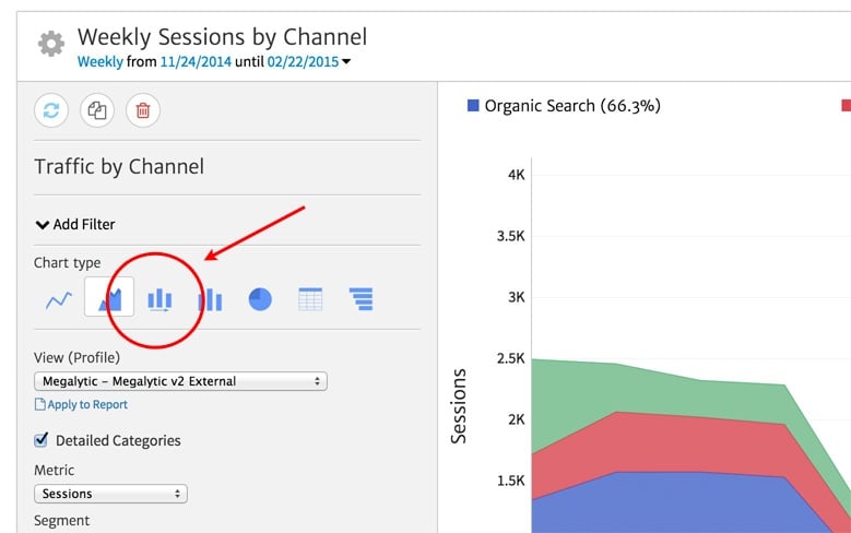
Most of the Megalytic widget support the Time Series Bar Chart Type – although the default Chart Type may be different. (For a video showing all the chart types, see: Working with Chart Types). To switch the Chart Type to Time Series Bar, first click on the gear symbol in the upper left to open the widget editor.

Inside the widget editor, under “Chart type”, select the bar symbol with the arrow underneath for the Time Series Bar Chart Type.
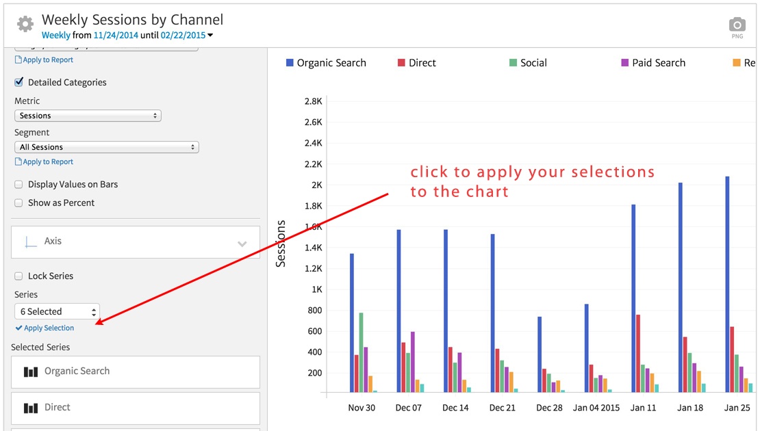
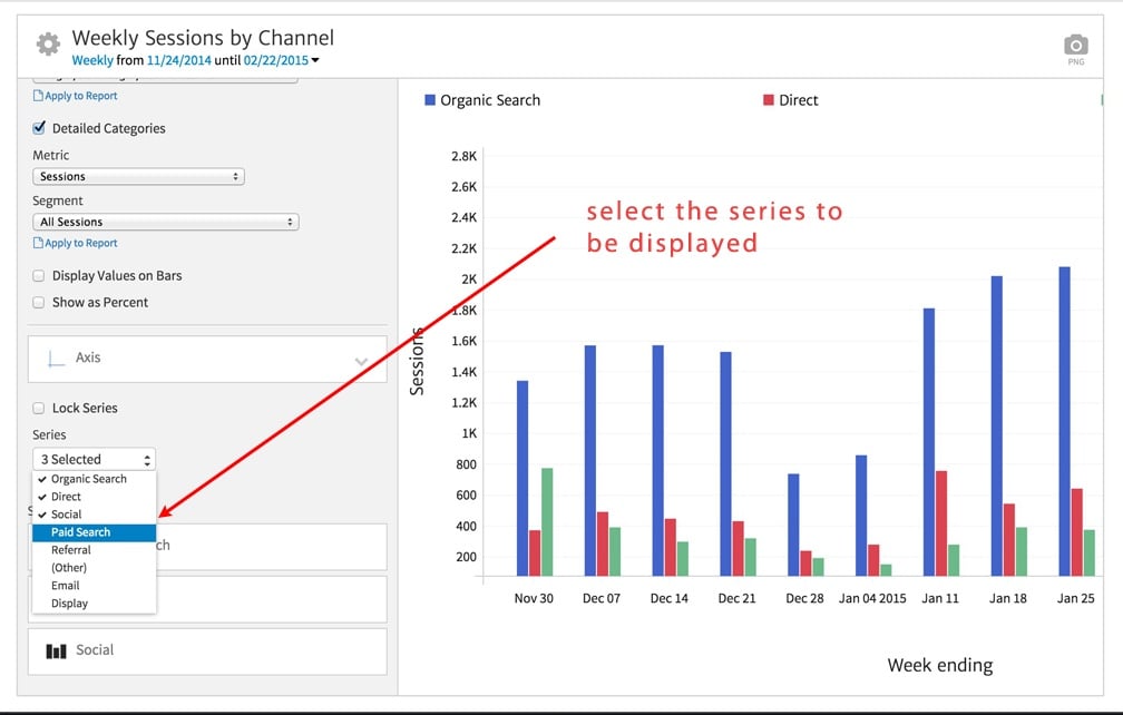
By default, three series are displayed – clustered as a group of 3 bars on each time period. You can change the series that are displayed by using the Series selector in the widget editor, as shown below.

After making your selections, click “Apply Selections” to apply your selections to the chart. In the example below, we have selected 6 series, and you can see that each time period in the chart now shows a cluster of 6 bars.