Some Megalytic charts can display rolling averages of data. For example, below is a chart produced from the Rolling Average Comparison widget.
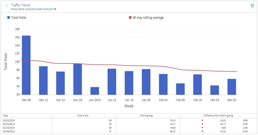
In this chart, the blue bars show the weekly number of total visits. The red line shows the 90-day rolling average of weekly visits. While the weekly visits bounce up and down, the 90-day rolling average is smoother – providing a better idea of the long term trend in traffic.
A 90-day rolling average (sometimes called a moving average) is simply the average taken over the last 90-days. A good explanation of how rolling averages are useful in web analytics can be found in this article: The Math Behind Web Analytics.
Many analysts compute rolling averages in Excel (as described in that article). Megalytic does that for you.
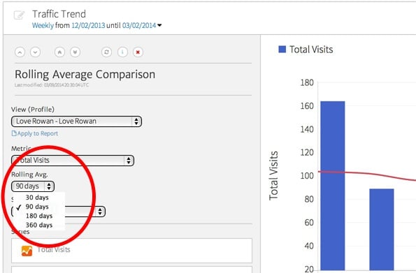
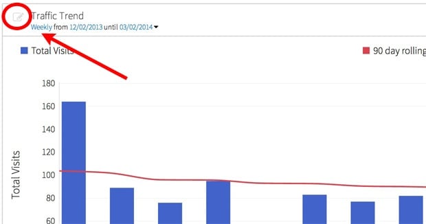
You can customize the period used in the rolling average (e.g., 30-day, 90-day, 180-day, etc.) from inside the widget editor. First, open the editor by clicking on the edit icon in the upper-left corner of the chart, as shown below.
When the widget editor opens, you will see a select box that lets you change the period for the rolling averages.