Good reports tell a story. When you are designing your web analytics report, think about the story you are going to tell when you present it to your audience. Even if you are simply emailing it to them - design it as if you were going to stand up in front of your audience and present it.

But, what story should you tell? That starts with knowing your audience, as we discussed in our last post. Ideally, you have had some discussions with your audience before creating your report. They should have told you what topics are of interest. From there, you should have applied your web analytics skills to decide which metrics are most relevant to those topics. If you haven't been able to talk with your audience, then hopefully, you have at least mentally put yourself in their shoes and thought about what you would be interested in if you were them.
For the purposes of this post, we are going to assume that your audience is the Marketing Department and that one of the topics they are interested in is website engagement. The have told you that they want to know whether visitors are engaged or not and what determines how engaged they are. Furthermore, they have told you that they consider an engaged visitor to be one who has viewed at least 6 different pages on the site.
Here is a sample report that you might have produced for the Marketing Department in this scenario. Have a look at it while you read the rest of this post. It illustrates the main points.
Use a Cover Page
A cover page is useful because it orients your audience to the content that they are about to read. A good cover page should tell the audience what important question the report answers. I like to use the sub-title for this purpose. In this example, the subtitle is "How engaged are our visitors and where do they come from?". This should be the question that the Marketing Department told you it was interested in. The title should simply tell them which report this is (as you may be providing them with more than one). "Engaged Visitor Update" is simple and to-the-point.
It is also a good idea to include some descriptive text on the cover page. This emphasizes who the report is for - "Monthly Report prepared for the Marketing Department". It also describes at a high level what the report contains - "Summary of trends and sources of engaged visitors to the website". If there are any terms which are important to define, this is a good place to do it. Here, we defined what and "engaged visit" is, reinforcing that we are using the definition provided to us by the Marketing Department.
Lastly, it is often a good idea to include some "key observations" in this cover page. These are the highlights or important insights provided by the charts and tables within. Include observations that you think will be of particular interest to the audience. Since the Marketing Department handles direct email campaigns, one of the observations called out here is that "Direct email campaigns are the fastest growing contributor to overall engagement".
Start General and Get Specific
It is usually a good idea to start with a general overview chart or table. Use something that will provide the audience with background that is relevant to the rest of the report. In this case, we are using a time series chart that combines visits, engaged visits, and the engagement rate (Engaged Visits %). This shows the audience, at a glance, what the trends are in traffic to the site and the percentage of that traffic that is engaged. This kind of background information serves two purposes. First, it answers one of the key audience questions about trends. Second, it provides context for the other charts and tables. For example, now the audience will know that when the see engagement rates in other charts that are above 5% - that is a good number relative to the site average.
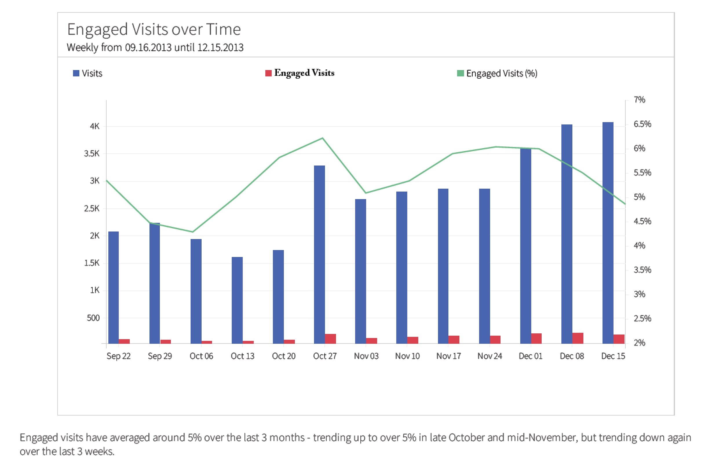
As you see in the above image, it is also a good idea to include some summary text along with each chart or table. This reinforces the insight to be gained from the chart. In this case, we are pointing out the relative stability of the engagement rate, along with the decline in the last 3 weeks.
As you browse through the next few charts in the report, you will see that they are all general - Engaged Visits by Country, Engagement by Platform, Source of Engaged Visits. The next chart is also titled "Source of Engaged Visits", but it is more specific than the pie chart.
Introduce Time as One Method of Getting Specific
The pie chart shows the breakdown of engagement during an entire 13 week (3 month) period. The area chart shows how that breakdown has changed over time. One way of getting more specific is to segment the data along additional dimensions. In this case, we started with the source dimension (without time). Now, we are introducing the time dimension. The additional insight to be gained by getting specific in this way is that the "Email Referral" source has clearly grown in importance over the last 13 weeks.
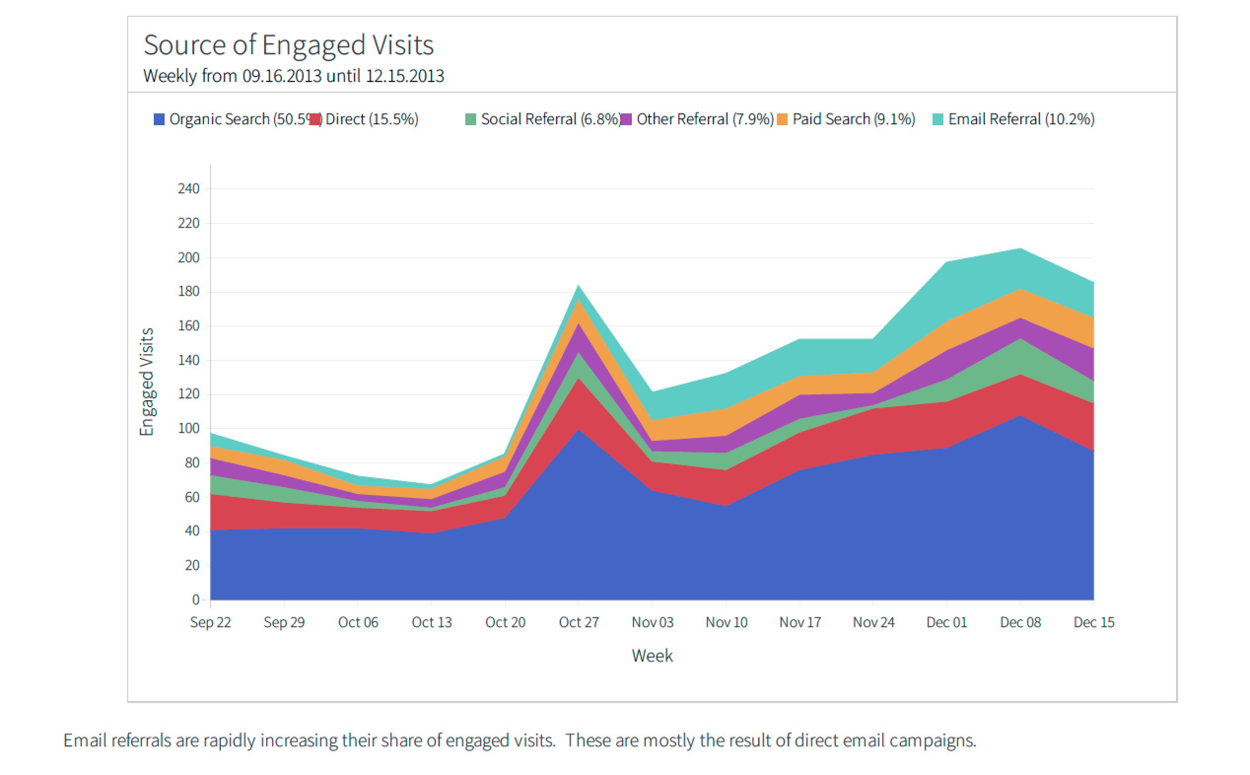
Notice that in the case, the summary text for this chart points our the primary insight gained by drilling down along the time dimension. "Email referrals are rapidly increasing their share of engaged visits".
Summary
To summarize, a good web analytics report tells a story that your audience wants to hear. In the example report used here, the story is about engagement - a key issue that our audience has identified. The charts and tables all describe some aspect of engagement - the overall trend, its sources, its relationship to social media, the landing pages producing the most engagement, etc. We've also shown and example of one way that you can get more specific - by first segmenting data along one dimension (source) and then showing how that varies over another dimension (time).
The next installment in this series will look at how to best distribute reports and get feedback from your audience.
Part I: Know Your Audience
Part II: Tell a Story
Part III: Get Feedback

