
Using the AdWords Campaign Widget
The AdWords Campaigns widget allows you to break down performance by campaign, selecting the metrics most important for your report, shown in the chart format you desire. When you add this widget to a report, you’ll first be asked to select an AdWords account to use, or to connect one if not already connected with your Megalytic account.
Once you’ve chosen your desired AdWords account, you’ll see the widget displaying a table format with four default metrics: Clicks, Impressions, CTR (clickthrough rate), and Avg. CPC (cost per click).

Customizing the Table View
Before use, you’ll likely want to tweak the widget further to display additional metrics or to show data in a different format. First, let’s examine a few ways to customize the default table format. Click the gear in the upper left to see the widget options.
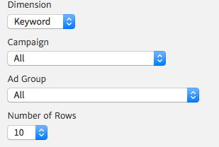
Perhaps you want to break down data by ad group or keyword instead of by campaign. You can do so by selecting the “Dimension” dropdown within the widget options, choosing from Campaign, Ad Group, Ad, Keyword, or Account.
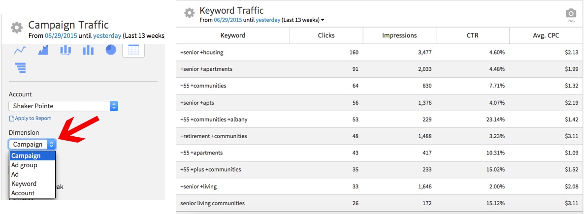
In this example, we’ve chosen to show data by Keyword, so you can see how the final report updates to include keywords from the AdWords account. If you’d like to filter data to keywords from a particular campaign or ad group, use the respective dropdowns that now appear under the Dimension dropdown. You could even create multiple widgets, each showing keywords from a different campaign.
You may want to show more than ten keywords in your table. You can do so using the “Number of Rows” dropdown, adding up to 300 rows. The opportunity to display anywhere from 10 to 300 rows makes this widget useful both for high level performance reports and in-depth analysis. Your CEO can see the top ten keywords, while your marketing team can see a breakdown of hundreds of keywords to closely assess which ones were most effective.
Changing Table Columns
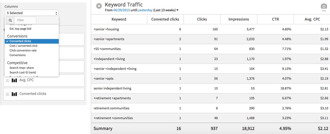
If you want to change the table columns from the default options, use the “Columns” section at the bottom of the widget options. Choose your desired column(s) from the dropdown and click “Apply Section” to add to the report. You can also click and drag the current columns listed below the dropdown to rearrange their order (be sure to click the stack of three lines on the left to move any of these).
For instance, you’ll likely want to show conversion results in your report. To add a Converted Clicks column, find that metric in the Columns dropdown and select it to add. Once you’ve chosen “Apply to Selection,” you can move that metric to the top of the list to make it the first column. Note that Megalytic will sort data by the first column of any widget.
Using a Line Chart to Show Trends
To show trends in your AdWords account over time, use a line chart to demonstrate how metrics have gone up or down. Choose your chart type from the icons at the top of the widget options (Line Chart is first in the list). Next, you can customize the Dimension (Campaign, Ad Group, etc.) and Metric (Clicks, Impressions, etc.) you’d like to show in the chart.
In this example, we’re choosing to show clicks by ad group over the past 13 weeks. The final chart provides a quick snapshot of how these three ad groups compare in click volume, as well as when clicks have gone up or down for each, providing a window into how interest has varied over time for different sets of keywords.
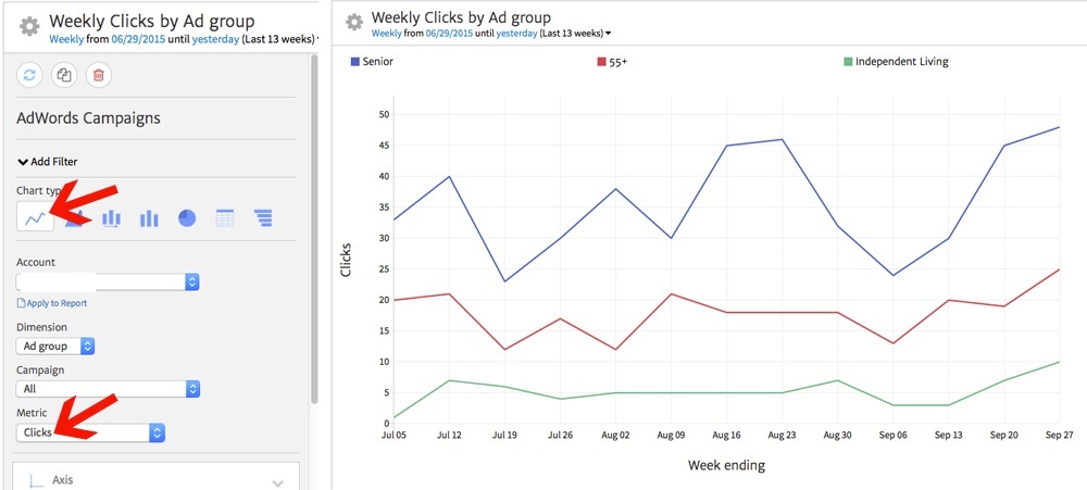
You can also select the specific ad groups (or whatever dimension you’re using in the chart) using the Series dropdown, which appears at the bottom of the widget options. This replaces the Columns dropdown previously shown.
Comparing Cost Per Click Over Time
The Time Series Bar Chart offers a handy way to compare how cost per click averages have changed over time, looking at specific cost figures for each campaign. Choose the third icon in the row of chart types to create this chart.
Note that this chart format also allows you to select one Dimension and one Metric to show. Checking the “Display Values on Bars” box will toggle showing the specific numbers for each bar in the graph (in this case, dollar amounts for CPC). Once again, you can also select your dimensions using the Series dropdown at the bottom of the widget options.
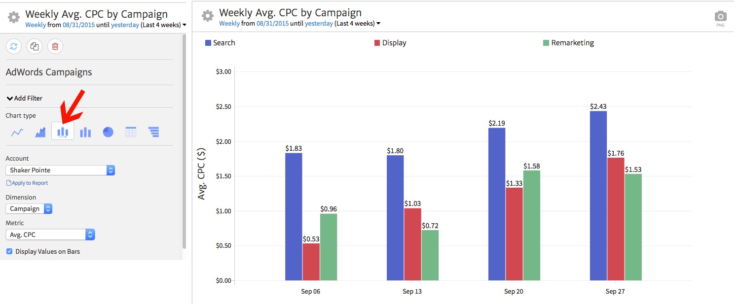
In this case, we’re comparing weekly average CPC for our three main campaigns over the past four weeks. This way, we can quickly and easily show our client how these costs have changed over time, separating by different formats of online advertising with different styles of bids.
If you want to change labels on the line chart, you can do so easily. For instance, you may want to clarify to your client that CPC stand for Cost Per Click. Selecting the Axis dropdown, you can customize the text for the X (horizontal) or Y (vertical) axis. In this case, we’ve updated the Y axis label to read Average Cost Per Click.
Comparing Date Ranges
If you’d like to compare data between two date ranges, the Table Graph widget offers a straightforward method to show this information. First, we’ll select the Table Graph icon from the widget options (last in the row of chart types) and choose to compare clicks by campaign. We’ll set the date range to the past four weeks, comparing to the previous period.
[screenshot: comparing-date-ranges]
Now, we can see graphs and numbers comparing clicks by campaign for each timeframe. This data shows that total clicks remained roughly the same, with the “Display” campaign increasing and the “Remarketing” campaign decreasing (hint: add a Notes widget to point out stats like these in your report!).
Conclusion
The AdWords Campaigns widget offers endless possibilities to show results from your PPC efforts. Breaking down data by campaign, ad group, or keywords, you can select just the right type of chart to portray your desired data to help you tell the right story. Start making better AdWords reports by customizing Megalytic widgets to show the data that matters for your clients!

